
When people first try making a promotional poster with AI, the process often goes something like this: upload a product photo, then type in phrases such as “premium,” “commercial photography,” “cinematic lighting,” “8K,” and “elegant typography.” A few seconds later, the result may look impressive, but something still feels off. It looks more like a visual experiment than an ad you could actually publish. The problem is usually not the model. It is the assumption that a beautiful image and an effective advertisement are the same thing. A good promotional poster needs to do at least three things within a few seconds: show people the product, communicate the main benefit, and make the next step clear. Lighting, materials, color, and atmosphere all help, but they cannot replace those three basic jobs.
1.Before Writing the Prompt, Define the Advertising Task
The instruction you give an AI model is usually called a Prompt. In this article, I will occasionally shorten it to Pmt. Before writing the actual Prompt/Pmt, it helps to create a very short advertising brief. Even five clear lines are more useful than a long list of visual keywords. At minimum, answer these five questions: What are you selling? Who is it for? What is the one benefit you want people to remember? Where will the poster appear? What should people do after seeing it? Suppose we are creating a social media poster for a lime sparkling water. The brief might look like this:
- Product: zero-sugar lime sparkling water
- Audience: young professionals who enjoy refreshing drinks
- Main benefit: zero sugar and a fresh summer taste
- Placement: Instagram, Pinterest, and short-form video covers
- Desired action: learn about the new product or click through to buy it
The most important part is choosing one main benefit first. If a poster tries to explain health benefits, flavor, ingredients, price, and the entire brand story at the same time, people usually remember none of them. A poster is not a product manual. Its first job is to make one idea stick.
2.An Ad-Like Look Starts With Visual Hierarchy, Not Effects
Most commercial posters have roughly three levels of visual hierarchy. The first is the product or main person. It should be what people notice first. The second is the key message, such as “Zero-Sugar Lime Sparkling Water” or “Summer in Every Sip.” The third includes the brand name, supporting information, campaign dates, and call to action. AI-generated images often lack this hierarchy. The background may be elaborate while the product is pushed into a corner. Water splashes, lens flares, floating fruit, and decorative objects may fill the frame until it is no longer clear where the viewer should look. That is why a useful prompt needs to describe more than what appears in the image. It should also explain what matters most, where it sits, and how much space it occupies. Instead of writing:
A bottle of lime sparkling water, fresh summer mood, commercial advertisement, premium look.
Try something more specific:
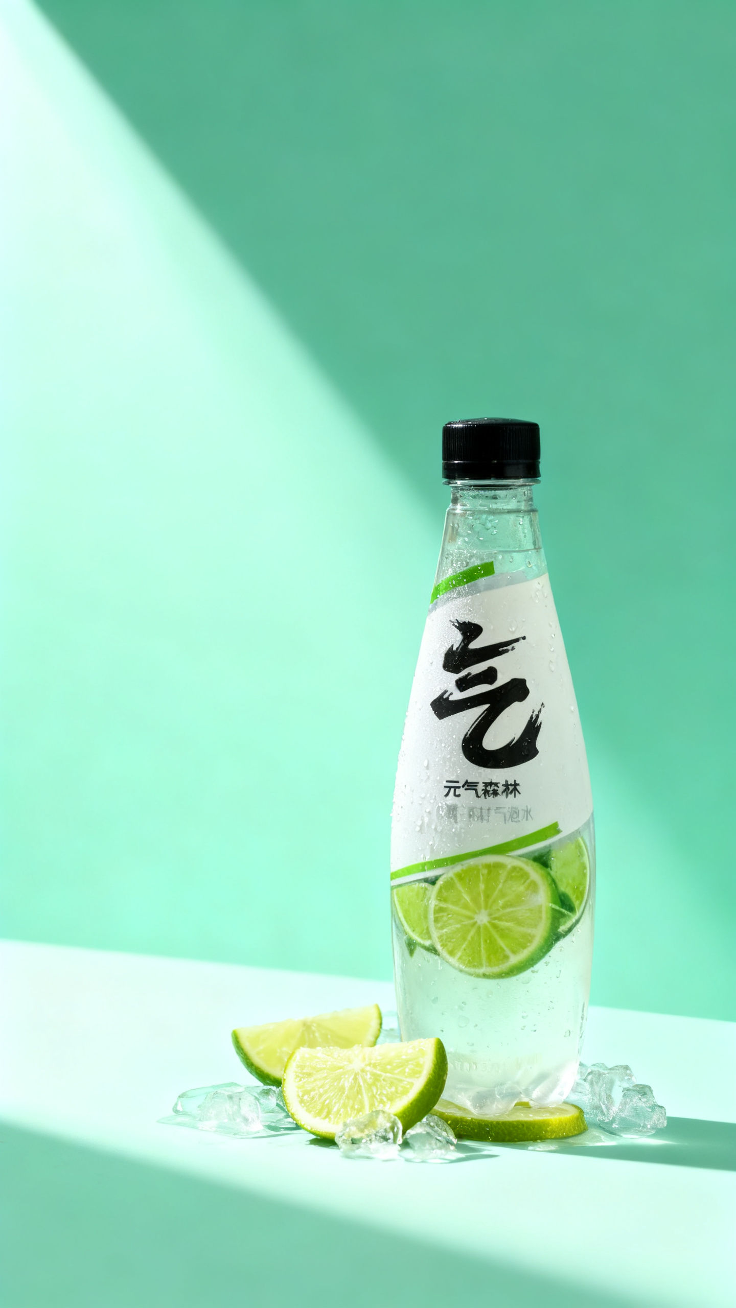
A single bottle of lime sparkling water as the only visual subject, positioned slightly right of center and occupying about two-thirds of the image height. Leave a clean headline area in the upper-left. Use a restrained pale green background with a small amount of condensation. Keep the product silhouette crisp and the front label facing the camera. The overall image should resemble a summer beverage launch poster.
The second version does not rely on more “premium” words. It simply explains the subject, composition, empty space, and intended use, giving the model a much clearer job.
3.What Should a Commercial Poster Prompt Include?
A practical product poster Prompt/Pmt can usually be organized in this order:
Product identity and reference image + central concept + composition + intended use + lighting and materials + brand colors + copy space + restrictions
This is not a formula that must be followed word for word. It is a checklist that helps prevent important information from being forgotten. The product reference keeps the AI from casually redesigning the item. The central concept determines whether the image feels refreshing, professional, warm, playful, or luxurious. Composition and copy space determine whether the poster can be typeset later. Lighting and materials make the product believable. Brand colors help a campaign remain consistent. Restrictions reduce unwanted text, altered packaging, and unnecessary background elements.
4.What Does a Complete Product Poster Prompt Look Like?
Let us continue with the lime sparkling water example. If you already have a real product photo, upload it to a model that supports image references or image editing, then use a prompt like this:
Use my uploaded sparkling water bottle as the only product identity reference. Preserve the exact bottle shape, cap color, label position, logo, and packaging proportions. Do not redesign the packaging. Create a summer product launch poster with the bottle standing slightly right of center and occupying about two-thirds of the image height. Add natural condensation to the bottle, with a small amount of crushed ice and fresh lime slices at the base. Use a bright but restrained pale green background. Sunlight enters from the upper-left, creating believable highlights and shadows. The image should feel fresh, realistic, and similar to professional beverage photography. Leave approximately one-third of the left side clean for a headline and supporting copy. Do not include text, people, other brands, additional bottles, or unnecessary decorations. Vertical 3:4 composition for a social media product ad.
If the model keeps changing the product, add stricter constraints:
Do not alter the packaging, logo, label, or product proportions. Do not generate random text or nonexistent accessories. Keep the label fully visible. Do not let the ice cover the product. Use realistic scale, natural contact shadows, and physically believable lighting.
What makes this prompt useful is not the phrase “pale green” or the mention of sunlight. It clearly states what must remain unchanged, how the composition should work, where the copy will go, and what should not appear.
5.Why Should You Avoid Letting AI Completely Redraw a Real Product?
If you are making a concept piece, there is nothing wrong with letting AI invent a bottle and label. For real commercial work, however, the packaging, logo, product color, and printed information need to be accurate. An AI model can create packaging that looks convincing while quietly changing one letter, stretching the bottle, moving the logo, or inventing a product size that does not exist. A more reliable workflow is to generate the background, lighting, surface, and creative setting with AI, then composite the real product photograph into the scene. Another option is to edit around an uploaded product image while carefully checking every part of the packaging afterward. Prices, promotional terms, ingredients, dates, and brand marks always need manual verification. AI can be a useful art director and set designer, but it should not be treated as the final brand reviewer.
6.Should AI Generate All the Text on the Poster?
Some current models can produce surprisingly clear English and Chinese text. Even so, for an advertisement that will actually be published, it is usually better to separate image generation from final typography. Ask the model to leave a clean, deliberate area for copy. Once the visual direction is approved, add the headline, product benefit, price, and call to action in Canva, Figma, Photoshop, or another layout tool. This gives you proper control over spelling, typefaces, spacing, hierarchy, and brand guidelines. The copy hierarchy should stay simple as well. Most social media posters only need three levels:
- Headline: Summer in Every Sip
- Supporting benefit: Zero-Sugar Lime Sparkling Water
- Call to action: New Product Launch
Once a poster contains ten different messages, even a beautiful image begins to look like a crowded flyer.
7.Do Not Change Everything at Once
When the first result is disappointing, a common reaction is to change the background, color palette, composition, lighting, and product position all at the same time. The problem is that you never learn which change actually improved the image. A better approach is to adjust one major variable at a time. In the first round, focus on composition: Is the product prominent enough? Is the copy space usable? In the second round, refine lighting and materials. In the third, settle the brand colors. Only then should you add decorative elements such as splashes, mist, petals, or floating ingredients. It also helps to compare several closely related variations in each round instead of asking the model to reinvent the concept every time. Commercial design depends on control and consistency, not endless surprises.
8.How Do You Know Whether the Poster Is Actually Usable?
Try a simple five-second test. Reduce the poster to the size it would normally appear on a phone screen, look at it for five seconds, and then ask yourself a few questions. Did you notice the product first, or the background effects? Can you tell what is being sold? Is the main benefit obvious? Is there enough readable space for the headline? Do the packaging, shadows, and materials look believable? If you removed words such as “premium” and “commercial,” would the image itself still feel like an advertisement? Then check the factual details. Is the logo correct? Has the packaging been distorted? Is every line of text accurate? Are the price and promotional terms correct? Does the aspect ratio match the publishing platform? Are all people, fonts, brand assets, and reference materials properly licensed for the intended use? These checks are usually more important than adding another photography term to the prompt.
9.Real Advertising Style Comes From Making Creativity and Information Work Together
AI can produce attractive visuals very quickly, but the goal of a promotional poster is not simply to look attractive. A useful ad needs an accurate product, a clear benefit, strong visual hierarchy, readable copy, and a format that fits the brand and publishing channel. Instead of only asking, “How do I make this look more premium?” ask three better questions: What should people notice first? What should they remember five seconds later? What job is this image supposed to perform for the product? One useful way to improve is to study final visuals alongside the prompts behind them. ccprompt.com includes product, poster, video, and other visual references that can help you observe the relationship between composition, lighting, materials, and Prompt/Pmt structure. Jimeng can be used to experiment with image generation, while Nano Banana Prompts provides additional prompt references. The goal is not to copy a professional-looking block of text. It is to learn how to translate a commercial objective into a clear visual instruction that an AI model can actually follow. Once you can clearly explain what you are selling, who it is for, and what people should remember, AI becomes a genuinely useful advertising tool.