
When people create product marketing images with AI, they often put the selling points directly into the prompt: premium, portable, refreshing, professional, comfortable, powerful. The model can usually produce something polished, but the result quickly falls into familiar patterns. “Premium” becomes a black-and-gold background. “Refreshing” becomes splashing water and mint leaves. “Professional” becomes blue lighting and complicated equipment. These images are not always unattractive. The real problem is that they do not explain why the product is worth buying. They simply replace a few abstract marketing words with predictable visual clichés. Product benefits are written for customers to understand. A prompt has a different job: it must tell the AI what should actually appear in the image. There is one important step between the two: turning the selling point into visible evidence.
1.A Selling Point Is Not an Image
The instruction given to an AI model is usually called a Prompt. In this article, I will occasionally shorten it to Pmt. Many product-image Prompt/Pmt attempts fail not because they are too short, but because they hand marketing language directly to the model and expect it to handle the translation. Take the statement, “This portable blender is easy to carry.” People understand it immediately, but “portable” does not have one fixed visual form. The AI might make the blender smaller, place it in someone’s hand, or simply generate a generic outdoor scene. If we break the statement down further, the image becomes clearer:
Product feature: compact and lightweight
Customer benefit: easy to carry throughout the day
Typical situation: commuting, working out, or traveling
Visible evidence: the blender fits inside a commuter bag, can be held in one hand, and appears next to a phone and keys for scale
Now “portable” is no longer an empty adjective. It has become a scene, an action, a sense of scale, and a composition the model can follow. A useful way to think about selling-point visualization is:
Product feature → Customer benefit → Use case → Visible evidence
2.One Image Should Usually Carry One Main Selling Point
A product may have many advantages, but a single poster has limited attention to work with. Suppose a portable blender is lightweight, powerful, easy to clean, long-lasting, and visually attractive. If all of those ideas are forced into one image, the AI may add fruit, water splashes, battery icons, travel bags, cleaning scenes, and random text. The result starts to look like an overcrowded product-detail page. A better approach is to turn the benefits into a small campaign:
- The first image focuses on portability.
- The second shows how quickly a drink can be prepared.
- The third demonstrates easy cleaning.
- The fourth presents commuting and fitness use cases.
Each image becomes easier to understand, and together they form a set of promotional assets that can be published over time. The AI also receives a much clearer task: prove one benefit through one scene.
3.How Do You Find “Visible Evidence” for a Selling Point?
Ask yourself one question: If the selling point could not be written on the poster, how much of it would people still understand from the image? Different benefits require different kinds of visual evidence.
Portable
Do not stop at “lightweight, portable, premium product photography.” Show the product being held in one hand, placed inside a small bag, or positioned next to familiar objects such as a phone and keys for scale.
Refreshing
Instead of only writing “fresh summer feeling,” use realistic condensation, a translucent drink, natural sunlight, and freshly cut lime.
Quiet
Instead of “quiet, comfortable, immersive experience,” show a relaxed person using the product in a busy commuting environment, with the background crowd slightly motion-blurred.
Easy to Clean
Do not rely on “simple and easy to clean.” Show detachable parts arranged clearly, clean water rinsing the product, and a structure without hidden or complicated corners.
Premium
Instead of filling the prompt with “luxurious” and “high-end,” use restrained composition, believable materials, controlled edge lighting, accurate reflections, and enough negative space.
Made for Outdoor Use
Do not simply place the product in front of a dramatic landscape. Show it being used naturally while camping, hiking, or traveling. There is an important limit here: an image can suggest a feeling or demonstrate a use case, but it cannot replace factual proof. Claims such as “24-hour battery life,” “IP68 water resistance,” or “30% more efficient” require real supporting data. AI can help create the visual setting and leave space for verified copy, but it cannot prove that a number is true. It should never be allowed to invent specifications, certification marks, or comparison charts.
4.A Five-Step Method for Turning Benefits Into Images
The first step is to define the selling point accurately. Do not begin with words such as “premium” or “easy to use.” Write down the actual product feature. The second step is to explain what changes for the customer. Low weight is not the final value; being able to carry the product all day is. A noise-cancellation rating is not the final value; being able to find a moment of calm during a crowded commute is. The third step is to choose one representative use case. An office, kitchen, subway, gym, and campsite all communicate different lifestyles. The closer the setting is to the customer’s real life, the easier it is for that person to imagine using the product. The fourth step is to define the visual evidence: the person’s action, the product’s scale, environmental details, lighting, and materials. Do not tell the AI that the product “feels convenient.” Explain what convenience looks like. Only then should you decide the advertising composition: where the product appears, where the selling-point copy will go, how complex the background should be, and whether the final image is intended for a horizontal website banner, a vertical social post, or an e-commerce listing.
5.Complete Example: Showing That a Portable Blender Can Make Fresh Drinks Anywhere
Start with the advertising brief:
- Product: portable blender
- Audience: commuters, fitness customers, and frequent travelers
- Main selling point: drinks can be prepared away from the kitchen
- Intended use: a new-product social media campaign
- Visible evidence: the blender fits inside an everyday bag and can be used outdoors with one hand
If you already have a real product photograph, upload it as a reference and use a prompt like this:
Use my uploaded portable blender as the only product reference. Preserve the exact body shape, color, button placement, logo, and real-world proportions. Do not redesign the product. Create a lifestyle product advertisement showing a young professional beside a bench in a city park, holding the blender naturally in one hand. The blender contains a freshly prepared orange fruit drink. An open commuter bag sits nearby with a phone, keys, and notebook visible inside. Show that the blender fits easily into the side pocket, using the familiar objects to communicate its true size and portability. Use soft morning daylight. The image should feel bright, fresh, and believable. Keep the blender sharp and clearly visible while the background remains gently out of focus. The person supports the use case, but the blender is the primary visual subject. Leave a clean area in the upper-right for the headline “Fresh Wherever You Go.” Do not add additional blenders, alter the product packaging, generate random text, or use exaggerated water splashes. Vertical 3:4 composition for a social media advertisement.
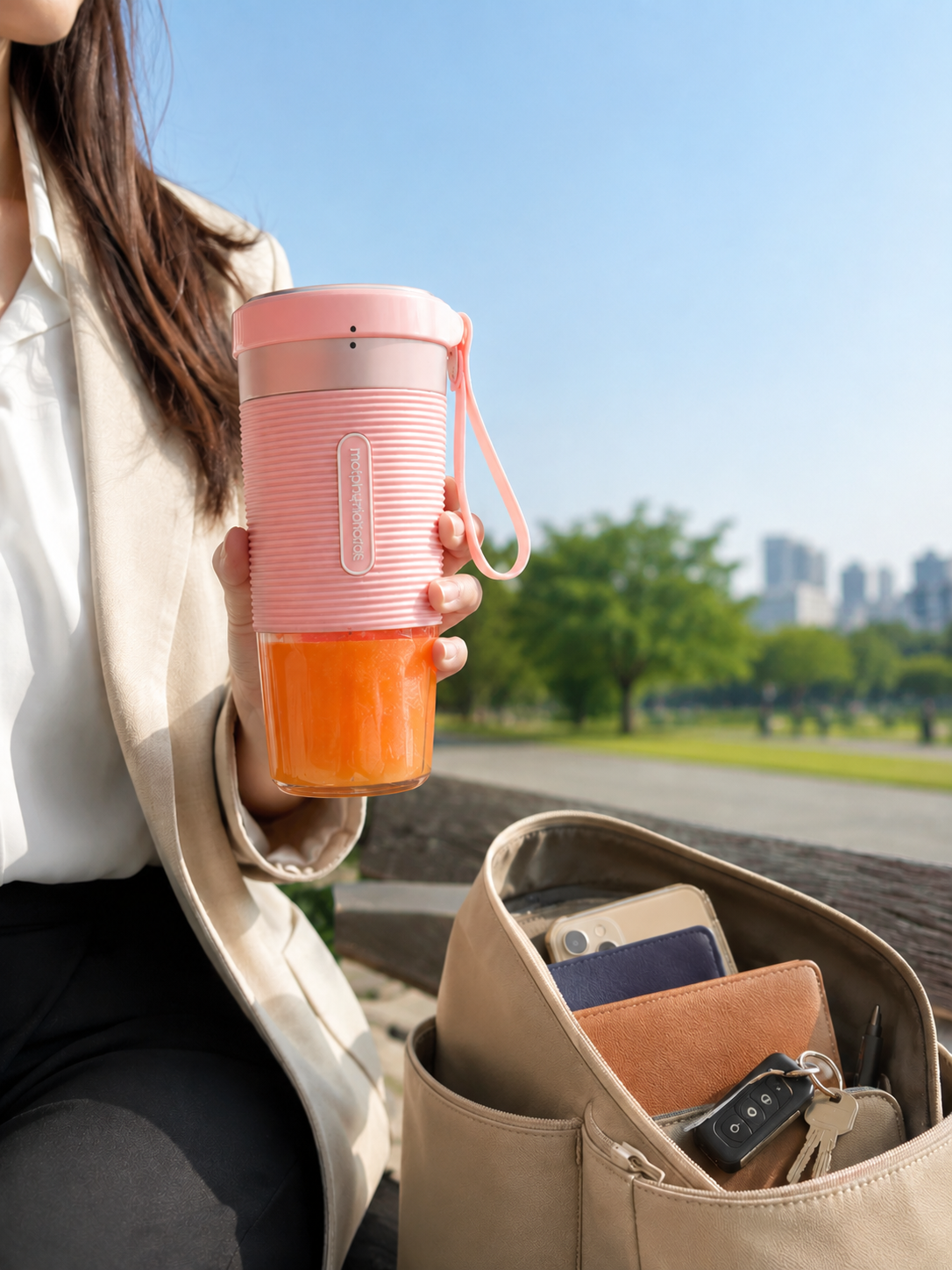
This Prompt/Pmt does not repeatedly say “portable,” “premium,” or “commercial photography.” Instead, the bag, phone, one-handed action, and outdoor setting allow people to understand the benefit for themselves. The final copy does not need to explain everything either. The headline could be “Fresh Wherever You Go,” followed by “Blend. Take. Go.” Detailed specifications and purchase information can remain on the product page or in the accompanying ad copy.
6.How Should Different Product Categories Visualize Their Benefits?
Food and beverage advertising depends heavily on texture. Steam, sauce, bubbles, cut surfaces, condensation, and believable serving details usually communicate more than the phrase “delicious.” However, ingredients should not be added if they are not actually present, and the serving size or packaging should not misrepresent the real product. Beauty and skincare products often use liquid textures, skin feel, soft lighting, and clean environments to suggest lightweight, moisturizing, or refreshing qualities. Claims such as “reduces wrinkles” or “repairs instantly” require evidence. The fact that AI can generate a dramatic before-and-after image does not make the promised result true. Technology products are often better explained through use. Headphones can appear in commuting, work, or exercise scenes. A keyboard can be shown as part of an organized desk and a real workflow. A camera can demonstrate its professional role through the shooting environment. Placing every device on a metallic platform under blue lighting only proves that it looks like a technology product; it does not show what problem it solves. Services and software do not have physical packaging, but their value can still be visualized through outcomes. A time-management app does not always need a poster filled with interface screenshots. It could show the difference between a chaotic and organized workspace, the relief of completing a task, or the real interface inside a believable working environment. The interface and features must still come from the real product. AI should not invent buttons or capabilities that do not exist.
7.Visual Metaphors Can Help, but They Should Not Become False Promises
Advertising often uses visual metaphors. Speed can be suggested with directional motion blur. Lightness can be expressed through suspension or soft materials. Quiet can be shown through the contrast between a calm subject and a busy background. The purpose of a visual metaphor is to make a benefit easier to feel, not to fabricate product performance. If an ordinary running shoe is not waterproof, the image should not show it moving through deep water while remaining completely dry. If a drink contains no functional ingredient, the poster should not imply medical or health benefits. This is especially important for food, skincare, health, finance, and other regulated categories. A visual implication can still be interpreted as a product promise.
8.Why Do So Many AI Product Images Still Feel Unconvincing?
The problem is usually not image resolution. More often, one of the following has gone wrong: First, the prompt uses abstract adjectives without a use case or visible evidence. Second, one image tries to communicate too many benefits at once. Third, the background and effects attract more attention than the product. Fourth, the AI changes the packaging, logo, or product structure. Fifth, the model is allowed to generate unverified claims, certifications, or specifications. Sixth, no space is reserved for copy, so there is nowhere to place the headline after the image is generated. Another common issue is that the result looks like a brand mood image rather than a product advertisement. Mood images can establish an atmosphere, but if people finish looking at the image without knowing what is being sold or why it matters, the image has not completed its commercial task.
9.Prompts Become Useful Only After the Selling Point Has Been Visualized
AI does not naturally understand how to sell a product. It is good at arranging a scene based on instructions, but a person still has to decide why the customer should care. When writing prompts for product marketing images, temporarily set aside familiar phrases such as “premium,” “cinematic,” and “commercial masterpiece.” Follow a more useful line of thought: What is the product feature? What changes for the customer? Where does that change happen? What visible detail would allow people to understand it? One way to practice this skill is to study finished images together with the prompts behind them. ccprompt.com includes product, poster, video, and other visual examples that can help you observe how subjects, settings, composition, lighting, and materials are organized inside a Prompt/Pmt. Jimeng can be used to test different visual directions, while Nano Banana Prompts provides additional references. The most useful lesson is not a single “universal prompt.” It is learning how someone turned an abstract idea into a commercial image that can be seen, understood, and checked against reality.