
Many AI product-image prompts sound impressive on paper: premium, luxurious, commercial photography, cinematic lighting, ultra-detailed, 8K. The results may be polished, with a clean background and a product placed neatly in the middle, yet they still look like generic AI images rather than photographs a real brand would use. The problem is usually not a lack of keywords. It is that the prompt describes the desired mood without explaining how the product should actually be photographed. Commercial product photography is not a filter, and adding “commercial photography” at the end of a prompt does not automatically create it. It is a series of deliberate decisions: where the camera sits, how much of the frame the product occupies, where the light comes from, which areas should be bright or dark, how the material should reflect light, why each prop is present, and what the viewer should notice first. The English word for 提示词 is Prompt, and it may also be shortened to Pmt. To make an AI product image look more like commercial photography, the useful skill is not collecting more impressive adjectives. It is learning how to translate a photographer’s decisions into a clear Prompt/Pmt.
1.Where Will the Product Image Be Used?
The same product should not be photographed in exactly the same way for an ecommerce listing, a brand campaign, a product-detail page, and a social media ad. If the intended use is missing, AI often creates an image that could theoretically fit anywhere but is not quite right for any specific purpose. An ecommerce hero image usually needs a clear, complete, and accurate product on a simple background. Props should not compete with the subject. A brand campaign image can place more emphasis on mood and memorability, but it may also need clean space for a headline, logo, and call-to-action. A product-detail image might focus entirely on a cap, connector, fabric surface, or material finish. A social ad must remain readable on a small mobile screen, so the product cannot disappear inside an elaborate scene. Before writing the prompt, answer three questions: Where will this image appear? What should the viewer notice first? Where will the copy be placed? “Create a perfume product photo” only identifies the subject. “Create a horizontal homepage hero image for a new perfume launch, with the bottle on the left and clean space for a headline and button on the right” describes an actual commercial requirement.
2.Lock the Product Before Describing the Style
The first requirement of commercial product photography is that the product must be correct. If the proportions, packaging color, logo, label, controls, ports, or materials change, even beautiful lighting cannot make the image suitable for a real campaign. When advertising an existing product, upload clear reference images and separate the features that must remain fixed from the rest of the photography instructions. For example:
Use the product in the uploaded images as the only identity reference. Accurately preserve the bottle proportions, frosted ivory glass, silver dropper cap, front-label position, and brand mark. Do not alter the packaging text or add any decoration, control, or structural feature.
This part protects product accuracy. The camera, lighting, and background instructions can then control its presentation. Keeping these two jobs separate helps the model understand what it may interpret and what it must not change. Packaging with small or complex text still needs careful review. AI is good at creating shapes that look like writing, but it may not reproduce the real copy consistently. For high-accuracy work, it is often safer to generate the scene first and composite the original product or label into the final image.
3.How Does Camera Language Change the Product?
Prompts often include phrases such as “professional camera” or “studio shot,” but those descriptions are still too broad. The product’s appearance is shaped more directly by the camera angle, shot size, perspective, and depth of field. A straight-on eye-level view is useful for packaging, logos, and symmetrical products. It feels stable and rational, which is why it is common for skincare, bottles, and consumer electronics. A three-quarter angle reveals both the front and the side, making it easier to show volume. A slight overhead view works well for food, cosmetics collections, gift boxes, and tabletop arrangements. A low angle can make a product feel stronger or more imposing, which may suit sports equipment, cars, speakers, and performance-focused products. Lens language also affects the result. Wide-angle views exaggerate near-to-far scale and can distort product proportions. Unless that distortion is intentional, they are usually a poor choice for accuracy-focused product images. A medium telephoto look produces calmer, more natural perspective, while a macro look is useful for jewelry, surface texture, droplets, buttons, and construction details. A practical camera instruction might be:
Position the camera at the height of the product, using a front-right three-quarter view and a medium close shot. Use the natural perspective associated with 85mm commercial product photography. Keep the proportions accurate, avoid wide-angle distortion, and show the complete product clearly.
AI does not simulate every focal length and aperture with the precision of a physical camera. Terms such as 85mm, 100mm macro, and f/8 mainly guide the model toward a familiar photographic appearance. Do not rely on numbers alone. Describe the intended result as well: natural perspective, the whole product in focus, or a softly blurred background with a sharp and readable label.
4.Do Not Just Ask for “Cinematic Lighting”
Lighting is often more important than the background in product photography. It defines not only brightness and shadow, but also volume, silhouette, and material. A basic commercial lighting setup can be understood through a key light, fill light, and rim or edge light. The key light establishes direction and form. Fill controls the depth of the shadows so that important detail is not lost. A subtle rim light separates the product from the background. Not every photograph needs all three, but the prompt should explain the most important relationship between them. For example:
Use a large softbox above and to the front-left as the key light, creating a broad, soft highlight that gradually wraps around the bottle. Add a weaker white reflector on the right to preserve detail in the shadow side. Use a subtle edge light from the upper rear to separate the transparent outline from the background. Keep a natural, soft contact shadow beneath the product.
This is much more useful than “premium lighting, cinematic shadows.” It tells the model where the light begins, how strong each source should be, and what kind of highlight it should create on the surface. Commercial photography does not always mean a dark image. Food, baby products, and everyday household goods often use bright, soft, high-key lighting. Perfume, jewelry, and premium spirits may suit a restrained dark background and stronger contrast. Technology products can benefit from crisp edge lighting, but they do not automatically need blue and purple neon. The lighting should support the product’s position in the market rather than apply the same idea of “premium” to everything.
5.How Should Different Materials Reflect Light?
Materials are one of the quickest ways to spot an unconvincing AI product image. A bottle may have the outline of glass without its transmission and refraction. A surface may be labeled as metal but show only a flat white patch. Matte plastic may reflect light as if it had been polished with wax. Instead of asking for “realistic materials,” describe what the material should do when light reaches it. Glass needs transparency, defined edge highlights, refraction, visible internal contents, and controlled reflections. A useful description might be “clean glass edges, soft refraction, visible liquid inside, and controlled reflections without blown highlights.” Frosted glass should look semi-translucent and softly diffused rather than mirror-like. Metal is defined by long, continuous reflections that explain its curved or flat surfaces. For stainless steel or aluminum, describe “clean strip highlights, visible brushed-metal texture, detail in the darker areas, and no broken white glare.” Matte plastic should not produce sharp mirror reflections. It is better described through “broad, soft tonal transitions, subtle surface grain, and low reflectivity.” Leather and fabric benefit from side light or grazing light that reveals fibers, texture, stitching, and natural folds. Food and drinks have their own material language. A cold beverage may need natural condensation, a slightly wet glass surface, and transparent liquid. Baked food may need a soft interior, lightly browned edges, and believable crumbs. More decoration does not necessarily make food look fresher. The image needs visible evidence of qualities such as cold, crisp, soft, juicy, or freshly baked.
6.Why Should Every Prop Have a Reason to Be There?
AI tends to be overly helpful with product scenes. Mention skincare and it may add petals, water, stones, leaves, silk, gold rings, and reflective decorations all at once. The image looks busy and expensive at first glance, while the product itself becomes secondary. In commercial photography, props should communicate something. A leaf can suggest a botanical ingredient. Water can suggest hydration or freshness. Stone can imply natural origin, durability, or an outdoor setting. A wooden surface can create warmth and familiarity. One image normally needs one clear visual idea, not every possible association with the product category. The prompt can limit both the number and placement of props:
Use only a pale warm-gray gradient background and a low matte ivory stone pedestal. Place one softly blurred green leaf in the rear-right background as a restrained accent. Do not add petals, silk, jewelry, gold decorations, or additional bottles.
These restrictions do not make the image empty. They make its hierarchy clearer. Commercial-looking photography often depends on knowing what to remove.
7.How Do You Leave Space for Copy and Layout?
A product image rarely exists as a standalone artwork. It may also need to hold a headline, benefit statement, logo, price, button, or legal copy. If AI fills every corner with products, reflections, and props, the image becomes difficult to use in an actual design. A horizontal website hero might place the product in the left third and reserve the right side for copy. A vertical social ad might keep the product in the lower center and leave room for a short headline above it. An ecommerce main image usually prioritizes a centered product, a complete silhouette, and immediate recognition at thumbnail size. Do not simply request “negative space.” Explain where it should be and what it is for:
Place the product in the left third of the composition and keep the full bottle visible. Reserve approximately 40% of the right side as a clean, pale area for the product name, primary benefit, and call-to-action button. Do not place props, strong reflections, or complex shadows inside the copy area.
This creates an image designed for the next stage of production, not a visually finished image that cannot accommodate any real layout.
8.How Should a Commercial Product Photography Prompt Be Structured?
A practical order is:
Product identity and accuracy + intended use + camera and angle + composition + lighting + material behavior + background and props + copy space + exclusions.
This is not the only possible order, but it follows a sensible production process. First establish what is being photographed and why. Then decide how it should be photographed. Finally, restrict the mistakes the model is most likely to make. You can adapt this template:
Use the uploaded product images as the only product reference. Accurately preserve [shape, colors, logo, packaging copy, and essential construction details]. Create a commercial product photograph for [channel or use case], with the image primarily communicating [visual objective]. Use [camera position and angle] with the visual characteristics of [lens or photographic approach]. Place the product at [position] and let it occupy approximately [percentage] of the frame. Position the key light at [direction] to create [highlight and shadow behavior]. Use [fill method] to preserve shadow detail and [rim or background light] to separate the subject. Accurately render the [glass, metal, plastic, fabric, or other material] through [reflection, refraction, texture, and transparency behavior]. Use [background color, setting, and surface] with only [a small number of relevant props]. Reserve clean copy space at [location]. Do not alter the product structure, logo, or packaging. Do not generate random text, extra products, or unrelated decorations.
The purpose of the template is not to make every campaign look the same. It is to prevent the prompt from overlooking the details that make product photography commercially usable.
9.Complete Example: How Do You Prompt a Skincare Serum Photograph?
Suppose we need a homepage hero image for the launch of a 30ml skincare serum. The real product uses a frosted ivory glass bottle, a silver dropper cap, and a minimal label. The brand wants to communicate gentleness, cleanliness, and professional credibility. A weak prompt might say:
Premium skincare advertisement, luxurious commercial photography, cinematic lighting, 8K, hyper-realistic.
The model may respond with water splashes, flowers, gold ornaments, and dramatic reflections. It may even redesign the cap and label. The problem is not that the result lacks beauty. The words “premium” and “luxurious” have not been translated into specific photographic decisions. A more complete Prompt/Pmt would be:
Use the uploaded photograph of the 30ml skincare serum as the only product identity reference. Accurately preserve the frosted ivory glass bottle, silver dropper cap, bottle proportions, front label, and brand mark. Do not change the packaging copy or add any new structural element. Create a horizontal 16:9 commercial product-photography hero image for a skincare product launch. The overall impression should feel gentle, clean, credible, and professionally formulated.
Position the camera at the midpoint of the bottle and use a front-right three-quarter view with a medium close composition. Create the natural perspective associated with 85mm product photography. Keep the complete silhouette visible and the front label sharp. Place the bottle in the left third of the frame at approximately 65% of the image height. Reserve 40% of the right side as a clean area for a headline and call-to-action.
Use a large softbox above and to the front-left as the key light, producing a wide, gradual highlight across the frosted glass. Add a low-intensity white reflector on the right to retain detail in the shadow side. Introduce a very subtle edge light from the upper rear to separate the silver cap and bottle outline from the background. Create a natural, soft contact shadow under the bottle so that it does not appear to float.
Render the frosted glass with semi-translucent depth and fine diffusion. Give the silver metal cap a continuous, controlled strip highlight without clipping or plastic-like shine. Use a subtle warm-white to pale-gray gradient background and place the product on a low matte ivory stone pedestal. Include only one softly blurred pale-green leaf in the background. Keep the image restrained and quiet. Do not add water splashes, petals, silk, gold rings, neon lighting, extra bottles, or random text. Do not alter the packaging.
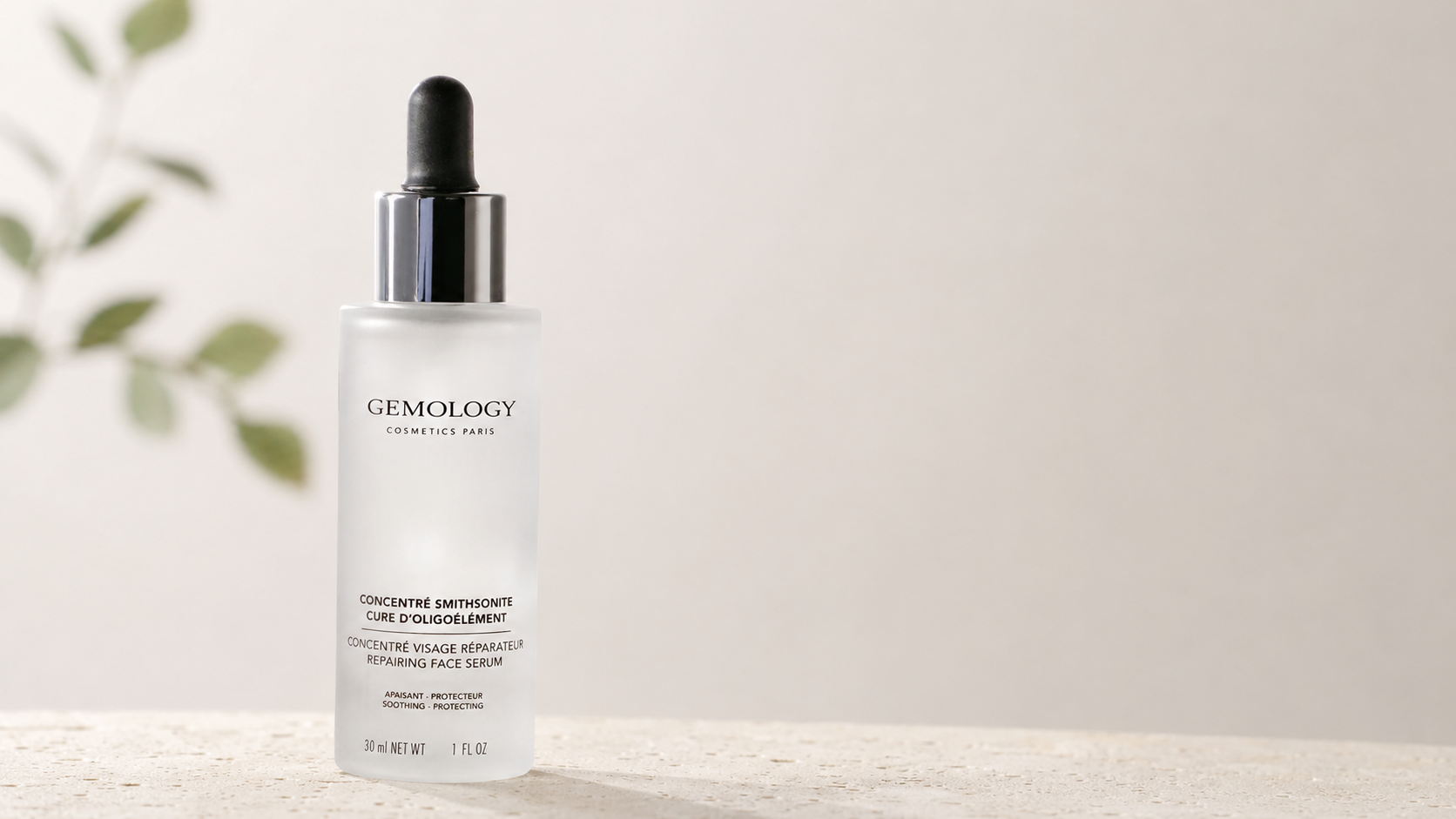
The prompt is long because each part has a job. The first paragraph protects the product and defines the brand direction. The second controls camera and composition. The third designs the lighting. The fourth controls materials, background, props, and exclusions. It is not a pile of premium-sounding words; it is a written version of a real photography brief. In practice, you do not always need to begin with the full version. Start with the product identity, composition, and key light. Once the direction is correct, add material and background controls where the output still needs improvement.
10.Which Part of the Prompt Should You Change First?
When the result is wrong, do not rewrite the entire prompt. Change the module responsible for the problem. If the product shape is inaccurate, check the reference images and identity description before changing the style. If the bottle looks flat, adjust the key-light direction, highlight shape, and tonal transition. If the material looks like plastic, clarify reflection, refraction, texture, and transparency. If the product does not stand out, remove props, reduce background contrast, or strengthen edge separation. If there is no room for copy, specify the product position and exact negative-space area again. Changing one main variable at a time and comparing two to four results is far more informative than replacing the whole keyword list after every generation. Commercial product photography should not be treated as a slot machine. The goal is to reduce the model’s room for interpretation in a controlled way. Also remember that a prettier result is not always a more usable one. Ask a few practical questions: Can the product still be recognized when the image is small? Are the logo and packaging accurate? Does the lighting explain the product’s shape? Do the materials match the real object? Are the props competing for attention? Is the copy space genuinely usable?
11.What Actually Creates a Commercial Photography Look?
A commercial look does not come from a darker background, a brighter rim light, or more expensive-looking props. It comes from purposeful control. Why is the product positioned there? Why was that camera angle chosen? Why does the key light come from that side? Why does the material produce that particular highlight? Why is one part of the frame deliberately empty? When those questions have clear answers, even a simple image can look professional. When they do not, a prompt full of “premium, luxurious, cinematic, 8K” may create a dramatic image without creating a useful product photograph. One of the most effective ways to learn is to compare finished images with the prompts behind them. You can browse product photography, commercial posters, and material-focused visual references on ccprompt.com to see how creators describe subjects, composition, light, and backgrounds. You can then test reference-image and scene-editing workflows with Jimeng, while Nano Banana Prompts provides additional prompt examples. The point is not to copy one perfect prompt. It is to learn to look at an image like a photographer: understand the product first, then decide how the camera and light should explain it.