Autumn Tunnel Floral Brand Poster AI Image Prompt
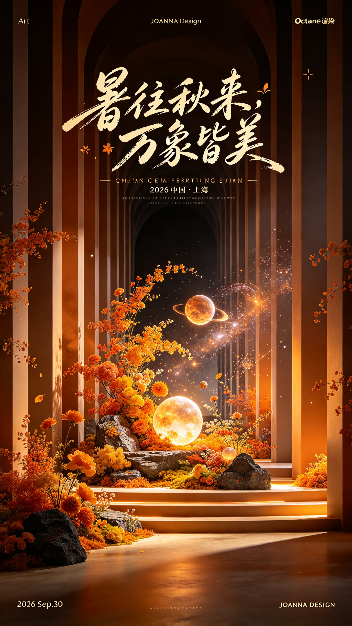
Creative brand poster bidding farewell to midsummer, where autumn beauty continues to bloom; suited to autumn aesthetics, the beauty industry, new product launches, and brand galas. Strong perspective depth (tunnel-like corridor): repeated vertical columns on both sides converge toward the center of the image, creating a powerful one-point perspective that leads the eye directly to the floral landscape at the visual center; the space feels grand and highly ceremonial. Warm orange autumn primary palette: orange + deep brown-black base. Orange represents golden autumn, warmth, and refined understated luxury; the dark background darkens the image to highlight the subject, with a strong atmospheric light-and-shadow mood—a currently popular autumn light-luxury color scheme for commercial events. Central scene: in the depths of the image, an autumn floral installation with orange-yellow flowers, rocks, planet-like glowing spheres, and fine starlight particles, blending natural autumn scenery + dreamy cosmic elements, combining natural elegance with a technological fantasy feel. At the top, a handwritten atmospheric text title “暑往秋来,万象皆美”; below it, extremely small English supporting copy information; clear typographic hierarchy, generous letter spacing, not blocking the subject; small text label: “2026 中国・上海”. At the top of the image, extremely small, extremely thin sans-serif fonts: “Art”, “JOANNA Design”, and “Octane 渲染”; at the bottom left, extremely small text “2026 Sep.30”; at the bottom right, extremely small text “JOANNA DESIGN”.
Content: Structure: brand-poster theme + tunnel one-point perspective + central autumn floral and glowing-planet installation + warm orange/deep brown-black light-luxury palette + handwritten title and tiny typographic details; covers scene, composition, lighting, color, material, and text hierarchy.
Pros: Clear perspective and palette directions; explicit typographic hierarchy.
Cons: Many text elements may crowd or garble; floral and cosmic motifs may feel busy.
Reference image: No obvious reference-image dependency
Curated from publicly available creative examples. Prompts and commentary are edited and organized by this site. Please contact us with any rights concerns. Copyright & Privacy