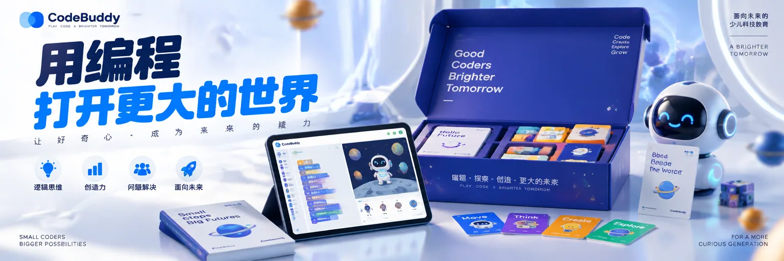
Future Enlightenment Kids’ Tech Education Campaign Poster AI Image Prompt
[Brand Positioning] This is not a course poster, but a children’s tech education campaign centered on “future enlightenment.” The product must be in an active “opened/explored” state, creating a dual resonance of parent trust and child curiosity. The image should convey the quality feel of a collaboration between a top edtech group’s in-house creative team × a children’s aesthetics lab. Viewers should understand at a glance: coding, fun, professional, future. [Visual Composition] The experience gift package (gift box/tablet/coding cards combination) is the absolute visual core, occupying about 40% of the frame. The product can stand firmly on a light-colored surface or float slightly; if child elements appear, limit them to tablet-screen light reflection or partial arms (never complete hands or finger details). The screen shows a real coding interface (block-based code/animated characters). The gift box surface has authentic material texture and a sense of unwrapping ceremony. Surround with micro tech elements (circuit board textures, binary particles, geometric light points). All elements are built around the brand-exclusive color palette. [Background Design] Brand-exclusive light-toned gradient background, not a cluttered classroom scene, a pure advertising-grade education studio setting. Foreground has soft-focus tech particles (light points, floating geometry, soft data lines) creating depth of field. Commercial-grade soft-light bloom, subtle light spots suspended in the air, premium matte/mirror reflections. [Product Presentation] The real experience gift package itself, packaging/screen perfectly visible, ultra-sharp materials, clear micro details (cardboard texture, screen pixels, printing craft), authentic material reflections, high-end commercial retouching. [Copy Hierarchy and Typography System] Top left: official brand logo, small and refined. Main title: extra-bold rounded sans-serif (referencing the friendly strength of children’s tech brands), -3% letter spacing, tight arrangement, occupying the upper half as the visual focus, colors extracted from brand primary colors. Subtitle: medium-weight sans-serif, +10% letter spacing, airy arrangement, creating professional trust. Right side/bottom benefit points: minimalist icon system, small rounded type, 4–6 characters each, like capability tags. Clean, highly readable fonts that do not steal focus from the product. [Graphic System] Apple-level minimalism, LEGO-level playful confidence, edtech-level product communication. Strong visual hierarchy, perfect negative space, children’s tech typography, mobile-first readability, all elements aligned to a professional advertising grid. [Lighting System] High-end education commercial soft light, large overhead softbox, premium rim light on product edges, controlled specular highlights, natural soft shadows, soft product glow. [Camera Parameters] Hasselblad H6D-400C, 85mm lens, f/4, ISO 100, studio commercial photography, ultra-sharp focus, professional advertising retouching. [Emotional Tone] Future, fun, professional, trustworthy, enlightenment, exploration. [Technical Constraints] no human hands, no fingers, no palms, photorealistic product packaging, accurate screen display with block-based coding interface, authentic material textures, soft tech particles in foreground, professional advertising retouching. [Final Effect] A world-class children’s tech education advertising poster, presenting authentic global education product_campaign texture, blending hyper-realistic product photography, tech education aesthetics, luxury commercial lighting, high-end graphic design, strong brand recognition, perfect typographic hierarchy and high-conversion social media aesthetics.
Content: Formula: brand positioning + product as ~40% core + education studio background and tech particles + typography hierarchy + soft lighting + Hasselblad 85mm commercial camera + constraints such as no hands.
Pros: Complete modules with clear product, typography, lighting and camera guidance; high commercial-ad finish.
Cons: Too many constraints can overwhelm the model; brand colors, logo and accurate coding UI may be unstable.
Reference image: No obvious reference-image dependency
Curated from publicly available creative examples. Prompts and commentary are edited and organized by this site. Please contact us with any rights concerns. Copyright & Privacy