MATCHIEN Matcha Stream WHISK Poster AI Image Prompt
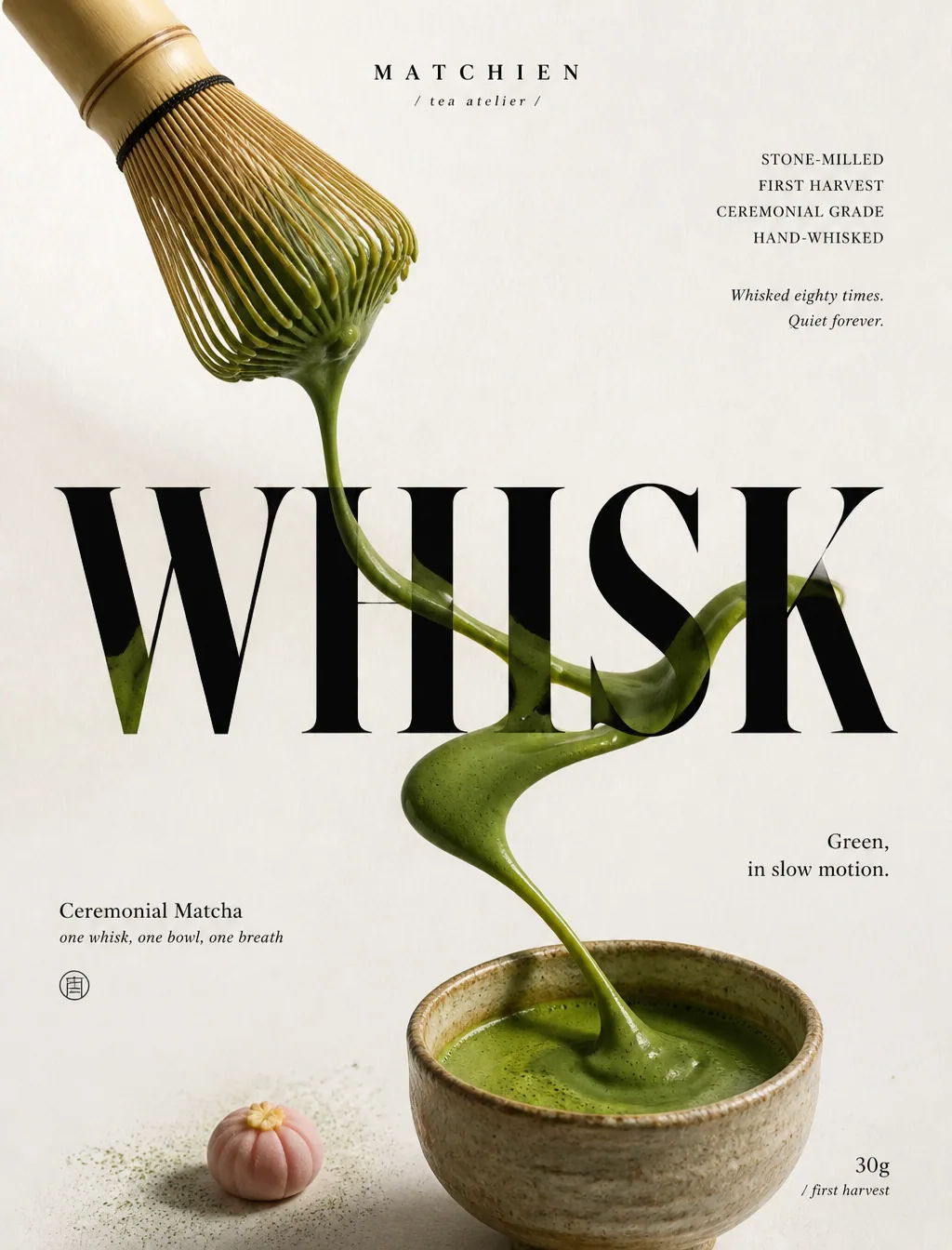
Cannes-grade vertical premium matcha poster advertisement, brand MATCHIEN, a fusion of luxury food photography × Eastern minimalist graphic design. [Composition] Vertical elongated composition, warm-white xuan paper texture background, fine fiber grain, generous negative space. In the upper left, a handmade bamboo chasen enters diagonally, thick matcha clinging between the tines; a continuous stream of matcha drips from the whisk, running vertically through the poster, rich, slow, naturally controlled, with credible gravity. At the center, a monumental ultra-bold serif word "WHISK"; the matcha stream winds around the letter stems, passes behind the counters, and precisely occludes the stroke edges, with continuous moss-green luster and soft natural contact shadows. The stream extends to the lower right, ending in a small handmade coarse ceramic bowl whose matcha surface has a fine foam texture. [Food rendering] Hand-whisked usucha-grade matcha liquid, stream thickness varying naturally, deep moss green with velvety sheen; fine surface foam and tiny bubbles realistically visible; a very small amount of matcha powder lightly dusted, one wagashi as a restrained accent. Bamboo chasen with handmade texture, matte finish, soft reflections; coarse ceramic bowl with matte glaze and kiln-transformation details. [Typography] Fully original custom typeface, treated with graphic-architectural logic. Top center "MATCHIEN / tea atelier"; top right "STONE-MILLED / FIRST HARVEST / CEREMONIAL GRADE / HAND-WHISKED" plus italic line "Whisked eighty times. Quiet forever."; center "WHISK"; lower left "Ceremonial Matcha" and "one whisk, one bowl, one breath"; mid-right "Green, in slow motion."; lower right "30g / first harvest". [Light and color] Soft directional window light from upper left, studio-grade light control; matcha stream with velvety highlights, black type rich but not dead black, delicate layered shadows where it crosses the letters. Color scale: warm xuan paper white 60%, moss-green matcha 25%, black typography 10%, warm-pink wagashi accent 5%. Mood quiet, tactile, elegant, modern, quiet luxury. [Negative] No floating tea liquid, no broken or blending streams, no deformed tea utensils, no legibility issues, no menu-board feel, no decorative overload, no murky shadows, no dirty paper stains, no dead black, no plastic texture, no stiff geometry, no cheap light effects, no random grain, no compositing artifacts, no letter deformation, no style drift, no brand imitation, no extraneous props.
Content: Structure includes vertical poster composition, bamboo chasen and matcha-stream subject, ceramic bowl ending, custom typography, window studio light, warm-white/moss-green/black/warm-pink palette, material details, and extensive negatives.
Pros: Detailed control of materials, lighting, and typographic hierarchy.
Cons: Heavy text and complex layout may cause legibility or letterform issues; the long negative list may overconstrain generation.
Reference image: No obvious reference-image dependency
Curated from publicly available creative examples. Prompts and commentary are edited and organized by this site. Please contact us with any rights concerns. Copyright & Privacy