Dirty Chocolate Milk Shaped Card Design AI Image Prompt
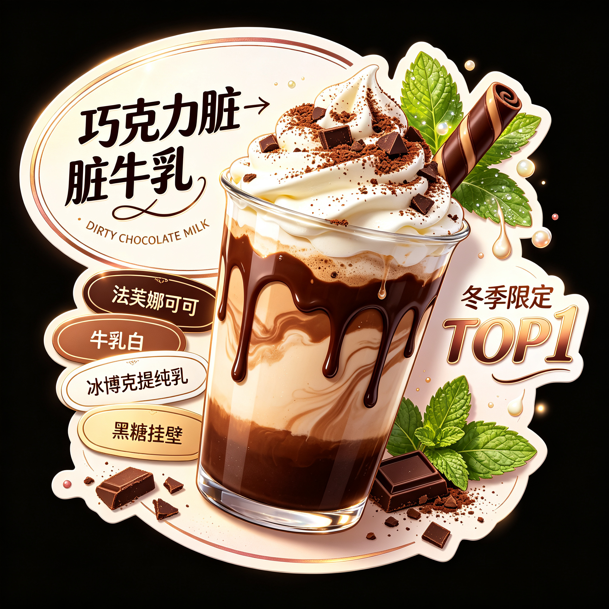
Chocolate dirty milk, premium beverage series shaped card design, overall a horizontal oval long shaped card, blending high-end beverage sticker card, dessert brand label card, anime food collectible card, milk tea shop main visual card style. Card outline round and smooth, left and right ends naturally elongated, edges with slight irregular outward expansion and soft frame-breaking shape, reinforcing the category tone of shaped card, die-cut card, premium sticker card. Overall base color uses a soft gradient of “chocolate brown → brown sugar cocoa brown → milk white”, partially overlaid with warm pearl particles, milk mist sheen, silky liquid texture and slight cocoa powder mist, overall colors warm, premium, rich, healing, combining winter sweet drink atmosphere and delicate collectible card texture. The outer edge of the shaped card uses a rose gold low-relief border effect, not an ordinary flat outline. The border is slender and delicate, with slight relief height, forming fine raised highlights and shallow shadows only under soft light, like a metal hot-stamped relief line lightly embossed on the card edge. The card edge retains slight thickness, lamination texture and warm pearl reflection, presenting the premium feel of a real shaped card, beverage label card, collectible card; the border is not heavy and does not overpower the subject, only enhancing refinement and brand feel. On the left side place the main title text “巧克力脏脏牛乳”, font is original anime dessert beverage title font, mainly black, strokes round and full, obvious thickness variation, glyphs with slight elasticity, creamy feel and silky liquid feel. The last stroke of the character “乳” naturally extends and connects, forming an outward-extending decorative line. The top of the title partially exceeds the oval edge, forming a lively frame-breaking effect, enhancing the shaped card's visual impact. The title outer layer adds cream white fine outline, cocoa gold highlight edge and soft brown sugar brown shadow, making the font more three-dimensional, clearer, and more like a dessert beverage brand logo. Below the title pair with rose gold script English “DIRTY CHOCOLATE MILK”, the English serves as auxiliary decoration, arranged in a slight arc below the title, with fine metallic highlights, elegant and refined but not overpowering the Chinese main title; the overall Chinese-English combination layout is clear, compact, and branded. Below the title stack three small shaped badge signboards, in chocolate brown, milk white, and cocoa gold. The small text inside the signs reads “法芙娜可可”, “冰博克提纯乳”, “黑糖挂壁” respectively; font is rounded clear small sans-serif, text color harmonizes with the sign body tone. Each sign edge adds an extremely fine rose gold hot-stamp line and slight embossed texture; the signs have front-back stacking layers, as delicate and cute as premium beverage sticker badges, reinforcing the shaped card's collectible feel and hierarchy. In the center of the image place an oversized semi-realistic anime-textured chocolate dirty milk, as the absolute visual subject, occupying the largest central area. The glass is slightly tilted, the cup body transparent and clean, edges with clear highlights, cup walls covered with brown sugar and chocolate sauce flowing patterns, presenting a naturally dripping, thick and silky dirty wall-clinging effect. The liquid inside the cup is a clearly layered chocolate milk gradient, from bottom deep chocolate brown transitioning to middle cocoa milk brown, then to upper light milk coffee color, rich layers, silky and delicate, premium texture. On top pile a tall whipped cream snow cap, cream full and fluffy, dense and smooth, with light airy feel and soft peaked shape. The snow cap surface is sprinkled with fine cocoa powder and chocolate shards, partially dotted with a small amount of brown sugar powder and cocoa crisps, reinforcing the “dirty” sweet drink atmosphere. The topmost tip of the cream snow cap extends beyond the oval edge outward, forming an obvious frame-breaking effect, enhancing the shaped card's visual tension. The cream's soft texture, the chocolate sauce's flow, and the glass's reflective layers must all be clearly visible; light and shadow are transparent and three-dimensional, and the beverage subject stands out at first glance. Behind the drink cup embellish with a sprig of mint leaves, a curled chocolate bar and a small amount of cocoa crumbs. Mint leaves are clear emerald green, edges naturally curled, surface with tiny cream beads and soft highlights; leaf tips gently drop a small amount of cocoa powder, detailed yet not messy. The curled chocolate bar has silky cocoa luster and fine curled edge texture, extending diagonally from behind the cup, enhancing dessert decoration feel. All ingredients serve as auxiliary background elements, colors slightly lower than the main drink, not overpowering the cup body. On the right side set secondary copy “冬季限定TOP1”, font is rounded anime promotional type, color uses cream white to cocoa gold gradient, outer layer paired with rose gold fine outline and soft warm brown shadow. The text wraps along the cup body, cream snow cap and mint leaf outer contour curves, fitting the shaped card edge, forming a flowing layout. The copy is flanked by three-dimensional mint branches/leaves, chocolate crumbs, small cream drops and soft highlight dot decorations, enhancing spatial layers and sweet drink atmosphere, but not blocking the main drink. The overall display background of the card is pure black, used to highlight the shaped card outline, cream snow cap and chocolate milk subject. Soft fill light makes the dirty milk cup body, cream snow cap, mint leaves, title text, badge signs and low-relief border emerge with fine premium highlight contours. The overall image has clear layers, distinct primary and secondary; the central drink is largest, brightest, most three-dimensional, the absolute visual center; the left title is eye-catching, the right secondary copy balances. Overall style is high-end beverage shaped card, anime semi-realistic dessert illustration, Japanese food toy sticker style, premium beverage brand visual, collectible card design. Color palette mainly chocolate brown, brown sugar brown, milk white, cocoa gold, mint green, rose gold; overall rich, smooth, healing, premium, refined, shaped outline highly recognizable, suitable as beverage brand shaped card, packaging sticker, menu key visual and dessert IP card design.
Content: Structure: oval die-cut shaped card, chocolate dirty milk subject, title, badges, side copy; pure black display; frame-breaking composition; anime semi-realistic food-toy sticker, collectible brand style; soft lighting, chocolate brown/milk white/cocoa gold/mint palette, glass, cream, chocolate, rose-gold relief materials.
Pros: Clear hierarchy and focal subject; complete style/material/color guidance.
Cons: Dense detail may dilute focus; long bilingual text can split model attention.
Reference image: No obvious reference-image dependency
Curated from publicly available creative examples. Prompts and commentary are edited and organized by this site. Please contact us with any rights concerns. Copyright & Privacy