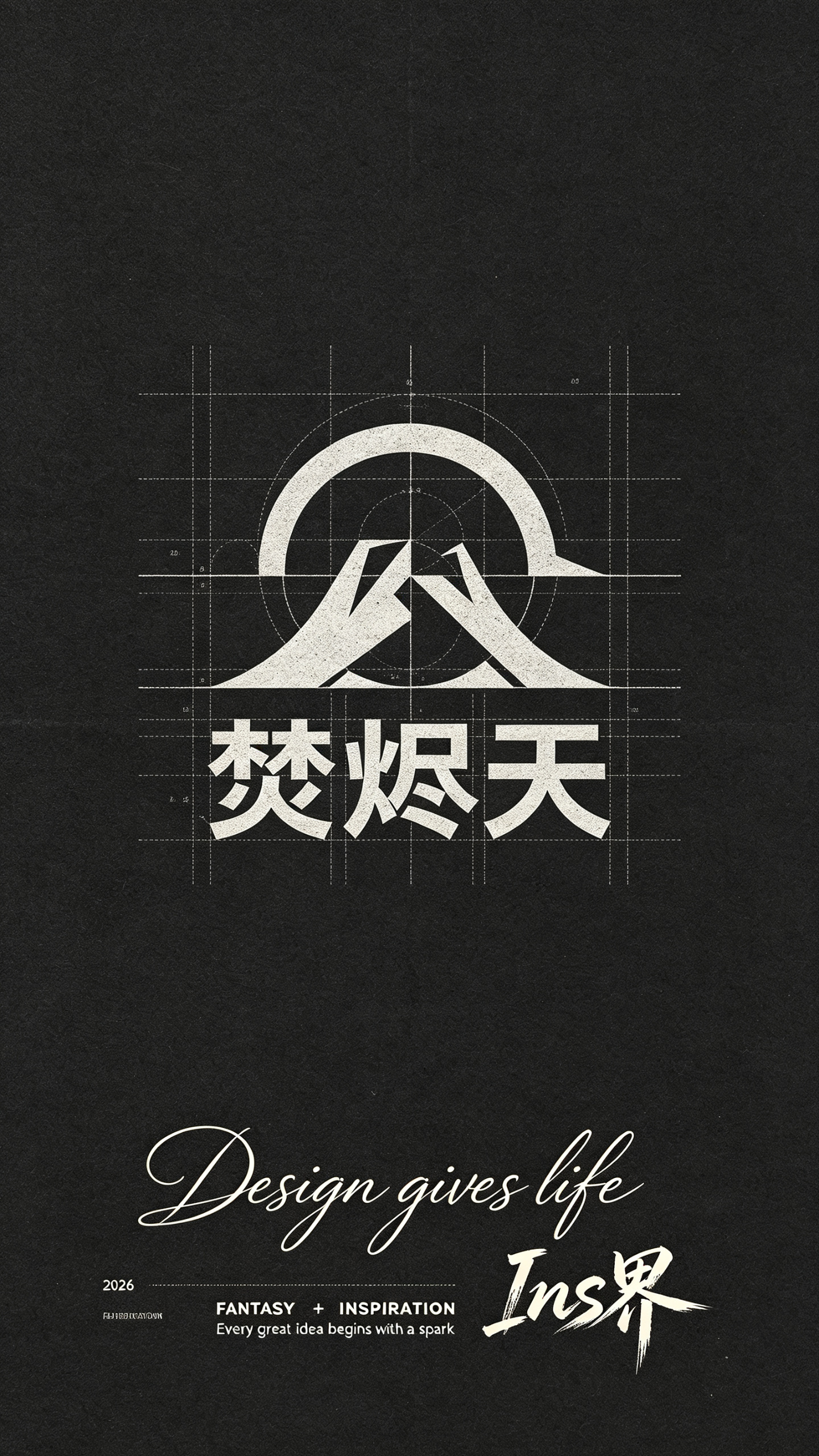
Bauhaus Fenjintian Volcano Logo Design AI Image Prompt
Bauhaus design-style artwork on Kent paper, with a LOGO design using the “焚烬天” volcano as the design element (centered; the logo consists of upper and lower elements, graphic above and text below, balanced graphic-to-text proportion; the composition is marked by minimalist aesthetics, dark plane, retro black-white-gray color palette; the center of the image is composed of arcs, straight lines, and sharp cut-corner structures; geometry, circles, and lines interwoven; modular path splicing and circular intersecting structures; delicate and clear fine lines and abstract geometry; clear structure and analytical design diagram; technical illustration perfectly blending elegant art and scientific precision; screen-printed stippling effect highlighting minimalist texture; perfect composition; editorial digital art). Lower middle of the image: flowing hand-drawn brush lettering: “Design gives life” (thin strokes, pulled/threaded strokes, agile curves, textured), extremely small decorative text, extremely thin sans-serif small font “2026”, extremely thin sans-serif font “FANTASY” + “INSPIRATION” + “Ins界” + “Every great idea begins with a spark”, among which the sharp, dynamic hand-drawn graffiti font “Ins界” highlights the visual focus; all text colors harmonize with the background, texture, grain, artistic abstraction, poetic, premium, masterpiece, highly visually striking, award-winning work, master-level color palette, master-level typography, high detail, high-end feel, ultra HD, coordinated layout.
Content: Structure: Bauhaus logo design with centered volcano, graphic above and text below; Kent paper; dark minimalist black-white-gray style; arcs, straight lines, cut corners, modular geometry; screen-print stippling and fine lines; layered brush, tiny sans-serif and graffiti typography in lower middle; high-detail/ultra-HD quality tags.
Pros: Clear division of subject, scene, style, composition, typography, and print finish. Specific multi-font hierarchy and visual focus.
Cons: Too many text and style elements may weaken logo recognition. Abstract repeated style words may reduce output stability.
Reference image: No obvious reference-image dependency
Curated from publicly available creative examples. Prompts and commentary are edited and organized by this site. Please contact us with any rights concerns. Copyright & Privacy