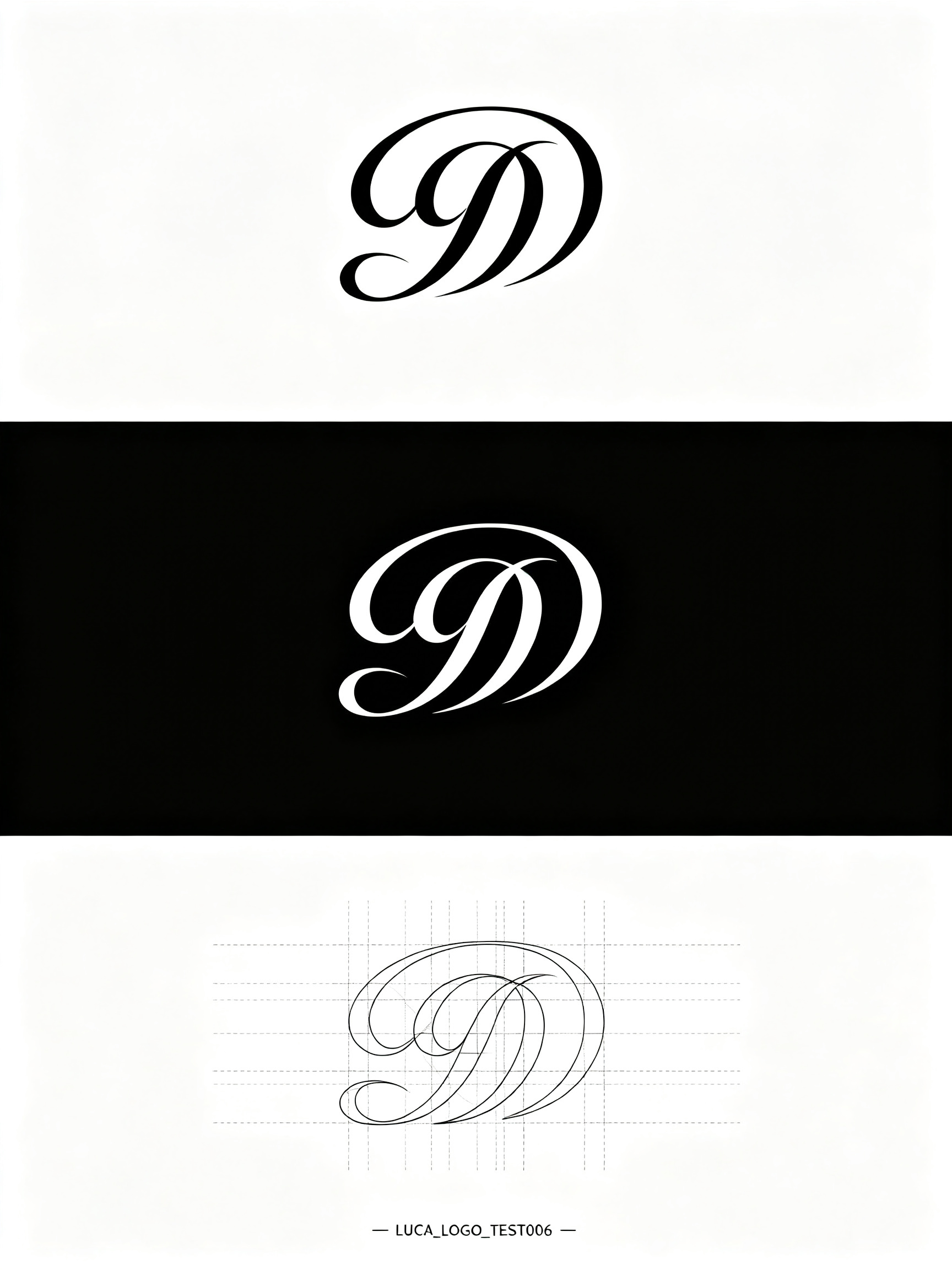
LUCA Logo Design: 3 Versions AI Image Prompt
Self-media brand "LUCA", needs to combine media brand's (with "minimal simple element graphics" as the core, prioritizing adaptability for small sizes and dynamic scenes, corresponding to "all-media touchpoint adaptation principle" and "differentiation principle"), LOGO design needs to fit brand temperament (fonts flowing and agile), while providing 3 core versions (including positive, reverse, annotated), the three versions are displayed in the figure from top to middle to bottom. The top is positive LOGO design without any marks, the middle is reverse LOGO design (white text on black background) without any marks, the bottom is annotated LOGO. The picture consists of arcs, straight lines, sharp cut-angle structures, geometry, circles, lines interweave, using modular path splicing and circular intersecting structures, delicate and clear fine lines and abstract geometry, clear structure and analytical design spectrum, elegant art and scientific precision perfectly fused technical illustration, perfect composition, editorial digital art. At the bottom of the picture there is very small text "一LUCA_LOGO_TEST006一".
Content: Subject: LUCA brand logo with three versions (positive/reverse/annotated) vertically arranged; minimal geometric style with intertwined lines, technical illustration; black-white palette, modular paths; no specific lens or ratio.
Pros: Clear structure with direct comparison; refined geometry and lines.
Cons: Many elements may reduce small-size recognition; dynamic adaptation not specified.
Reference image: No obvious reference-image dependency
Source materials are collected from publicly accessible web pages. Contact us if a rights issue needs review. Copyright & Privacy