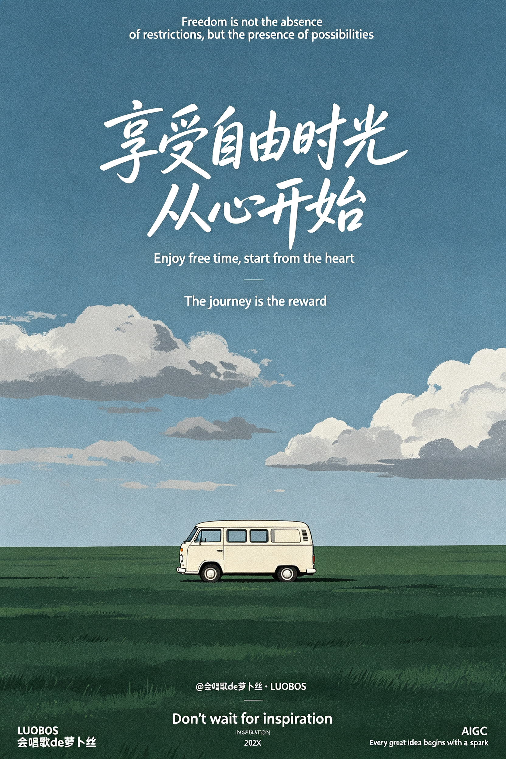
Ryo Takemasa Silk-Screen Retro Van Grassland Illustration AI Image Prompt
Ryo Takemasa cartoon-style illustration, silk-screen print style, grainy texture, eye-level view. The upper half is a gray-blue sky with a few gray-white cumulus clouds; the lower half is a deep green grassland wilderness, with the sky and wilderness divided 4:6. On the grassland horizon sits a cream-white retro van (no outline), positioned in the exact center of the frame, with no lines needed. Pure flat illustration, flat fill, ultra-high definition, dopamine color palette. At the upper center of the image, add bold large text “享受自由时光 从心开始” (handwritten style), with staggered typography, paired below with a thin English translation; at the top and bottom of the image, accent with minimal English literary sentences, and at the bottom add super small text crediting @会唱歌de萝卜丝·LUOBOS. Generous negative space composition, ins cold minimalist style, Japanese film soft texture, vast empty lonely healing atmosphere, clean low-saturation blue. Minimal text layout, 8K HD, soft natural light, cinematic shot, Octane render, 64K HD quality. Small text below: “Don’t wait for inspiration” as a tiny decorative small text, ultra-thin sans-serif small font “202X”, white ultra-thin sans-serif font watermark “ LUOBOS ”+“会唱歌de萝卜丝”+“ INSPIRATION ”+“ AIGC ”+“Every great idea begins with a spark”. Texture, graininess, artistic abstract, poetic, high-end, masterpiece, highly visually striking, award-winning work, master-level color palette, master-level typography, high detail, premium feel, harmonious layout.
Content: Formula: centered retro van, 4:6 sky/grassland, cartoon silkscreen flat grain, eye-level, negative space, minimal typography, soft light, low-saturation dopamine, cinematic, 8K/64K/Octane.
Pros: Cohesive style and palette; clear composition and typography hierarchy.
Cons: Stacked quality/render terms may conflict; heavy text layout is hard to render accurately.
Reference image: No obvious reference-image dependency
Source materials are collected from publicly accessible web pages. Contact us if a rights issue needs review. Copyright & Privacy