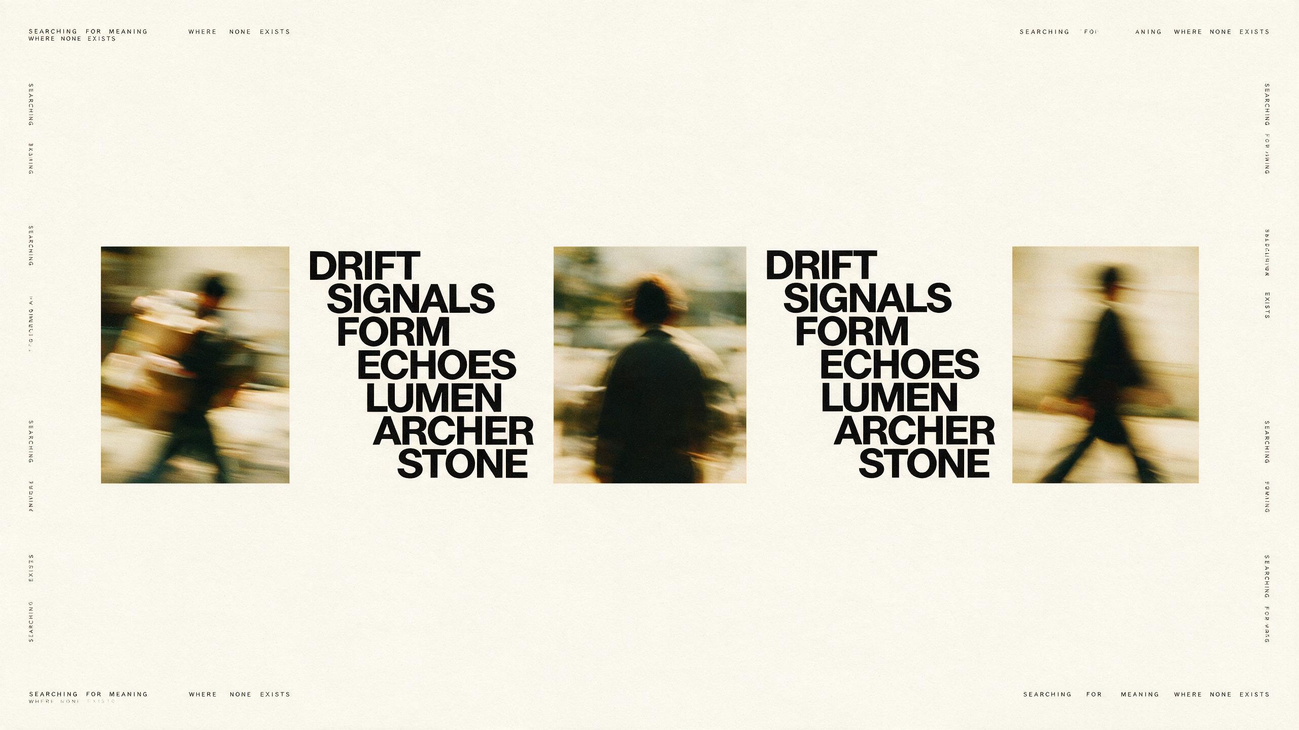
Motion-Blurred Figures with Staircase Typography Poster AI Image Prompt
16:9 landscape minimalist graphic design poster, pure off-white/ivory white paper-texture background. The composition uses a strict vertical central-axis symmetrical layout, arranged horizontally from left to right. Core visual elements: motion-blurred human photographic images alternating with bold black sans-serif uppercase typographic text. Photographic image section: 3 small square/vertical photos arranged evenly along the horizontal direction; the photos capture candid daily actions of people (carrying objects, standing with back to camera, walking), all with strong motion blur, blurred and hazy so only human silhouettes and direction of motion are discernible; color tone is warm film-like — yellowish warm tone, low saturation, grainy. Typography section: between the photos insert vertically arranged bold black uppercase English word groups, each word on its own line, indented progressively to the right forming a staggered staircase layout (staircase indentation), typeface is high-contrast bold black sans-serif (similar to Helvetica Bold / Arial Black), words are: "DRIFT" "SIGNALS" "FORM" "ECHOES" "LUMEN" "ARCHER" "STONE". In the four corners and above/below the photos, repeat an extremely small uppercase sans-serif decorative text phrase "SEARCHING FOR MEANING WHERE NONE EXISTS", as a unified visual rhythm marker, font size extremely small, decorative reading only. Overall style: contemporary conceptual art magazine layout, Swiss International Style graphic design, minimalist negative space, mainly black and white with only photos carrying a slight warm tone, emphasis on grid system and typographic hierarchy, clean and crisp, anti-decoration, experimental editorial layout aesthetics. HD, high detail, coordinated layout, master-level typography.
Content: 16:9 poster formula: off-white paper texture, strict vertical axis, horizontal alternating grid; subject is 3 motion-blurred candid human photos with bold uppercase staircase typography; daily scene; Swiss minimalist/conceptual magazine style; warm low-saturation black-and-white base; film grain and paper feel; font hierarchy and small decorative rhythm.
Pros: Clear structure and controllable layout, type, color, and ratio; cohesive style suited to editorial poster.
Cons: Fixed words and dense elements demand high text-layout and composition accuracy; less flexible.
Reference image: No obvious reference-image dependency.
Curated from publicly available creative examples. Prompts and commentary are edited and organized by this site. Please contact us with any rights concerns. Copyright & Privacy