Foshan New Chinese Illustration Poster AI Image Prompt
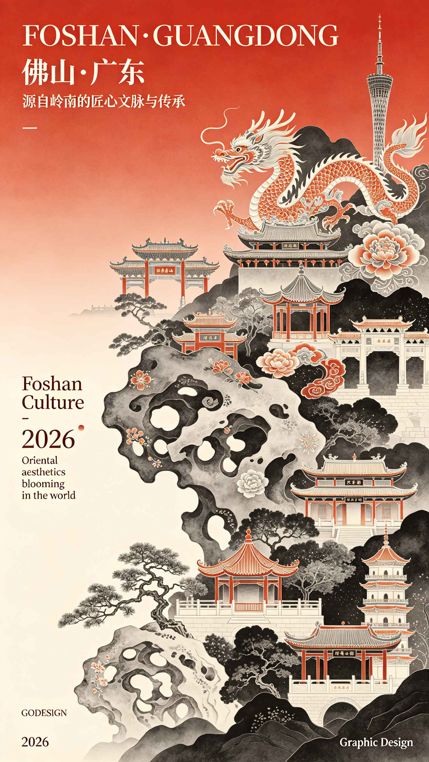
Graphic illustration, poster design, high-end typography, New Chinese aesthetics, contemporary Chinese art style, New Chinese Song Dynasty theme, Guofeng aesthetics, high-saturation red, black, white or other gradient color background, surreal, incorporating (Foshan) elements, set off by exquisite Taihu stones and overlaid with local distinctive culture, highlighting a New Year atmosphere, gradient and textured matte treatment, soft forms, main subject depiction. (Foshan Ancestral Temple, Xiqiao Mountain, Nanfeng Ancient Kiln, Qinghui Garden, Lingnan Tiandi, Renshou Temple, Shiwan Gongzai Street, Foshan TV Tower, Shunfeng Mountain Park; grand and elegant Lingnan Chinese architectural silhouettes), accompanied by Chinese patterns such as dragon and phoenix motifs with both opaque and semi-transparent textures, fine brushstrokes of Gongbi painting, rich layers, diffuse gradient effect, full of details; place the title (“FOSHAN・GUANGDONG”) in the upper left, enlarged in a thin serif typeface; below the title place (“佛山・广东”), and below that (“源自岭南的匠心文脉与传承”); in the lower left of the entire composition place the date (“Foshan Culture”) and “2026”; the date part has small decorative text “Oriental aesthetics blooming in the world”; both the date and decorative text use a serif typeface; at the bottom left corner, extremely small serif “GODESIGN” arranged horizontally; at the bottom left side, extremely small serif “2026” arranged horizontally; at the bottom right corner, extremely small serif “Graphic Design” arranged horizontally.
Content: Structure: Guofeng illustration poster; subject: Foshan/Lingnan architectural silhouettes plus Taihu stones, dragon-phoenix motifs, New Year mood; style: New Chinese Song, Gongbi, surreal; color: high-saturation red/black/white or gradients, matte texture, soft forms, diffuse light; layout: title upper-left, date lower-left, tiny corner typography.
Pros: Clear elements, style, and typographic hierarchy; executable. Specific title/date placement aids layout replication.
Cons: Too many elements and text may crowd or garble text. Color description is broad, risking style drift.
Reference image: No obvious reference-image dependency
Curated from publicly available creative examples. Prompts and commentary are edited and organized by this site. Please contact us with any rights concerns. Copyright & Privacy