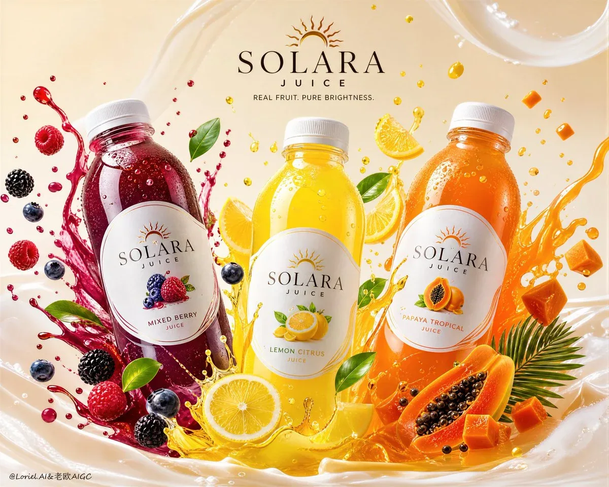
SOLARA JUICE Premium Juice Beverage Campaign Poster AI Image Prompt
Create an ultra-premium juice beverage campaign poster for the self-created brand 'SOLARA JUICE'. It must preserve the exact commercial logic of a three-product premium beverage advertisement: three realistic bottled fruit drinks in one hero composition, each bottle representing a different flavor, surrounded by corresponding fruit slices, fruit particles, juice splashes, and clean liquid motion, arranged in a highly art-directed promotional layout with elegant English branding and minimal supporting copy. The image should feel like a flagship global juice campaign: fresh, vibrant, premium, hyper-real, and product-dominant. Creative direction: Combine Milk Cloud Orbit and Cream Halo Transit. Keep the exact three-bottle campaign skeleton, intensify luxurious product details, and reduce non-product distractions. Push cleaner bottle reflections, richer liquid translucency, brighter fruit-edge highlights, and sharper premium splash realism. Reduce visible text and icon clutter so the bottles, fruit, and liquid relationships dominate more completely. Core composition: Use a wide hero composition with three beverage bottles across the center area as the main visual anchors, forming a balanced rhythm: left, center, right, each slightly angled or staged with premium product-photography precision. Around each bottle, create a highly controlled halo of related fruit slices, juice arcs, droplets, fruit cubes, seeds, leaves, and splash motion tied to that flavor. The three product worlds should overlap slightly, but each flavor identity must remain clear. Brand direction: Create a self-invented premium juice brand, SOLARA JUICE. Brand language: modern, international, clean, healthy, premium, vibrant. Use elegant English-only brand typography, a refined logo area, and one short premium campaign line only. Typography must feel minimal, polished, and beautifully integrated. Flavor system: Create three distinct bottled fruit drinks: 1) Mixed Berry Juice, 2) Lemon Citrus Juice, 3) Papaya Tropical Juice. Each bottle has its own liquid color, fruit identity, and surrounding composition system. Packaging is unified across the trio: shared bottle design and clean brand identity, with different label colors and ingredient illustration accents per flavor. Product realism: Render the bottles with extreme realism: premium transparent or semi-transparent plastic bottle material, crisp label printing, subtle condensation or surface reflections, realistic cap texture, believable liquid fill level, and elegant bottle proportions. Labels must feel branded, refined, and globally market-ready. Milk Cloud Orbit product-light logic: Purify the most convincing product zones: bottle shoulder reflections, liquid translucency, fruit-particle edge highlights, and the clean luminous transition where juice, bottle plastic, and light meet. Bottles must feel more polished, liquid richer and brighter from within, and fruit more jewel-like, without becoming artificial. Cream Halo Transit hierarchy logic: Keep the same three-bottle structure, reduce visible text and icon assistance. Let the fruit, liquid, and packaging speak more strongly. Any remaining support information must feel more selective, more premium, and more architecturally integrated. Flavor-specific surrounding logic: Mixed Berry Juice: surround with raspberries, blackberries, blueberries, berry droplets, berry juice splash arcs, and fresh leaves. Lemon Citrus Juice: surround with lemon slices, lemon wedges, citrus droplets, yellow juice ribbons, tiny zest particles, and fresh green leaves. Papaya Tropical Juice: surround with papaya halves, papaya cubes, black papaya seeds, orange juice splash arcs, and tropical leaf accents. Fruit and liquid elements must feel physically tied to their bottle. Fluid and fruit-particle logic: Juice splashes must feel elegant, clean, and physically believable, not chaotic. Fruit slices and fruit particles should orbit or burst around the bottles with dynamic realism, but always remain controlled and premium. Show thin juice arcs, suspended droplets, fruit cubes, seeds, and slice fragments with excellent motion logic. No messy explosion. No cheap over-effecting. Background: Use a minimal saturated clean background with no glow-heavy effects. The backdrop must remain smooth, spacious, and premium, allowing the product, fruit slices, and liquid motion to dominate. Use subtle tone variation or controlled gradient depth only if needed, but avoid flashy lighting gimmicks. Lighting: Use extremely delicate high-end commercial beverage lighting. Let the bottles, juice, fruit flesh, droplets, and liquid splashes glow with premium highlight control, beautiful translucency, and elegant dimensional separation. Lighting must feel fresh, refined, and world-class, never over-glossy. Typography layout: Use elegant English-only branding and one short promotional copy line such as: SOLARA JUICE / REAL FRUIT. PURE BRIGHTNESS. Keep typography highly restrained and secondary to the product trio. Remove unnecessary icon clutter and over-explaining. Color system: Use a vibrant but controlled fruit palette: deep berry crimson-purple, bright lemon yellow, sunlit papaya orange, supported by clean green leaves and a neutral premium backdrop. The three flavors must feel different but harmonized inside one premium campaign world. Mood: fresh, premium, vibrant, healthy, juicy, clean, modern, hyper-real, appetizing, global-brand, product-dominant. Rendering style: ultra-realistic premium juice beverage campaign poster, three bottled fruit drinks, minimal elegant English branding, stronger bottle reflections and juice translucency, reduced text and icon clutter, realistic fruit slices and fruit-particle composition, clean juice splash motion, minimal saturated background, refined commercial lighting, world-class image quality, 8k. Negative prompt: cheap juice ad, cluttered layout, neon glow effects, fake fruit texture, cloudy bottle plastic, muddy liquid, chaotic splash explosion, too much text, too many icons, supermarket flyer style, cartoon rendering, low resolution, weak product focus.
Content: A complete commercial ad structure: three bottles as hero, wide horizontal composition, each with flavor-specific fruit halo; includes branding, color system, lighting, materials, fluid dynamics, and negative prompt—a highly detailed product-dominant poster formula.
Pros: Comprehensive with brand, flavor, lighting, materials, negative prompt; clear commercial logic and detail control.
Cons: Overly long and restrictive, may limit creative freedom; abstract terms (e.g., Milk Cloud Orbit) require interpretation.
Reference image: No obvious reference-image dependency
Source materials are collected from publicly accessible web pages. Contact us if a rights issue needs review. Copyright & Privacy