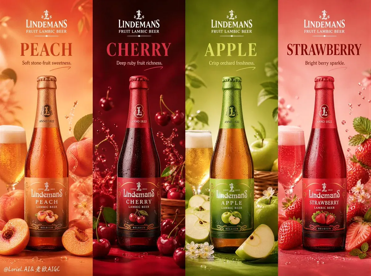
Lindemans Fruit Lambic Beer 4-Panel Promotional Poster AI Image Prompt
Create an ultra-premium horizontal 4-panel promotional poster for Lindemans Fruit Lambic Beer, merging extreme bottle realism with stronger flavor-emotion differentiation while preserving strict premium display order. Fully preserve the premium flavor-series campaign structure: four vertical flavor panels side by side in one wide landscape composition, each presenting one real Lindemans bottle as a polished hero product advertisement while remaining part of one unified brand series. The artwork should feel like a world-class fruit beer campaign: hyper-realistic, elegant, colorful, clean, appetizing, editorial, and visually striking, with strong product focus, refined English typography, subtle handwritten accents, official brand presence, and perfectly controlled composition. Core structure: wide horizontal layout divided into four equal vertical flavor panels. Each panel functions as a premium fruit beer promo card, yet all four read as one coherent Lindemans Fruit Lambic Beer series. Composition balanced, bold, collectible, immediately readable. Product system: four real Lindemans Fruit Lambic Beer flavors: Peach, Cherry, Apple, Strawberry. Each panel includes one real Lindemans bottle as clear hero element, one matching fruit accent or fruit-beer interaction, one strong flavor title block, one short supporting line, subtle official brand presence, and minimal elegant accent graphics if useful. Bottle consistency: all four bottles must appear in exactly the same size, placement logic, and framing structure across panels. Every bottle fully visible, never cropped by image edge, never cut off, never floating at inconsistent positions. Aligned as one luxury display system across the full horizontal 4-panel layout. This consistency is critical. Composition within each panel: bottle in consistent central or slightly lower-central anchor position. Fruit accents secondary, elegantly arranged around the bottle without overpowering it. Fruit/beer relationship immediately clear: peach with peach Lambic, cherry with cherry Lambic, apple with apple Lambic, strawberry with strawberry Lambic. Clean, premium, highly controlled. Flavor identities: 1. Peach: warm peach-gold palette, soft blush fruit flesh, juicy ripe peach slices, gentle sweetness, elegant golden beer glow. 2. Cherry: deep ruby-red palette, glossy cherries, richer crimson depth, darker fruit intensity, luxurious boldness. 3. Apple: fresh green-gold palette, crisp sliced apples, orchard brightness, lighter refreshing energy, clean clarity. 4. Strawberry: soft berry-red or pink-red palette, fresh strawberries, bright lively sweetness, youthful sparkle, airy fruit softness. Each flavor feels like its own emotional world: peach soft and mellow, cherry deep and dramatic, apple crisp and refreshing, strawberry bright and playful. Emotional contrast visually immediate, series still unified. Background color system: four different saturated premium backgrounds matched decisively to flavor: Peach warm peach-beige or golden apricot; Cherry rich ruby, crimson, or deep cherry pink; Apple fresh green-gold or pale orchard green; Strawberry soft berry pink, blush red, or strawberry cream tone. Bold, clean, luxurious, never cheap or noisy; each panel distinct yet harmonious in full horizontal system. Typography and branding: elegant English-only typography, as an international original brand product. Include LINDEMANS, FRUIT LAMBIC BEER. Then flavor title in large premium text: PEACH, CHERRY, APPLE, STRAWBERRY. Add one short supporting line per panel: Soft stone-fruit sweetness. / Deep ruby fruit richness. / Crisp orchard freshness. / Bright berry sparkle. Typography bold, clean, modern, premium. Subtle official-style brand mark placement. No Chinese text. No crude fonts. Handwritten accent logic: minimal handwritten-style accents if needed: a soft underline, a small flourish, a subtle arrow, or a tiny circular gesture near flavor title or fruit accent. Playful but refined, never messy. Beer realism: push to absolute highest level. Glass bottles crisp, elegant, premium with believable reflections, label detail, condensation control, realistic glass thickness. Beer inside beautiful fruit-tinted transparency, subtle liquid depth, premium sparkling character. Fruit surfaces fresh, juicy, tactile. Restrained droplets, splash hints, light condensation, micro highlights where appropriate. Pristine, luxurious, highly drinkable. Push bottle-glass realism so each flavor feels like a premium collectible object. Lighting: extremely delicate, soft, high-end studio lighting. Each bottle catches beautiful highlights along glass, label, cap, liquid body. Fruit surfaces glow with freshness and realism. Shadows soft, short, controlled. Lighting makes full series feel cold, refined, premium, collectible. Visual mood: full horizontal 4-panel poster communicates premium flavor individuality, elegant beverage craftsmanship, product confidence, boutique promotional sophistication. Polished international fruit-beer launch campaign or premium social-media promotional series with strong visual consistency and refined hierarchy. Emotional differentiation stronger and more memorable. Rendering style: ultra-premium photorealistic beverage advertising poster, Lindemans Fruit Lambic Beer, horizontal 4-panel luxury product series, Peach Cherry Apple Strawberry flavor variants with stronger emotional differentiation, identical bottle size and placement across all panels, full bottles completely visible, elegant English typography, saturated flavor-matched backgrounds, minimal handwritten accents, soft cinematic studio lighting, hyper-detailed glass and liquid realism, world-class beer campaign aesthetics, 8k, masterpiece quality. Negative prompt: cropped bottles, inconsistent bottle sizes, off-center bottle placement, cheap supermarket ad, cluttered composition, cartoon fruit, fake glass texture, unreadable typography, noisy background, oversaturated chaos, flat lighting, low-resolution textures, plastic-looking bottle.
Content: Four-panel horizontal poster, each vertical panel for one flavor with bottle hero, fruit, title, and tagline. Emphasizes identical bottle framing, emotional contrast, saturated backgrounds, English typography, minimal handwritten accents, photorealistic glass/lighting, premium campaign feel.
Pros: Clear structure; strong emphasis on consistency.
Cons: Overly detailed, may constrain creativity; emotional differentiation vaguely defined.
Reference image: No obvious reference-image dependency
Source materials are collected from publicly accessible web pages. Contact us if a rights issue needs review. Copyright & Privacy