Four-Image Brand Visual Identity Proposal AI Image Prompt
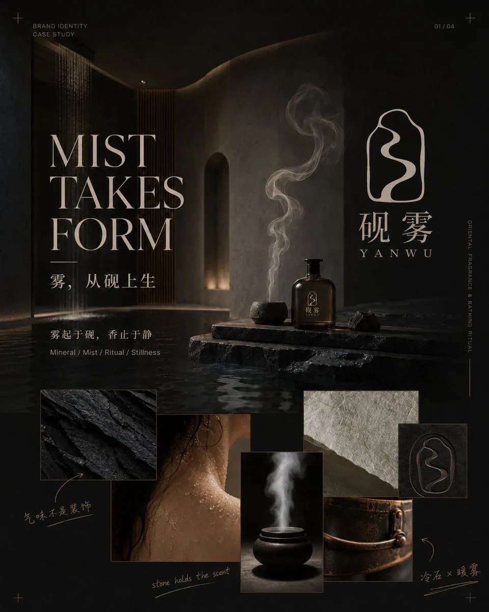
You are a senior brand designer, logo designer, visual art director, and editorial layout designer. Based on the following brand information, directly generate a four-image brand visual identity proposal. 【Brand Information】 Chinese Brand Name: [Chinese Brand Name] English Brand Name: [English Brand Name] Brand Industry: [Brand Industry] Main Products or Services: [Main Products or Services] Brand Positioning and Target Audience: [Brand Positioning and Target Audience] Brand Core Concept: [Brand Core Concept] Brand Personality Keywords: [Brand Personality Keywords] Brand Slogan: [Brand Slogan] Logo Inspiration Source: [Logo Inspiration Source] Logo Type: [Logo Type] Meaning to Express with Logo: [Meaning to Express with Logo] Elements Not Wanted: [Elements Not Wanted] Overall Visual Style: [Overall Visual Style] Main Color Palette: [Main Color Palette] Secondary and Accent Colors: [Secondary and Accent Colors] Main Materials: [Main Materials] Photography or Space Atmosphere: [Photography or Space Atmosphere] Main Products, Packaging, and Application Scenarios: [Main Products, Packaging, and Application Scenarios] Aspect Ratio: [Default 4:5 vertical] Text Language: [Chinese primarily / English primarily / Chinese-English combination] Extra Requirements: [Extra Requirements] 【Design Task】 First, uniformly design and lock the brand system, including: an original, clear, and independently usable logo mark; Chinese and English brand wordmarks; primary, secondary, and accent colors; typography, materials, and photographic language; supporting graphics and patterns extended from the logo; product, packaging, collateral, and spatial application methods. The logo cannot be purely typographic. It must include an independent Symbol with a strong design sense, related to the brand concept, with clear silhouette, negative space, or geometric structure, recognizable at small sizes, and suitable for embossing, foil stamping, embroidery, engraving, and environmental signage. Avoid directly using common industry icons such as incense burners, tea leaves, female profiles, houses, ordinary leaves, lotus flowers, auspicious clouds, tai chi, or traditional seals. They must be abstracted, simplified, and recomposed into an original brand symbol. Once the logo is finalized, the core silhouette, internal structure, wordmark, and combination must remain consistent across all four images; do not redesign for each image. 【Four Image Contents】 Image 1 | Brand Worldview and Concept Cover: Use a large brand key visual to establish brand mood and worldview, while clearly displaying the complete logo, Chinese name, English name, concept headline, brand manifesto, 3–5 mood or material images, and a few handwritten concept notes. Adopt a structure of “large headline + large key visual + complete logo + irregular mood collage.” The logo must be clearly visible but not overpower the headline and brand atmosphere. Image 2 | Logo Concept and Symbol Generation Logic: Use an oversized logo symbol as the visual center, showing the complete logo, Chinese and English wordmarks, horizontal and vertical compositions, simplified versions, concept source sketches, and negative space and structural relationships. Add a few hand-drawn outlines, arrows, callouts, and designer handwritten notes to help viewers understand why the logo was designed this way. The page should have a research feel but must not become a complex engineering drawing or traditional VI table. Image 3 | Brand Visual Language and Design System: Show brand primary colors, secondary colors, typography, materials, photographic language, logo crops, and supporting patterns. Colors need to be connected to real materials such as stone, paper, metal, glass, plants, or fabric. Supporting graphics must be extracted from the logo outline, internal curves, negative space, or strokes; do not add unrelated decorations. The layout combines a regular grid with free collage, incorporating large typography, vertical text, thin lines, and a few handwritten marks. Image 4 | Brand Application and Experience Scenarios: Show how the brand enters real products, packaging, paper goods, textiles, and spaces. Choose 5–7 reasonable touchpoints based on the industry, such as hero product, gift box, shopping bag, card, label, uniform, towel, metal sign, storefront, reception desk, or wayfinding. Use a structure of “one large product or spatial key visual + 4–6 application details.” The complete logo, standalone Symbol, and supporting patterns should be used in layers; do not repeat the full brand name on every product. 【Overall Visual Requirements】 The entire set adopts a design language combining high-end brand proposals, editorial magazine design, art direction boards, and modern visual identity cases. Each image must have: a striking large headline; a short subtitle; a key statement; 2–4 keywords or information tags; 2–4 meaningful handwritten notes; a clear visual center; and about 25%–35% white space. The headline must participate in the composition—it can be enlarged, cropped, offset, arranged vertically, or interwoven with imagery and the logo; it cannot be just a plain header. Handwritten marks can use short phrases, arrows, callouts, underlines, or simple sketches to explain the logo, typography, color, materials, and craft. Handwritten content must be brief, clear, and meaningful; avoid meaningless gibberish or doodle-filled canvases. All four images share a consistent brand name, logo, typography, color palette, materials, photographic atmosphere, margins, and guides, but the layouts must not be identical: Image 1 is a large key visual with mood collage, Image 2 is an oversized logo and structural study, Image 3 is a color/typography/material system, and Image 4 is product/space application. Avoid plain PowerPoint, simple moodboards, traditional VI tables, stock mockup collections, neat repeating grids, long body text, overcrowded information, low-quality 3D materials, cheap gold, color shifts, and logo structure changes. All four images are 4:5 vertical, output independently, and must not be merged into one composite image.
Content: Formula: brand-info placeholders → unified logo/type/color/material system → 4 images: 1) concept cover (big headline+key visual+logo+mood collage), 2) logo logic (oversized symbol+sketches/notes), 3) design system (color/type/material+patterns), 4) applications (product/space+details). Overall: premium proposal+editorial style, 4:5 vertical, headline in composition, handwritten notes, 25-35% whitespace, consistent system but varied layouts. No specific lighting/camera specified.
Pros: 1. Clear constraints avoid common AI pitfalls (PPT, VI tables, cheap materials) and ensure consistency via shared brand system. 2. Complete structure with per-image content/composition specs acts as a ready storyboard.
Cons: 1. Many brand-info placeholders require manual completion; incomplete info may yield unstable output. 2. No explicit lighting/camera specs, so mood consistency depends on the photography-atmosphere field, leaving variability.
Reference image: No obvious reference-image dependency
Source materials are collected from publicly accessible web pages. Contact us if a rights issue needs review. Copyright & Privacy