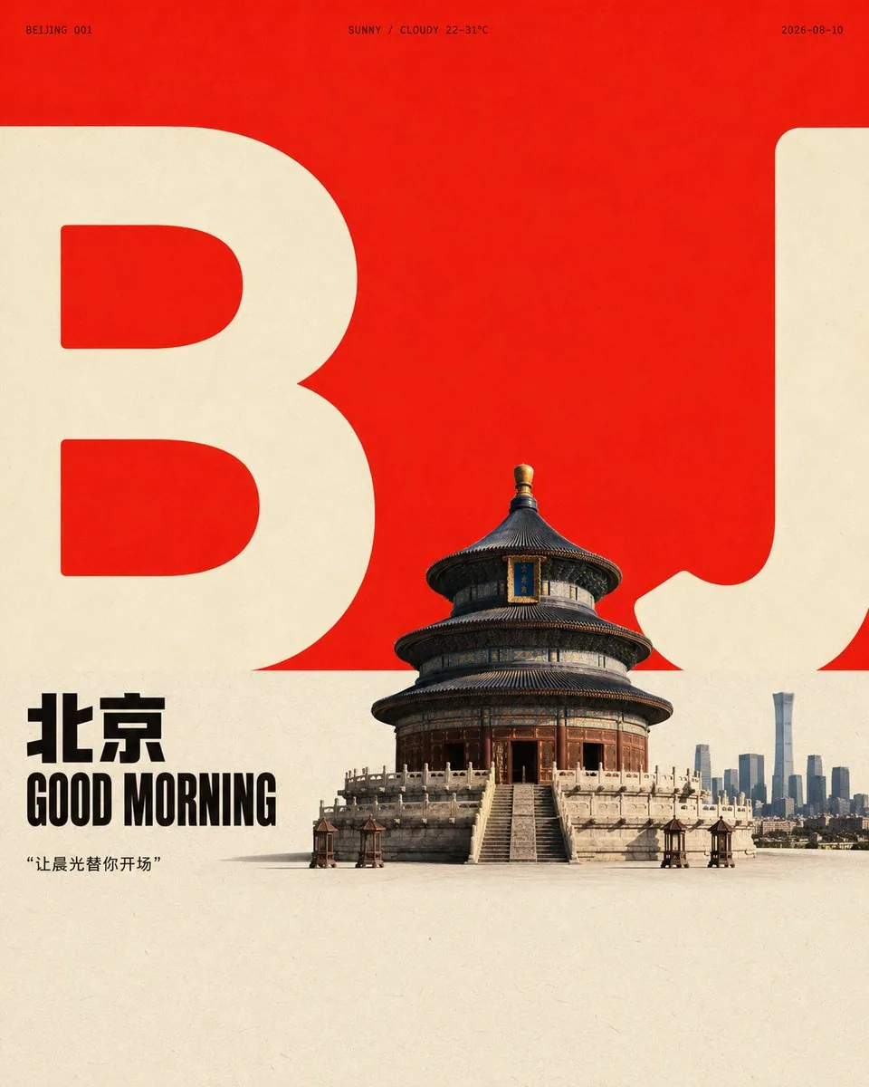
Flat Poster Order with Real Focus AI Image Prompt
Create a design around any subject that combines flat-poster order with a realistic focal image: first establish a large, open area of negative space with a broad, vivid, high-brightness color field occupying the upper portion, then connect a nearly equal, low-saturation, light paper-surface area below, creating a clean, explicit horizontal boundary between color fields. Let the core form of the subject be translated into two groups of oversized, low-detail, heavy and rounded, light-colored typographic shapes that straddle the boundary and bleed to the left and right edges, retaining clear internal cavities, thick-thin contrast, and cut-off incisions at the frame edges—the shapes are not decoration but serve as scale markers and visual skeleton in the background. Compress the main subject or core object into a small-to-medium-scale figurative focal point, place it near the boundary, and let it partially occlude the giant shapes, creating a clear front-back interweaving among the foreground object, the shape outlines, and the negative space. Render the focal object with natural-photography or highly figurative texture, preserving real surface details, soft side-top lighting, short loose shadows grounded on the surface, and neutral dark tones that do not compete for attention. Place a two-line short title related to the subject on the left side near the boundary, using bold, tight, geometric sans-serif uppercase letterforms, with tight leading, neatly left-aligned text block, forming a small strong anchor in black or the subject's darkest structural color. Add extremely small, widely letter-spaced metadata and numbered short labels on both sides of the upper edge of the giant shapes, creating a sparse editorial-design rhythm, but the text only carries order, scale, and informational cues—it does not replicate fixed copy. Let the subject's semantics determine the hue and material origin of the color, but maintain the high-brightness, high-purity main color field against the soft light background in terms of area, lightness, saturation, and emotional tension; the giant shapes use lighter colors that are more striking or more neutral than the light background, while dark text and focal shadows occupy only a small proportion. When the subject's color temperature changes, still maintain large-block contrast, clean boundaries, and limited accent colors—do not spread color evenly across the whole image. Overall, it should look like clean flat printing on matte paper, with subtle uniform fibers and grain; the light background and color field have slight density unevenness; the edges of the photographed object and the printed graphics are clear but not overly sharp; the color-block seams remain crisp. Avoid heavy distressing, yellowing, dirt, extra ornamentation, and modern gradients. Let the background white space, giant shapes, short title, micro labels, focal object, and grounded shadow together form a reading path that goes from large color field to text to subject—if the graphic occlusion, color-field boundary, or scale contrast is removed, the image should immediately lose this restrained yet tense design identity.
Content: Structure: main subject + focal object + background color field + giant light shapes + short title + micro labels. Formula: bright color field top + light paper bottom + horizontal boundary; shapes straddle and bleed, focal object occludes; soft side-top light, grounded shadow; matte paper texture, avoid distressing and gradients.
Pros: Clear front-back layering and reading path; well-defined color-area contrast control.
Cons: Many elements increase complexity; strict demands on composition and color balance.
Reference image: No obvious reference-image dependency
Source materials are collected from publicly accessible web pages. Contact us if a rights issue needs review. Copyright & Privacy