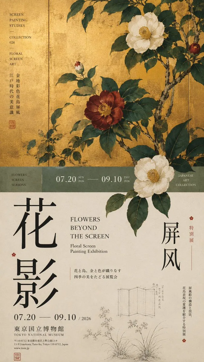
Top/Bottom Split-Section Museum Exhibition Poster AI Image Prompt
[Theme]: [Theme] [Key Visual]: [Key Visual] [Chinese Title]: [Chinese Title] [English Title]: [English Title] [Supporting Visuals]: [Supporting Visuals] [Primary Color Palette]: [Primary Color Palette] [Secondary Colors]: [Secondary Colors] [Date / Institution]: [Date/Institution] [Ratio]: 9:16 Generate a “top/bottom split-section” poster with high-end Editorial Design and a cultural exhibition quality. Do not simply make it “image on top, text below”. Divide the layout into 2–3 vertical areas of unequal proportions: main visual area about 50%–65%, middle transition cut-section about 8%–15%, lower information area about 25%–40%. Keep only one main visual core [Key Visual], then add a small amount of low-weight details, such as line art, partial painting, patterns, research images, small collection information, or vertical text, so the negative space has design density but does not overpower the subject. In the middle, low-saturation color blocks, narrow color bands, or information modules can be used to connect the upper and lower areas. The main title participates in the composition through enlargement, vertical arrangement, offset, or spanning areas; the subject may partially cross the cut-section boundary, creating front-back layering between the upper and lower areas. Establish clear text hierarchy: large Chinese title → English title / date → small subtitle → extremely small institutional information. Small text should be grouped together, not scattered. Control colors to 3–5, and build hierarchy through area proportions, visual weight, cross-area relationships, and Typography. Key point: the top/bottom split-section is not about cutting the image into two pieces, but about giving different areas clear roles while reconnecting them through the subject and text. Museum Exhibition Poster × Editorial Graphic Design, rich but not messy, with negative space but not empty, possessing the finish of a real museum poster and art catalogue.
Content: Structure covers theme, key visual, CN/EN title, supporting visuals, palettes, date/institution, 9:16; core is a top/bottom cut-section poster with three-zone ratios, text hierarchy, 3-5 colors, and editorial exhibition style.
Pros: Clear structure; specific layout ratios and hierarchy.
Cons: Many placeholders; execution-dependent and can feel generic.
Reference image: No obvious reference-image dependency.
Curated from publicly available creative examples. Prompts and commentary are edited and organized by this site. Please contact us with any rights concerns. Copyright & Privacy