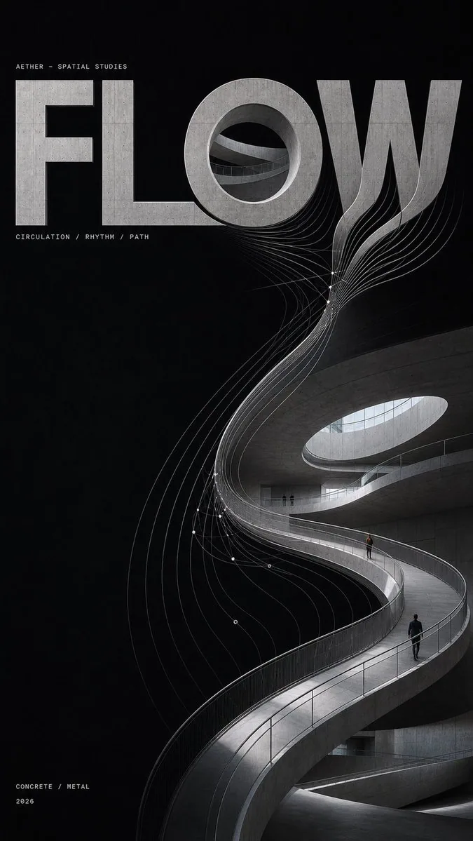
Typography as Architecture Poster AI Image Prompt
[Word]: {MASS / VOID / FLOW / SKIN / 4–6 letter word} [Concept]: {weight / light / movement / material} [Mode]: {Growth / Carved} [Materials]: {concrete / metal / glass / stone} [Lines]: {structural mesh / spatial lines / flow field / surface topology} [Format]: 9:16 vertical Create a high-end experimental architectural poster where typography becomes architecture itself. Make “[Word]” the main spatial structure, built from real architectural materials rather than placed over a photo or rendered as floating 3D text. Use one construction logic: Growth: letters grow into walls, ramps, corridors, façades, and structural forms. Carved: letters are cut, recessed, folded, or opened directly into one continuous architectural surface through negative space, glass, shadow, and material changes. The architecture itself should feel sculptural and visually striking, with strong massing, curves, voids, light, and refined material transitions. Use realistic perspective, material thickness, joints, reflections, and tiny human figures for scale. Add fine parametric lines derived from real letter edges, structural joints, paths, light boundaries, or surface curvature. Let them evolve naturally: structure → abstraction → deformation → dissolution Keep the lines thin, gray-white, non-glowing, with one concentrated Line Event before they gradually fade into the black space. Use a deep matte-black field with generous negative space. Keep colors restrained: graphite, concrete gray, metal silver, glass tones, plus a subtle warm-light or cool-blue accent. Use minimal micro typography like an architectural research archive. Only show: “AETHER — SPATIAL STUDIES” “[Word]” “[Concept]” “[Materials]” “2026” Final result: sculptural, spatial, minimal, experimental, and highly designed. Avoid floating 3D text, random decorative lines, cyberpunk effects, UI graphics, extra text, page numbers, logos, and watermarks.
Content: Parametric template: variables [Word/Concept/Mode/Materials/Lines/Format]; typography as architecture; Growth/Carved logic; materials, perspective, scale figures, parametric line evolution, matte-black field, restrained palette, micro typography, exclusions.
Pros: Reusable template; clear type-as-architecture concept.
Cons: Many variables may destabilize output; narrow experimental poster style.
Reference image: No obvious reference-image dependency
Curated from publicly available creative examples. Prompts and commentary are edited and organized by this site. Please contact us with any rights concerns. Copyright & Privacy