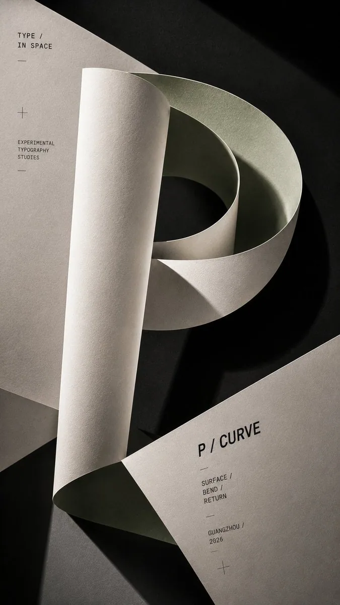
Experimental Paper Letter Typography Poster AI Image Prompt
[Letter]: {T / Y / P / E / any letter} [Spatial Action]: {fold / curve / intersect / layer / twist} [Paper Color]: {ivory / muted blue / sage green / warm sand} [Accent Color]: {burgundy / cobalt blue / olive / ochre} [Title]: {e.g. P / CURVE} [Format]: 9:16 vertical Create an experimental editorial typography poster where a large, clearly recognizable letter is physically formed from real sheets of matte paper. Keep about 70–80% of the letter structure recognizable, then transform it through [Spatial Action]. Let the paper fold, curve, overlap, intersect, or move through different depths while preserving the essential anatomy of the letter. Use thin, flexible paper rather than thick 3D blocks. Show realistic paper edges, subtle surface texture, natural bends, soft tension, and convincing deformation. Use [Paper Color] as the main paper tone with [Accent Color] appearing only where the structure changes — inside a fold, curve, intersection, cut edge, or deeper layer. Keep the palette muted and editorial, not brightly saturated. Use strong directional studio lighting to create large graphic shadows across the paper and background. Let light and shadow become part of the composition while keeping the paper form readable. Keep typography restrained. Use one medium-size title such as “[Title]”, one small series label, and only a minimal amount of micro text. Use modern Grotesk sans-serif typography with lighter weights, generous spacing, and soft charcoal or gray ink rather than heavy pure black. Leave large areas of paper completely free of text so the material, color, form, and shadow remain the main visual focus. Build clear foreground, middle ground, and background relationships. Allow parts of the paper letter to extend beyond the frame for scale and tension. Overall aesthetic: experimental typography, Swiss editorial design, paper sculpture, modern graphic design, restrained color, high-end art direction, realistic studio photography.
Content: Structure: swappable variables (letter, spatial action, paper/accent color, title, 9:16) plus fixed description: paper-sculpture letter subject, 70–80% recognizable deformation, thin-paper material, directional studio light with graphic shadows, restrained typography and negative space, foreground/mid/background depth, Swiss editorial style.
Pros: Variables are clear and easy to swap; material, lighting, and typography constraints are specific and cohesive.
Cons: No lens or camera parameters; no reference or example image, so shape control depends on the model.
Reference image: No obvious reference-image dependency
Curated from publicly available creative examples. Prompts and commentary are edited and organized by this site. Please contact us with any rights concerns. Copyright & Privacy