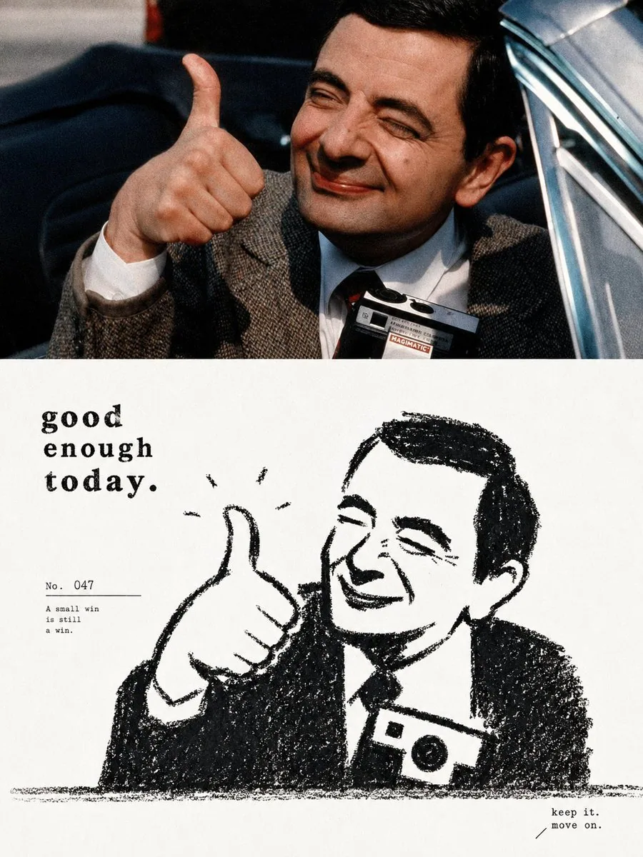
Photo and Black Crayon Silhouette 1:1 Poster AI Image Prompt
Create one separate high-end design poster for each uploaded photo, output each photo individually, no multi-image collage. Overall use a 3:4 vertical composition, with the upper and lower zones strictly 1:1 in height, each occupying 50% of the frame. The upper half retains the original photo, preserving the subject’s identity, structure, pose, realistic texture, natural light and shadow, and original color atmosphere, with only subtle high-end photographic color grading to give it the texture of art magazines, independent publications, and exhibition photography. To fit the format, you may naturally extend the sky, ground, or environmental background, but must not stretch, distort, or alter the subject. The lower half extracts the most recognizable subject, contour, pose, and narrative relationship from the photo, reconstructing them into a minimalist, thick black dry-medium silhouette illustration. Do not mechanically trace photo details; instead, compress the subject into rounded, sturdy, slightly naive and simplified forms. You may appropriately enlarge the head, main contour, or the most memorable part, so it remains recognizable at a glance with minimal information. If the photo contains multiple subjects, retain the most important interaction and treat them as a single visual unit rather than evenly distributing focus. The lower half uses only a near-pure-white paper base + dense black crayon, charcoal, or dry-brush marks, without color or grayscale gradients. The black forms are not smooth solid vector blocks, but are formed by short, forceful repeated crayon strokes, preserving paper grain, broken strokes, indentations, rough edges, uneven density, and areas of exposed white. The contours should be slightly shaky, incomplete, and imprecise, keeping a genuine handmade feel. The subject’s most critical identifying features can be reinforced through “white feature areas suddenly cut out from the black silhouette,” such as the face, around the eyes, window openings, vessel openings, animal faces, core structures of objects, or the most recognizable part; then use very few black dots, short lines, or symbols to complete expression and details. Do not pursue realistic facial features or precise structure; instead, let black and white form a direct, interesting, and strong recognizable relationship. Maintain a composition with large areas of pure negative space + one main visual relationship. The subject may float centered, or be slightly offset, partially cropped, or placed near the lower part of the frame, using only one rough ground friction line, a few short lines, or very few environmental symbols to suggest space. Grass blades, rain streaks, smoke, tabletop, shadows, roads, wind, or other environmental information should all be compressed into minimal crayon marks, keeping the background quiet and empty. Overall, do not pursue complex scenes; let one posture, action, distance, or relationship carry the main narrative. Keep a small-type system for text that combines a small amount of high-end editorial feel with children’s-book feel. Do not write only place or object names; instead, distill a short English title from the emotion, action, relationship, time, or tiny story in the photo, then pair it with numbering, a fitting quote, chapter number, or one very short subtle caption. The text can be restrained printed small type, or include a very small amount of clumsy handwriting, crayon lettering, or not-quite-regular letterforms, making it feel as if it originally belonged to the illustration. The text needs to form a clever relationship with the graphics: it can sit along the ground line, extend along the direction of the subject’s action, hide in large areas of negative space, slightly overlap the contour, fit into the negative shape between two subjects, or use a thin line to connect the numbering with the subject. Keep “one short title + 1–2 groups of extremely small supporting text”; let the text become part of the composition rhythm, not an ordinary poster title. Overall, present the visual characteristics of thick black, clean white, simple forms, and rough texture, maintaining a subtle balance between childishness, softness, quietness, humor, and loneliness, like an old black-and-white children’s book re-edited by a high-end design studio. Avoid smooth digital outlines, precise line art, realistic lighting, impasto, 3D effects, color, large gray rendering, cartoon sticker feel, and templated commercial illustration.
Content: Formula: uploaded photo → 3:4, 1:1 split; top original micro-graded, bottom black crayon silhouette; minimal negative space, rough dry texture, sparse editorial text; no color, 3D, realism.
Pros: Clear structure and style constraints; distinctive black-white silhouette plus typography.
Cons: Many rules can be hard to balance; depends on input photo quality and multiple uploads.
Reference image: Clearly depends on reference images or uploaded photos.
Curated from publicly available creative examples. Prompts and commentary are edited and organized by this site. Please contact us with any rights concerns. Copyright & Privacy