Photos Split-Layout Brand Packaging Identity Board AI Image Prompt
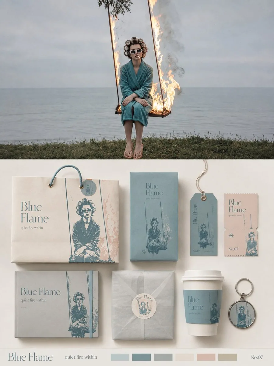
Turn each uploaded photo into a separate, independent high-end design poster — no multi-image collage. Use an overall 3:4 vertical composition, with the upper and lower zones at a strict 1:1 height ratio, each occupying 50% of the frame. The upper half keeps the original photo, preserving the subject's identity, structure, pose, true texture, natural light and shadow, and original color atmosphere, with only subtle high-end photographic color grading, giving it the quality of art-magazine, independent-publication, and exhibition photography. To fit the frame, sky, ground, or environmental background may be naturally extended, but the subject must not be stretched, distorted, or altered. The lower half extracts the most recognizable subject, silhouette, pose, and narrative relationships from the photo, turning them into a complete brand packaging and collateral visual system. Do not simply copy the photo; instead distill the subject's characteristics into reusable core graphics, illustration symbols, patterns, color blocks, or identity elements, then apply them separately across packaging carriers of different sizes and uses, so that all materials clearly belong to the same visual family at a glance. Based on the original image's theme, automatically choose the most suitable 5–8 carriers, such as paper bags, packaging boxes, boxed sets, labels, hang tags, tickets, cards, stickers, envelopes, cup packaging, keychains, wrapping paper, or other related materials; do not force a fixed set of categories. Use 1–2 primary packages as the visual anchor, with the remaining materials forming a modular composition according to size, horizontal/vertical ratio, and function; organize the layout with clear grids, edge alignment, scale contrast, spacing rhythm, and large areas of negative space, like a professional brand design studio's packaging identity presentation board, rather than product display or a cluttered mockup collage. Keep the palette soft, translucent, and slightly desaturated in a high-end range, dominated by pale pink-blue, misty blue, sky blue, and airy cool blue, paired with ivory white, cream white, light beige, soft gray-green, and architectural neutrals, using only a small amount of dusty rose or muted blush as visual accents. Different packages may vary the color areas and combinations, but must stay within the same color system, forming a rich yet unified series feel. Emphasize realistic and refined paper and packaging craft, showing matte paper, fine-textured paper, thick card, translucent paper, embossing, die-cutting, folding, stickers, spot printing, and slight layering relationships; lighting is soft and natural, used only to express paper thickness, creases, and material differences, avoiding a plastic feel, strong reflections, exaggerated 3D, and cheap product rendering. Typography is also designed as a unified part of the whole packaging system. Distill a short English main title from the subject's name, theme, mood, function, or symbolic meaning in the original image, and extend it into a very small amount of subtitle, short phrases, numbering, category names, or micro captions. Text can vary naturally across carriers: set vertically on hang tags, running along package edges, wrapping around circular labels, spanning box faces, hidden among the graphics, or becoming part of the package seal structure, so that type, graphics, and materials together form a complete brand language, rather than repeating the same title on every item. Present the whole thing as a high-end brand packaging system / visual identity proposal board: rich but not crowded, lively but orderly, showing the complete series while also revealing the design logic among graphics, text, materials, and different carriers. Whether the original image is a person, animal, plant, architecture, object, food, vehicle, or natural landscape, a unique packaging language should be built from the image itself, avoiding fixed product combinations, repetitive templates, an e-commerce display feel, and generic brand mockup templates.
Content: Structure: each uploaded photo becomes an independent poster; 3:4 vertical, upper/lower 1:1. Top preserves original photo with subtle grading; bottom distills subject into a brand packaging system, auto-selecting 5–8 carriers with modular layout. Style: soft desaturated cool-blue palette, paper craft, unified English typography.
Pros: Clear structure and zoning; concrete visual system and carrier applications.
Cons: Many constraints, hard to generate; prone to mockup collage or typography issues.
Reference image: Clearly depends on uploaded/original photo; a reference image is required.
Source materials are collected from publicly accessible web pages. Contact us if a rights issue needs review. Copyright & Privacy