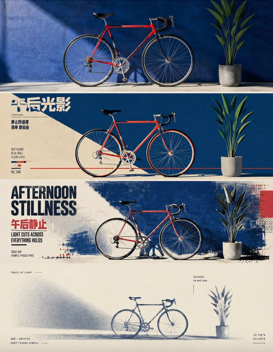
Four-Layer Vertical Style Translation Poster AI Image Prompt
Each uploaded photo should be made into its own independent high-end design poster; no multi-image collage, single-image output. Overall use a 3:4 vertical composition. From top to bottom, the image is strictly divided into four horizontal areas of equal size; each area must be exactly 25% of the total image height, with a strict 1:1:1:1 ratio for the four layers and no ratio deviation. The areas connect seamlessly, with no divider lines and no blank gaps. Here, 'no blank gaps' only means there must be no gaps at the seams between layers; within each layer, negative space, paper surface, or solid-color background may still be retained according to the corresponding style. All four layers are based solely on the same uploaded photo, presenting the same subject, same moment, and same spatial relationship. Strictly keep the subject identity, number, key structure, proportions, pose, action direction, gaze, viewing angle, perspective, occlusion, left-right position, front-back relationship, and core narrative consistent. The four layers are not four unrelated new compositions, but a continuous style translation of the same image. Because each layer is an extremely flat banner of about 3:1, the subject should be organized horizontally, with an appropriate amount of breathing space on the left and right; natural horizontal extension or slight cropping of the background is allowed, but do not vertically stretch the subject, crop key parts, change character relationships, or create scenes unrelated to the original image. The visual center of gravity, subject proportion, and contour placement of the four layers should align vertically as much as possible, forming a coherent evolution from real photography gradually transitioning to the target style. Each layer must completely fill its own 25% area. Do not add layer numbers, divider lines, borders, collage seams, watermarks, or logos. Unless a layer's style description explicitly requires a small amount of editorial text, ticket marks, or handwritten annotations, do not generate extra text; even if text is needed, it must be minimal, restrained, not cover the subject, and avoid garbled characters as much as possible. Layer 1 | Original Photography Directly preserve the real photographic state of the uploaded photo as the visual baseline for the style translation of the latter three layers. Maintain the original person's or subject's identity, number, facial features, hairstyle, clothing, structure, proportions, pose, action, gaze, interaction relationships, viewing angle, perspective, occlusion, environmental direction, natural light and shadow, and core colors; do not illustrate, materialize, geometrize, or reconstruct in 3D. To adapt to the extremely flat banner of about 3:1, only naturally extend the left and right sides of the background in a way consistent with the original scene logic, or make slight cropping that does not damage the subject; do not change the subject's proportions, do not stretch people or buildings, and do not crop heads, hands, feet, key objects, or important narrative relationships. Keep the image natural, real, and clear; avoid excessive skin smoothing, exaggerated color grading, fictional scenery, and decorations unrelated to the original image. Layer 2 | Retro Modernist Flat Illustration In this layer's flat banner area of about 3:1, translate the real subject from Layer 1 into a 'retro modernist flat illustration' style. Maintain the same subject identity, number, key structure, pose, left-right position, viewpoint, spatial relationship, and core narrative as Layer 1, then fully execute the following visual requirements: Extract the most recognizable subject, silhouette, pose, and narrative relationship from the photo, and reconstruct them as a retro modernist flat illustration. Do not mechanically trace details; instead, summarize the subject into clear silhouettes, geometric color blocks, firm facets, and concise curves, retaining the most critical proportions, contours, movement, and structural features so that it can correspond to the subject in the original image at a glance. The composition emphasizes visual center of gravity, scale contrast, foreground-background hierarchy, positive and negative shapes, and geometric rhythm. You may moderately enlarge, crop, offset, or overlap the subject, and use a small number of auxiliary shapes to build space; do not make a complex realistic scene. Extract the most recognizable and spirited colors from the uploaded original image, and reorganize them into a 3-5 color retro limited palette, establishing a clear hierarchy through a main color, dark structural color, light background, and a small amount of contrast color. Colors may be moderately purified and artistically translated, presenting a warm, vivid, restrained temperament of old print and modern graphic design; avoid gray dirtiness, neon, multicolor mixing, complex gradients, and a cheap cartoon feel. Establish a modernist editorial typography system for text; the language should primarily follow the user's language preference and the current input language, not fixed to English. Extract a short main title from the subject's identity, action, emotion, place, material, or metaphor in the photo, and pair it with 2-4 groups of extremely small auxiliary text, which may use short sentences, place or object information, numbers, serial numbers, status words, direction words, category labels, or micro descriptions; do not use years. If necessary, a small amount of another language may be mixed in as an editorial accent, but the main information should always be primarily in the user's preferred language. Text can align with, cut through, interweave with, surround, corner, run vertically with, or cross color blocks in relation to geometric shapes; through font size contrast, weight, letter spacing, and a strict grid, establish visual order, making the typography itself part of the illustration composition. Overall present the visual temperament of original imagery x retro graphic illustration x high-end editorial design: concise, vivid, geometric, stylish, restrained, and full of graphic tension, combining the visual force of classic posters with a contemporary design system feel. Avoid realistic illustration, complex textures, 3D rendering, UI feel, commercial stock feel, and template-like vector illustration. Layer 3 | Inkjet Dry-Brush Fashion Editorial In this layer's flat banner area of about 3:1, translate the real subject from Layer 1 into an 'inkjet dry-brush fashion editorial' style. Maintain the same subject identity, number, key structure, pose, left-right position, viewpoint, spatial relationship, and core narrative as Layer 1, then fully execute the following visual requirements: Extract the most recognizable subject, silhouette, pose, and narrative relationship from the photo, and reconstruct them into a flat illustration and collage image with a modern magazine cover feel and high-end editorial design temperament. Do not mechanically trace photo details; instead, distill the most core visual motif from the original image, and transform the subject into a more generalized, more vivid, more brand-like graphic system; through repetition, layering, enlargement, cropping, collage, and texture variation, build a thematic visual scene unfolding around the subject, so that at a glance one can feel it belongs to the same object, same emotion, and same narrative as the uploaded original image. The composition emphasizes clear layers, scale contrast, and layout rhythm. Based on the subject's characteristics, transform the contours, local shapes, environmental elements, or structural relationships in the original image into large-area repeated graphics, forming a progressive relationship of background layer, middle subject layer, and foreground accent layer; the main visual may be freely off-center, interwoven, or overlapped, but must maintain a clear focus and strong readability. You may moderately add a small-scale, high-contrast accent element to enhance drama and story, but it must not weaken the subject itself. Extract the most vital, most recognizable, and emotionally infectious colors from the uploaded original image, and translate them into a more condensed, more vivid, high-quality flat color set. Overall, you may use a high-saturation but not cheap comprehensive color system, establishing layers through main color, auxiliary color, dark weight, and bright refreshment; allow rich variation among comprehensive color blocks, and retain grain, grid, fabric texture, inkjet, rubbing, dry brush, and print texture, so the image has freshness, richness, fashion, and natural vitality. Avoid realistic photographic feel, gray dirty colors, smooth 3D, and ordinary commercial illustration feel. Text should participate in the composition like a real magazine cover typography system, rather than simply adding a title. Extract a striking English main title from the photo's theme, temperament, action, seasonal feel, material feel, or symbolic meaning, and pair it with a more emotional or narrative Chinese title; you may also add a small amount of explanatory short sentences, numbers, issue numbers, place, time, or label information. Text can use super-large type horizontally interwoven, vertically stacked, partially occluding, overlapping the subject, crossing color blocks, or embedded in negative space, jointly forming a cover feel with the graphics; overall typography should be bold, modern, and clear, with brand visual and high-end editorial design temperament. Overall present a visual effect of modern fashion, fresh richness, flat collage, rich layers, strong typography, obvious print texture, and vitality. Whether the subject is a person, animal, plant, building, object, vehicle, natural landscape, or abstract scene, it should maintain good adaptability and transferability; avoid template forest illustration, ordinary travel poster, e-commerce layout, cartoon feel, and cheap decorative feel. Layer 4 | Minimalist Silkscreen Halftone Printing In this layer's flat banner area of about 3:1, translate the real subject from Layer 1 into a 'minimalist silkscreen halftone printing' style. Maintain the same subject identity, number, key structure, pose, left-right position, viewpoint, spatial relationship, and core narrative as Layer 1, then fully execute the following visual requirements: Extract the most recognizable subject, silhouette, pose, and narrative relationship from the photo, organize the complex information into a single visual anchor, and reconstruct it as a minimalist silkscreen print and halftone print poster. If the original image contains multiple people or multiple subject relationships, preserve the complete relationship as the same visual anchor; do not reduce the number of subjects. Do not trace the photo, and do not add rich illustration details; retain only the most critical overall shape, action, and spatial relationship, so that the subject can still be recognized at a glance with minimal information. The composition follows 'one subject, one direction, one spatial relationship.' The subject usually remains small in scale, using large areas of negative space to create distance and poetry; based on the original image's own relationship, choose only one most natural structure, and prioritize horizontal extension, isolated suspension, outward dissipation, or progression from shallow to deep; only when the original image itself has a clear vertical momentum, retain limited vertical extension, and do not use multiple composition techniques at the same time. You may use a horizon line, boundary, shadow, or halftone band to establish space, letting the blank itself become a major part of the image. The palette does not directly copy the photo; instead, distill the overall color temperature, brightness, and emotion from the original image, and reorganize them into a limited spot-color system of paper base color + main ink color + mist layer color. Use off-white, warm gray, or natural paper color for large areas of negative space, use a calm and weighty comprehensive color as the main ink color, then use lighter and grayer colors in the same hue family to express air, distance, or layers. Overall control to 2-3 colors, building layers through color area, brightness, and halftone density; only allow a tiny area of spot color when it has clear narrative meaning. All fog, distance, shadow, dissipation, and spatial transitions use halftone dots that naturally disappear from dense to sparse; do not use digital blur or ordinary gradients. Retain paper grain, silkscreen ink, slight misregistration, and uneven inking, making the image look like an art print truly printed on old paper. Retain a small amount of decorative text system with a high-end editorial feel. Not limited to place names, generate an extremely short English title from the photo's theme, emotion, time, action, material, distance, or metaphor, paired with micro subtitle, number, year, chapter number, coordinate-style numbers, archive marks, or a subtle English short sentence. The copy may be slightly abstract, literary, and curatorial in tone, and does not need to fully explain the image, for example concepts about 'distance, stillness, passing, echo, boundary, time, light, traces,' making it like editorial annotations in an art book, architecture journal, or independent exhibition. Text itself must participate in the composition, rather than being pasted into blank areas afterward. Small text may be arranged along the horizon, fit the subject's contour, become a vertical visual axis, cross halftone boundaries, hide in negative shapes, or occlude, interweave, break, and align with the subject; rhythm can also be established through extremely thin vertical lines, short horizontal lines, numbers, page-like symbols, and large areas of negative space. A word may be split, set vertically, letterspaced, or partially covered by graphics, but reading order must always be maintained. Keep the text hierarchy restrained: one extremely short main title + 1-3 groups of extremely small auxiliary text is enough. Fonts reference high-end art publications and modernist editorial design, using restrained sans-serif, gentle serif, or minimal condensed type, creating refinement through extreme size contrast, wide letter spacing, thin weight, superscript and subscript, small caps, and asymmetric typography. Text color should be unified with the main ink color or mist layer color, and may have slight misregistration and ink grain, so that text and graphics belong to the same printing, not a digital typographic overlay. Overall pursue minimal elements, maximum negative space, minimal subject, extremely strong order, and subtle and smart text intervention, presenting quietness, loneliness, vastness, restraint, poetry, intellectual feel, and collectible feel. Avoid complex composition, multiple focal points, meaningless decoration, large titles overwhelming the image, commercial advertising copy, ordinary gradients, cheap retro filters, and template feel.
Content: Structure: one 3:4 vertical poster split into four equal horizontal bands (1:1:1:1), all based on one uploaded photo; sequential style translation: original photography, retro flat illustration, inkjet dry-brush fashion editorial, minimalist silkscreen halftone. Includes subject consistency, horizontal framing, palette limits, typography, print texture, negative space, seamless seams.
Pros: Clear layered progression; detailed style and layout control.
Cons: Very many constraints; high execution and stability demands.
Reference image: Clearly depends on an uploaded photo/reference image.
Source materials are collected from publicly accessible web pages. Contact us if a rights issue needs review. Copyright & Privacy