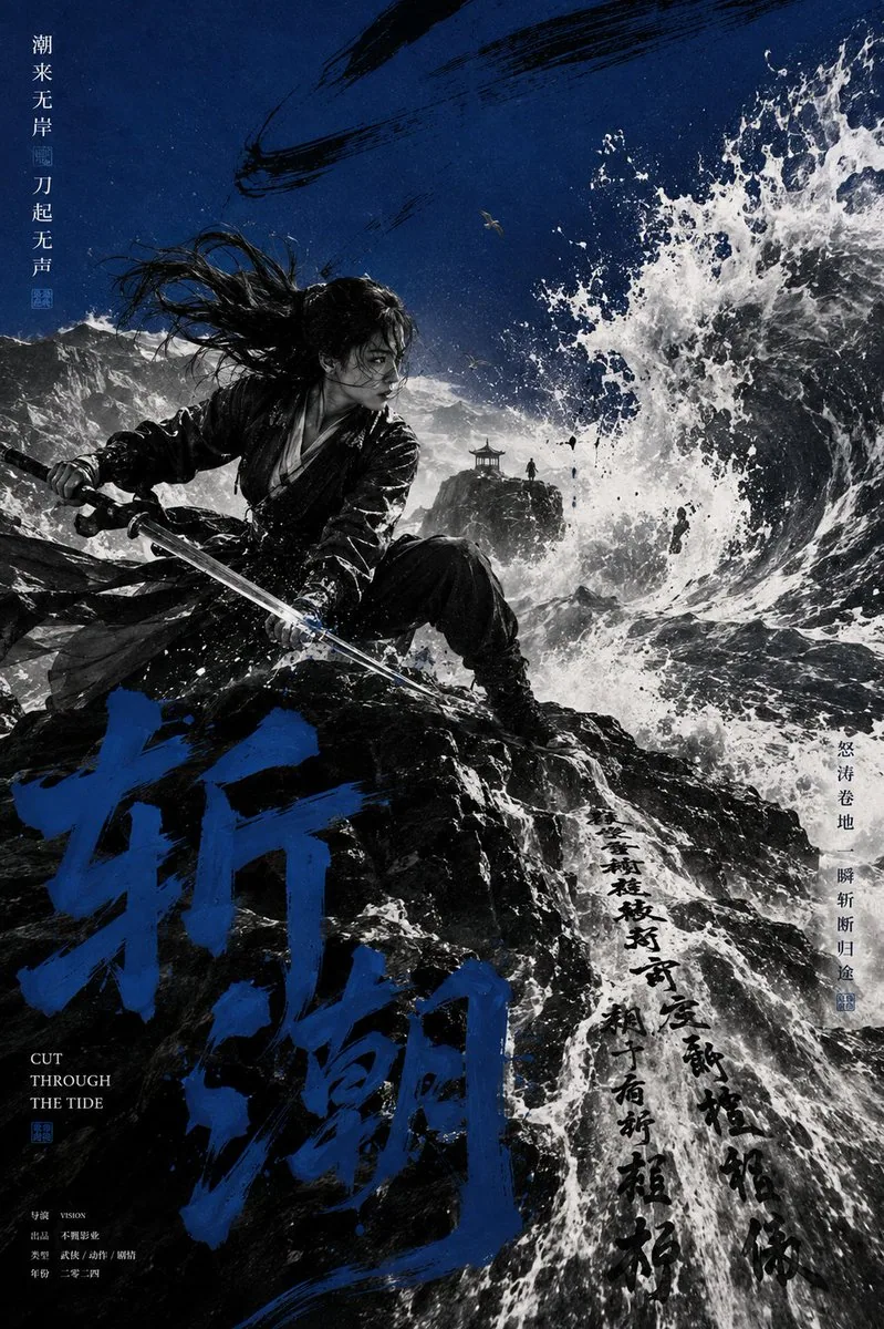
Eastern Visual Kinetic Movie Poster AI Image Prompt
[Theme] [Theme] [Main Title] [Main Title] [Character & Action] [Character & Action] [Scene] [Scene] [Core Prop] [Core Prop] [Accent Color] [Accent Color] [Aspect Ratio] 3:4 Generate an Eastern visual kinetic movie poster: high-contrast black-and-white figure photography + a single high-saturation accent color + exaggerated perspective + Chinese ink calligraphy. The figure should be realistic and caught in a clear dynamic moment, not standing stiffly. Use striding, turning back, drawing a blade, pressing a gun, riding, facing the wind, and the movement direction of the hem, hair, weapon, and environment to create strong visual momentum. Use a low camera angle, Dutch angle, foreshortening, and strong depth to create obvious spatial perspective among the figure, buildings, roads, or natural environment. Let the textures of [Scene] naturally transform into ink and calligraphy—for example, waves becoming flying-white brushstrokes, snowfields becoming ink marks, stone steps extending into characters, and sand trails blending with brush strokes. The large original Chinese main title [Main Title] should use real brush calligraphy. It may be partially occluded by the figure, perspective-stretched, cropped off the frame, and interwoven with environmental structures, so the text truly participates in the composition rather than being pasted on the surface. Keep the main image in black, white, and gray; use [Accent Color] only for the sky color block, the large calligraphy title, and minimal typographic elements. Combine cinematic photography, Chinese calligraphy, ink painting, editorial collage, silkscreen printing, and rough paper texture. Keep the figure as the first visual center, the calligraphy as the second, and the environment/text as the third layer. Avoid figures standing in a row, game CGI, xianxia glow effects, cheap ink filters, screens full of fake text, logos, serial numbers, "Vol", sparkles, or existing IP.
Content: Poster formula: subject+scene+accent color+ratio; style: B&W photo+single accent+perspective+ink calligraphy; composition: dynamic, low angle, Dutch angle; calligraphy integrated with perspective; main image monochrome, accent limited.
Pros: Well-structured; calligraphy integrated into composition.
Cons: Requires filling placeholders; many constraints may be hard to satisfy.
Reference image: No obvious reference-image dependency
Curated from publicly available creative examples. Prompts and commentary are edited and organized by this site. Please contact us with any rights concerns. Copyright & Privacy