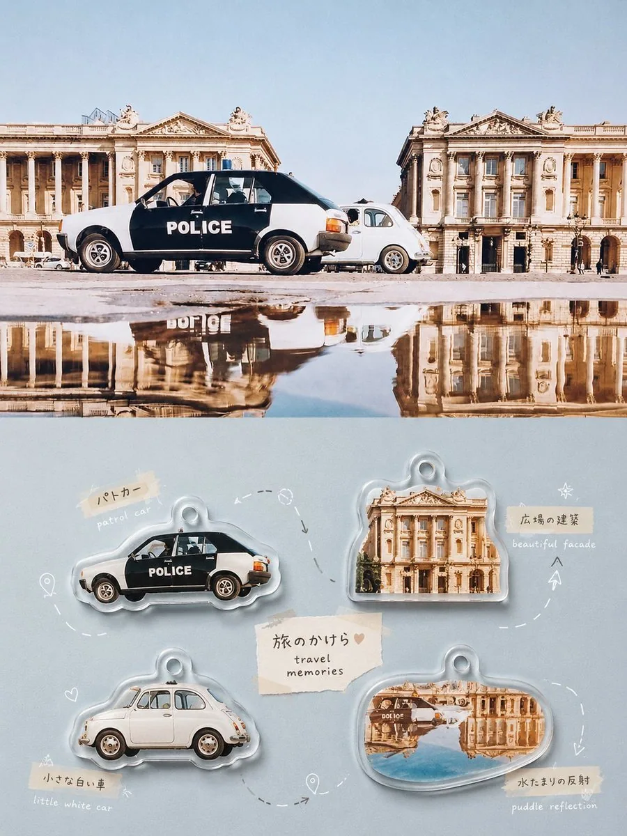
Japanese Acrylic Collection Poster AI Image Prompt
For each uploaded photo, create an independent high-end design poster. Do not combine multiple photos; output each one separately. Use a 3:4 vertical composition with the upper and lower areas strictly split at a 1:1 height ratio, each occupying 50% of the canvas. In the upper half, keep the original photo, preserving the subject's identity, structure, pose, realistic texture, natural lighting, and original color atmosphere. Apply only light high-end color grading to achieve a visual quality reminiscent of art magazines, independent publications, and lifestyle photography. To fit the frame, the environment background may be naturally extended, but do not stretch, distort, or alter the subject. In the lower half, extract the most recognizable subject relationships, object features, life details, and narrative memory points from the photo, and reconstruct them into a Japanese life fragments Scene Map / Acrylic Collectible Catalogue. Do not simply copy the photo; freely select about 4-7 of the most memorable elements, which may be body parts, food, drinks, utensils, plants, animals, architectural features, vehicles, or a small detail with emotional value. Each element should remain realistic, clear, and tangible in texture, and should not be flattened into cartoons. Unify them into a more INS-lifestyle visual tone: soft natural light, clean highlights, creamy bright areas, a slight soft haze, clear shadows, and a comfortable warm-cool relationship. Moderately reduce harsh contrast and brighten colors so that objects look gentle, refined, clean, and healing, yet still like real photographs. Add transparent rounded acrylic/resin edges, slight thickness, delicate highlights, and soft contact shadows around each element, making them resemble real small collectibles rather than plastic 3D toys. For multi-object layouts, do not use a fixed four-grid, evenly spaced rows, or uniform sizes. Instead, dynamically arrange elements according to their own size, direction, shape, and visual weight. You may adopt diagonal flow, S-shaped routes, circular enclosure, staggered heights, staircase rhythm, radial radiation, clustered pairs, edge insertion, or asymmetric floating compositions. Elements may vary in size, rotate slightly, partially overlap, touch edges, or be cropped, so that each poster has a distinct visual rhythm. Always maintain a clear reading path and sufficient whitespace, making the layout lively but not messy, relaxed yet orderly. Between elements, you may freely add thin dashed lines, curved arrows, route nodes, location symbols, dots, brackets, hand-drawn small lines, or light markers, naturally connecting them according to the composition flow; not all elements need to be connected. Lines may detour, jump, break, or form local loops, making the layout feel more like a carefully organized personal memory map than a flowchart or complex infographic. The background color should not presuppose a light template. It should intelligently match the dominant hue, overall color temperature, light, and mood of the upper photo. It may be cream, misty blue, sage green, peach pink, or brick red, caramel brown, warm orange, gray-blue, dark green, and other more substantial composite colors; the key is to form a beautiful color contrast with the real objects and a unified INS atmosphere. The overall colors may be moderately brightened, purified, and softened to give the image warmth, clarity, and a sense of everyday life, while avoiding dirty gray, dead black, fluorescent colors, high-saturation clashing colors, and cheap filters. Text and routes participate together in the composition. Based on each object's identity, action, emotion, or life associations, freely generate short cute labels, words, phrases, or symbols, with no fixed vocabulary, language restriction, or uniform format. Use a lightweight, rounded font with slight natural handwriting variance and a Japanese notebook temperament, optionally paired with a small amount of fine small type, sticky-note-like text, or micro symbols, to form a flexible mixed-media arrangement with the objects and routes. Overall, the visual language should combine real objects, INS soft tones, acrylic collectible texture, dynamic Scene Map, cute annotations, and generous whitespace, blending Japanese lifestyle, Xiaohongshu-style healing, and high-end editorial design. The image may be lively, varied, and collectible, but it must always stay clean, gentle, realistic, and refined. Avoid fixed four-grids, even arrangements, uniform sizes, flat cartoons, complex UI, excessive arrows, cheap plastic looks, e-commerce material feel, and template-based compositions.
Content: Formula: single-image poster, 3:4 vertical, 1:1 split. Top=original photo + grading; bottom=4-7 elements as acrylic collectible scene map. Dynamic layout, hand-drawn routes, text notes, bg color matches photo. Style: INS lifestyle x Japanese healing x editorial.
Pros: Clear split and dynamic layout; preserves realistic textures with healing aesthetics.
Cons: Many elements may clutter; routes/notes could reduce minimalism.
Reference image: Depends on uploaded images, treating each original photo as the main subject
Source materials are collected from publicly accessible web pages. Contact us if a rights issue needs review. Copyright & Privacy