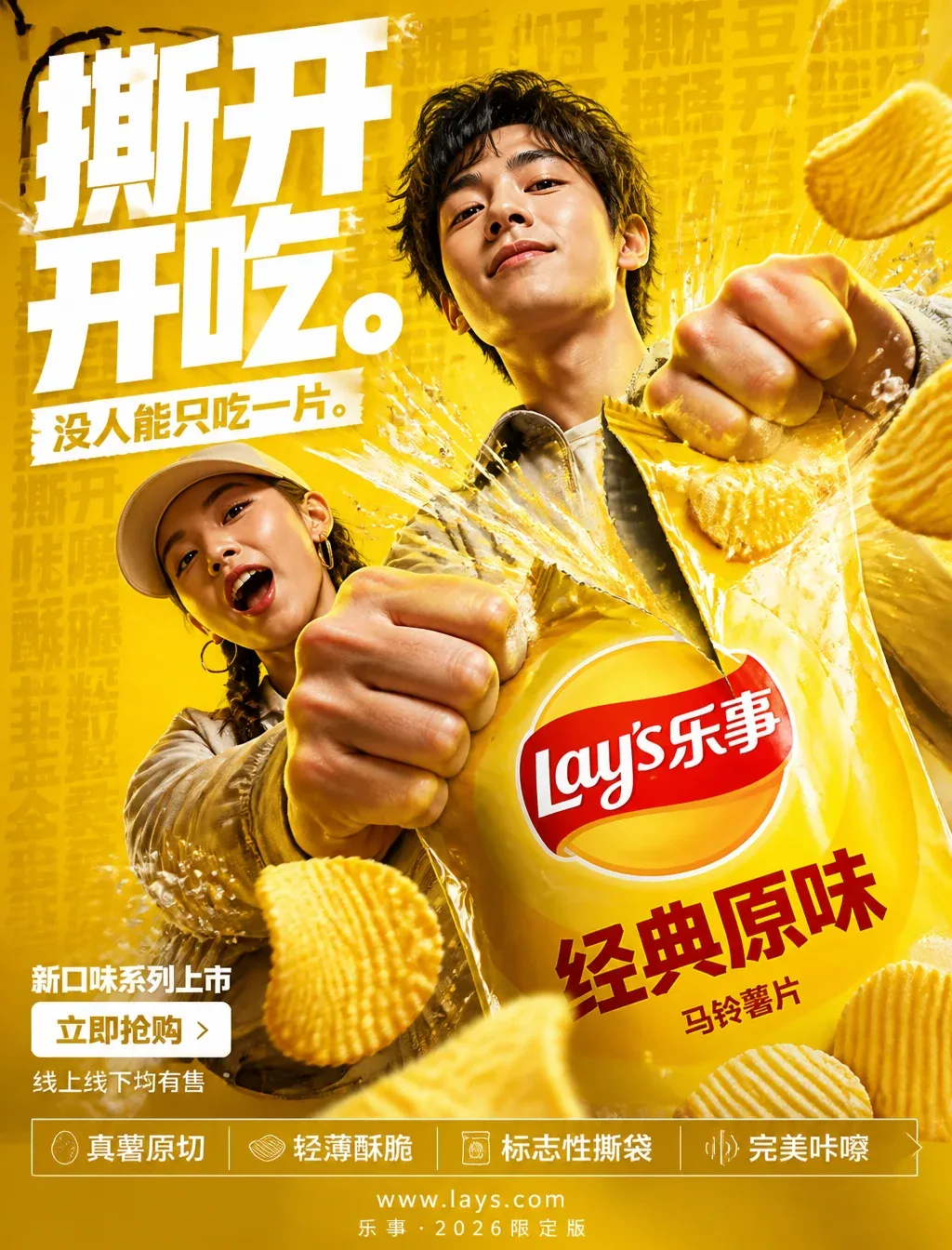
Lay’s “Tear Open and Eat” Chips Campaign Poster AI Image Prompt
FORMAT:4:5 vertical ultra-commercial snack campaign poster, ultra-high resolution (8K), outdoor billboard + social media ad-grade output. Style: bold FMCG advertising × modern potato chips campaign × high-energy commercial poster design × high-impact product photography. Core proposition: Everyone can hear it—that tear. Build the image around crispness, anticipation, and the satisfying crunch. Every element in the composition responds to the iconic Lay’s bag-tearing gesture. Main composition: Background is a deep Lay’s yellow environment with layered depth: rich yellow gradient, potato texture overlays, dynamic speed lines, fine salt crystal particles, repeated typographic texture, glossy studio reflection. Mood: bold, appetizing, high-energy, commercial-grade explosiveness. Subject: Gen Z young male and female models. Expression: playful, confident, in the moment of enjoyment. Action: holding the Lay’s bag toward the camera mid-tear. Camera angle: slight low angle + close-up to reinforce product dominance. Attire: modern streetwear, neutral tones allowing the yellow to dominate. Visual burst point: TEAR is the visual explosion center. At the tear point: potato chips fly outward, salt crystals suspended in mid-air, golden oil strands, dynamic lines radiating from the tear. The typography physically tears along the bag-tearing action, following the Lay’s tear trajectory. Feeling: satisfying, impactful, commercially exaggerated. Product hero: classic Lay’s chip bag + chips, foreground center-right, extreme 3/4 hero view. Product details: hyper-realistic chip texture, visible wavy ridges, glossy golden oil highlights, realistic salt crystals, embossed Lay’s logo, premium packaging reflection. Chips should convey: crispy, light, irresistible. Typography system: Main headline: “Tear Open and Eat.” Ultrabold condensed sans-serif, oversized stacked typography, white text, ultra-tight letter-spacing, torn/distorted at the tear point. Sub-headline: “No One Can Eat Just One.” Background text: low-opacity repeated words “Tear Crunch Crispy Potato Salt Golden” blended into the background layers. Feature strip: bottom premium feature bar: □ Real potato, original cut □ Thin and crispy □ Iconic tear-open bag □ Perfect crunch, with minimal modern icon system. Call-to-action area: bottom-left “New Flavors Launch”; CTA button is a pure white rectangle, button text “Buy Now”; secondary microcopy “Available online and in stores”. URL and brand info: bottom center www.lays.com, bottom micro-text “Lay’s · 2026 Limited Edition”. Color system: Primary: Lay’s yellow, deep potato gold; Secondary: white text; Accent: warm potato highlights, golden oil tones. Palette feel: bold, delicious, high-energy, commercial. Lighting system: Key light: strong commercial studio key light; Rim light: warm potato highlights around product; Ambient glow: soft yellow light behind the tearing action; Environment light: fine suspended salt particles catching light; Reflection: FMCG-grade glossy reflections. Lighting feel: premium snack ad × modern commercial photography. Hyper-fine details: hyper-realistic potato texture, sharp chip tear-bag details, realistic suspended salt crystals, golden oil reflections, premium packaging texture, maintain outdoor billboard readability, ultra-clean type edges, premium FMCG render quality. Composition flow: top giant typography dominates; middle tear burst + character interaction; foreground product hero; bottom-left CTA + selling points. Eye flow: headline → tear → product → chip dynamics → CTA. Camera & rendering: commercial food photography, Phase One medium-format look, 35–50mm lens, HDR commercial rendering, ultra-clean sharpness, premium FMCG color grade. Final tone: Nike energy campaign × premium snack launch × modern Behance commercial food poster.
Content: Vertical 4:5 commercial snack poster formula: Gen Z model tearing bag, hero product foreground, layered yellow bg with texture/speed lines/salt/type; tear-point burst and torn typography; clear flow from headline to tear, product, feature bar, CTA, branding; yellow/gold/white palette, studio lighting, 35-50mm medium-format commercial food photography, 8K.
Pros: Complete commercial hierarchy; strong integration of product and visual impact.
Cons: Overloaded with elements, high production complexity; requires brand approval.
Reference image: No obvious reference-image dependency
Source materials are collected from publicly accessible web pages. Contact us if a rights issue needs review. Copyright & Privacy