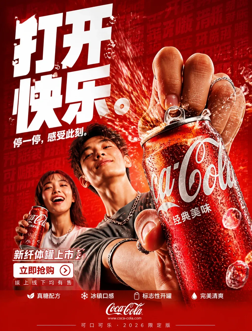
Open Happiness: Coca-Cola Commercial Poster AI Image Prompt
FORMAT: 4:5 vertical ultra-commercial beverage campaign poster, ultra-high resolution (8K), outdoor billboard + social media advertising grade. Style: bold FMCG advertising × modern beverage campaign × high-energy commercial poster design × high-impact product photography. Core proposition: everyone can perceive that opening. Build the image around refreshment, release, and satisfying hiss. Every element in the composition responds to the iconic Coca-Cola can-opening gesture. Main composition: Background: deep Coca-Cola red environmental layer stacking: rich red gradient, carbonated bubble texture layers, dynamic splash lines, fine ice crystal particles, repeated typographic text texture, glossy studio reflection. Mood: bold, thirst-quenching, high-energy, commercial-grade explosive power. Subject: Gen Z young male and female models. Expression: playful, confident, in the middle of drinking. Action: extending the Coca-Cola can toward the camera during the opening motion. Camera angle: slight low angle + close-up to intensify product dominance. Attire: modern street style, neutral tones let the red dominant color take absolute precedence. Visual explosion point: the POP of opening the can becomes the center of visual explosion. At the opening point: carbonated bubbles burst outward, ice crystal fragments suspend in mid-air, cola liquid stretches, dynamic lines radiate from the opening. Typography physically fizzes and bubbles with the opening action, following the Coca-Cola can-opening trajectory. Feeling: satisfying, impactful, commercial-grade exaggeration. Product hero: classic Coca-Cola can + condensation droplets. Position: front mid-right. Angle: extreme 3/4 hero view. Product details: hyper-realistic aluminum can texture, visible condensation droplets, glossy chilled highlight, realistic bubbles, embossed Coca-Cola logo, premium can reflections. The cola should convey: refreshing, thirst-quenching, irresistible. Typography system: Main headline: "Open Happiness." Font style: ultra-bold condensed sans-serif, oversized stacked typography, white letters, extremely tight tracking, bubbling/distorting at the opening point. Sub-copy: "Pause. Feel this moment." Background text: low-opacity repeated words: open, hiss, fresh, cola, bubbles, ice, blending into background layers. Selling points bar: bottom premium selling point bar: □ Real sugar formula □ Chilled taste □ Iconic opening □ Perfect refreshment, minimal modern icon system. Call-to-action area: bottom-left: "New slim can launch." CTA button: pure white rectangular button, button text: "Buy Now". Secondary micro-copy: "Available online and in stores". URL and brand info: bottom center: www.coca-cola.com. Bottom micro-text: "Coca-Cola · 2026 Limited Edition". Color system: Primary colors: Coca-Cola red, deep cola brown. Secondary color: white text. Accent colors: warm cola highlight, silver aluminum can tone. Palette feel: bold, thirst-quenching, high-energy, commercial. Lighting system: Key light: strong commercial studio key light. Rim light: warm cola highlight around the product. Ambient light: soft red glow behind the opening action. Environment light: subtle suspended bubble caustics. FMCG-grade glossy reflections. Lighting feel: premium beverage commercial × modern commercial photography. Ultra-fine details: hyper-realistic aluminum can texture, sharp cola opening detail, realistic suspended bubbles, chilled condensation reflection, premium can texture, maintain outdoor billboard readability, ultra-clean font edges, high-end FMCG render quality. Composition flow: Upper area: oversized typography dominates. Middle area: opening explosion + subject interaction. Foreground: product hero. Bottom-left: CTA + selling points. Visual flow: headline → opening → product → cola dynamics → CTA. Camera & rendering: commercial beverage photography, Phase One medium-format quality, 35–50mm lens, HDR commercial rendering, ultra-clean sharpness, premium FMCG color grading. Final tone: What it looks like: Nike energy campaign × premium beverage launch × modern Behance commercial beverage poster.
Content: Structure: subject (people + product) core, scene (red layered environment) linked with visual burst (opening), plus typography, color/lighting systems, composition flow, and camera/render specs forming a commercial poster formula.
Pros: Rich detail, clear commercial focus; defined visual flow.
Cons: Potential over-cluttering; creativity bounded by preset template.
Reference image: No obvious reference-image dependency
Source materials are collected from publicly accessible web pages. Contact us if a rights issue needs review. Copyright & Privacy