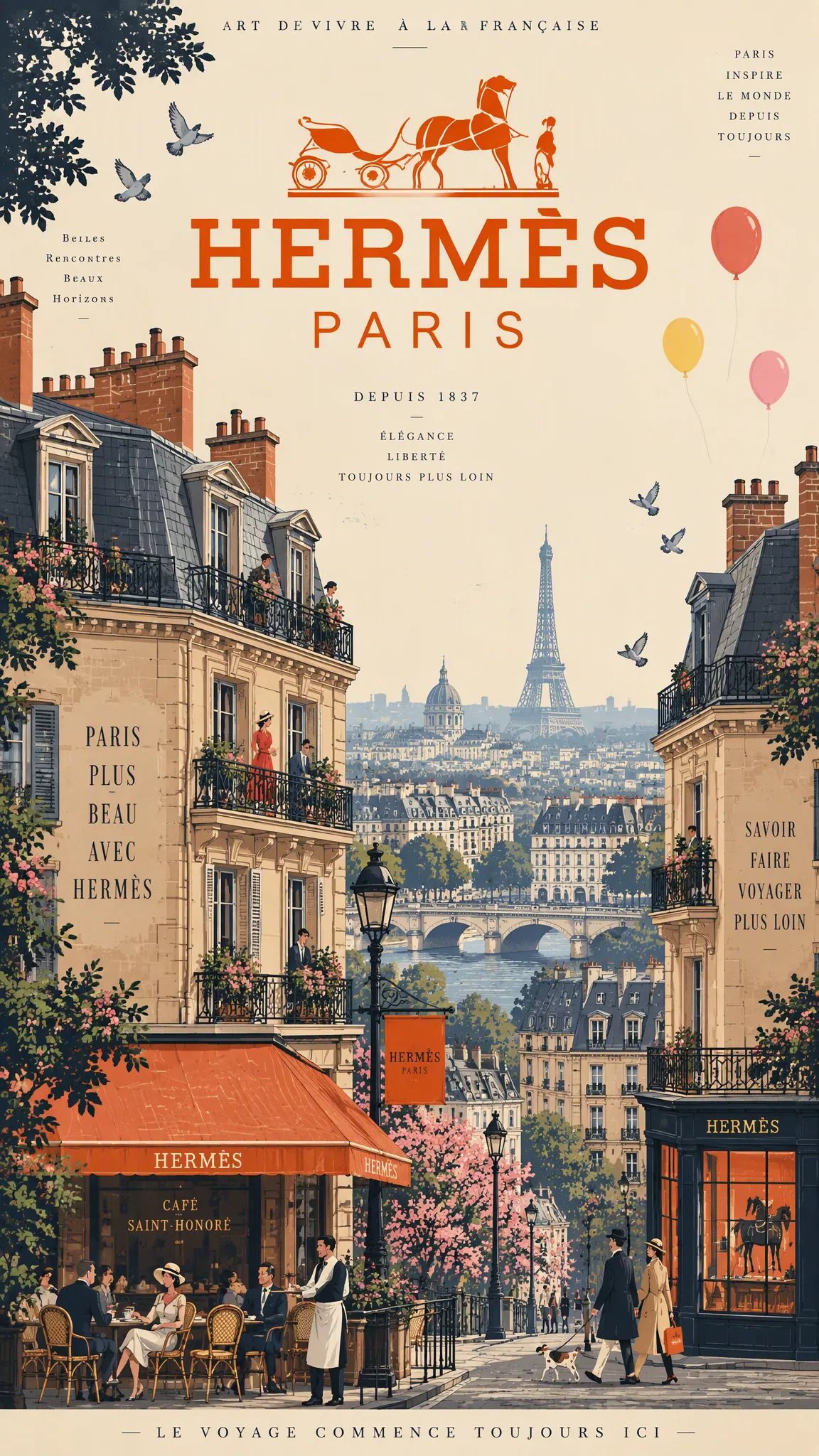
Vintage French Travel Poster: Parisian Buildings and Orange Carriage Emblem AI Image Prompt
Vintage French travel advertisement poster, mid-century graphic design style. Subject and Composition: A vertical, stacked architectural illustration of Parisian Haussmann buildings featuring intricate slate mansard roofs, terracotta chimneys, dormer windows, and ornate iron balconies. The composition is anchored by a dense, layered foreground of brick façades, while the upper field utilizes generous negative space against a pale cream sky to frame a centered, bold orange Hermès Paris horse-drawn carriage emblem. Subtle narrative details include tiny figures on balconies, café patrons at street level, fluttering pigeons, and floating red, yellow, and pink balloons. Visual Style: Flat, refined color palette with crisp, ink-like outlines and simplified two-tone shading. Selective dark navy accents provide structural contrast. Typography in elegant, bold serif fonts integrated into the composition. Aesthetic inspired by vintage travel posters, emphasizing clean lines and balanced graphic hierarchy. Lighting and Atmosphere: Soft, diffuse daylight with a consistent, warm cream ambient tone. The atmosphere is clear and evocative of a crisp Parisian morning, with a hazy, muted blue cityscape receding into the distance between building gaps. Constraints: No photographic textures, no digital gradients, no lens blur. Maintain sharp, high-contrast graphic edges. No watermarks, no distorted geometry, no messy ink bleeds. The Hermès carriage emblem must remain clean, symmetrical, and undistorted.
Content: Structure: vintage French travel poster; Parisian Haussmann buildings and orange carriage emblem; vertical composition, foreground façades, upper negative space; flat illustration, ink outlines, two-tone shading, navy accents, serif type; soft warm cream light; constraints against photo textures, gradients, blur.
Pros: Clear style, palette, lighting, and negative-space hierarchy; specific negative constraints preserve flat poster look.
Cons: No aspect ratio/resolution; many elements and brand emblem details may be hard to control.
Reference image: No obvious reference-image dependency
Curated from publicly available creative examples. Prompts and commentary are edited and organized by this site. Please contact us with any rights concerns. Copyright & Privacy