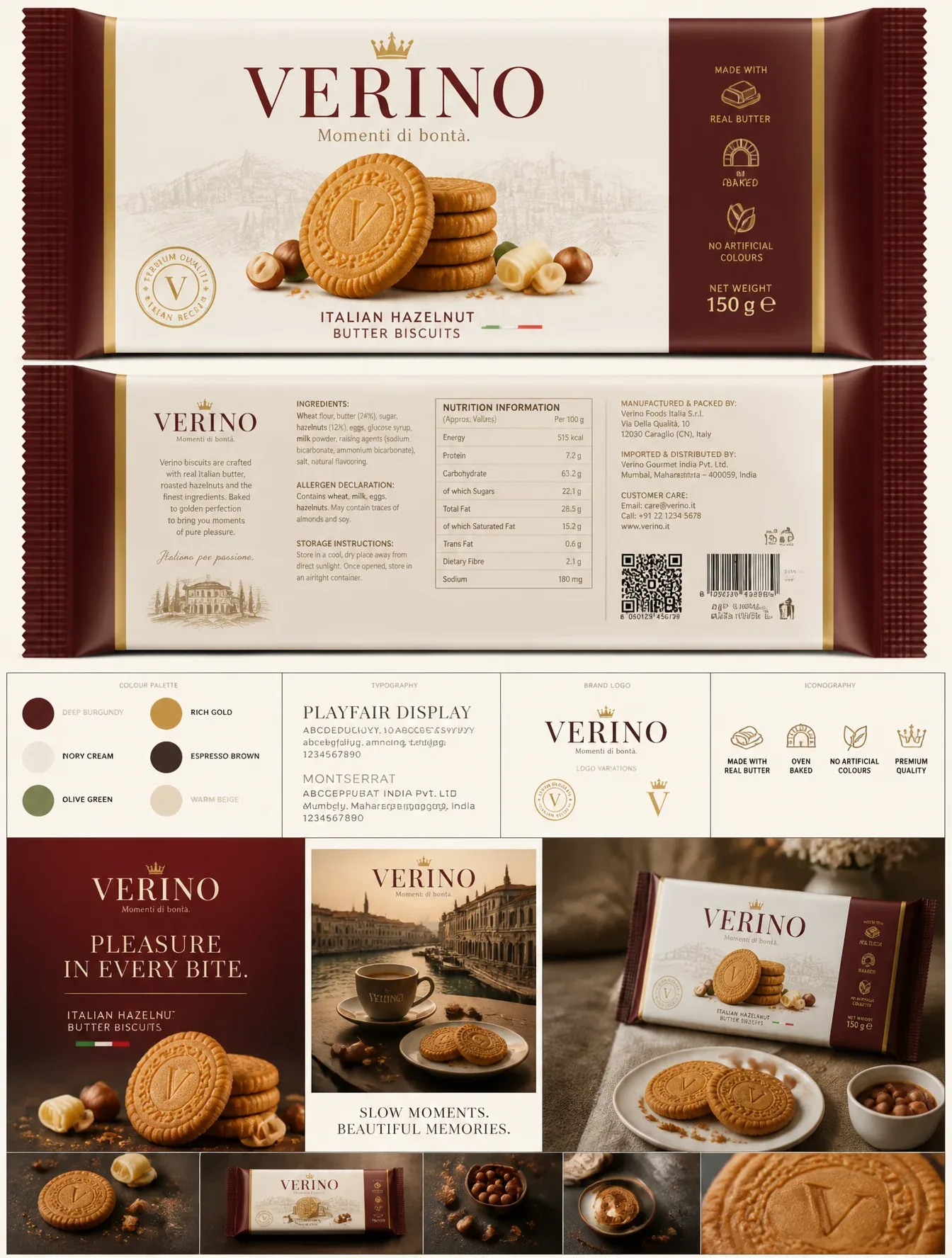
VERINO Luxury Biscuit Packaging Design AI Image Prompt
Create an ultra-premium 8K FMCG biscuit packaging and brand identity presentation for a fictional Italian-inspired luxury biscuit brand named "VERINO". The design should feel like a blend of Apple, Venchi, Loacker, Lavazza, and Gucci—minimal, elegant, timeless, and production-ready.Colour Palette: Deep Burgundy (#5A1F26), Ivory Cream (#F7F2EA), Rich Gold (#C89A3D), Espresso Brown (#3B2A23), Olive Green (#5F6B3D), Warm Beige (#E7DCC9). Use a matte finish with luxurious gold foil accents, embossed logo, and soft-touch packaging texture.Typography Style: Elegant high-fashion editorial typography. Logo inspired by Cormorant Garamond / Canela / Bodoni with refined luxury serif styling. Headlines inspired by Playfair Display. Body text inspired by Montserrat with clean premium spacing and perfect hierarchy.Brand Name: VERINOTagline: Momenti di bontà. (Pleasure in every bite.)Product: Italian Hazelnut Butter Biscuits.Packaging: Design both the front and back of the wrapper. Front features a large elegant VERINO logo with a subtle gold crown, hero stack of realistic buttery hazelnut biscuits, scattered hazelnuts, butter curls, fine biscuit crumbs, premium Italian-inspired illustration in the background, luxury quality seal, "Made with Real Butter", "Oven Baked", "No Artificial Colours", net weight 150 g, Italian flag accent, sophisticated composition with generous negative space.Back of Pack: Production-ready layout with realistic ingredients list, nutrition facts table, allergen declaration, storage instructions, barcode, QR code, batch number, MRP, manufacturer details, customer care, recycling icons, premium iconography, clean grid layout, perfectly aligned typography.Presentation Layout: Behance-quality brand board featuring:Front packagingBack packagingColour palette with HEX valuesTypography showcaseBrand logo systemProduct launch posterLuxury print advertisementLifestyle mockup with espresso coffee and biscuitsPremium flat lay product photographyLighting & Style: Studio-quality commercial lighting, luxury food photography, cinematic soft shadows, subtle reflections, realistic textures, ultra-sharp focus, photorealistic biscuits, premium print-ready packaging, Apple-style minimalism, Italian luxury branding, award-winning packaging design, Pentawards, Dieline Awards, Behance featured project quality, 8K ultra-detailed, photorealistic, professional FMCG packaging visualisation.
Content: Brand packaging design proposal for fictional VERINO Italian hazelnut butter biscuits; scenes include front/back wrapper and Behance-style brand board; style blends Apple/Gucci minimal Italian luxury; detailed specs for colors, typography, materials, lighting, composition; 8K ultra-detailed photorealistic lens.
Pros: Complete design system with reproducible colors/type/materials; packaging front/back and presentation layout thoroughly covered.
Cons: High element density risks output clutter; subjective terms like 'award-winning' rely on model interpretation.
Reference image: No obvious reference-image dependency
Source materials are collected from publicly accessible web pages. Contact us if a rights issue needs review. Copyright & Privacy