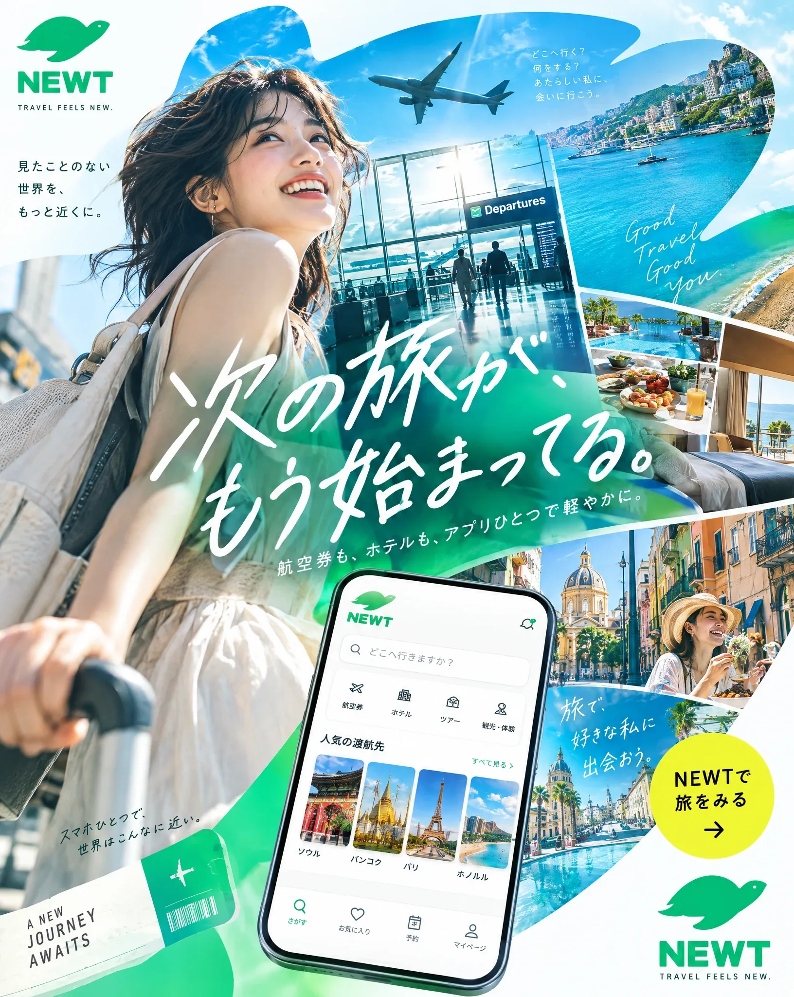
NEWT Travel App Vertical 4:5 Editorial Poster AI Image Prompt
You are a top-class advertising creative director, art director, travel photographer, editorial designer, and Japanese typography expert. Be sure to use the attached NEWT logo and produce a high-quality, live-action editorial poster in vertical 4:5 that works as a NEWT travel app ad. What this poster should aim for is not simply making a beautiful travel ad. It should make viewers stop their gaze the instant they see it on a smartphone and evoke the feelings of "I want to go on a trip," "I like this worldview," and "I want to keep watching on NEWT." 1. Overall tone of the image The overall impression should be bright / clear and airy / high saturation / urban / refined. Use NEWT Green as the base, and effectively add just 1–2 vivid colors from sky blue, turquoise, sunset orange, fluorescent yellow. Avoid the following directions: - Images centered on dark interiors - A gray-based, subdued impression - A look like a cheap package tour ad - A layout like an old travel flyer 2. Photographic expression and character design The core of the ad is high-quality live-action travel visuals. Strongly integrate the following elements within a single poster: - Traveler - Airport - Hotel - Cityscape - Sea - Food - App experience on a smartphone Compose the people using fictional Japanese or East Asian models. There is no need to resemble a celebrity. Emphasize natural expressions, natural skin, and natural hand gestures. For clothing, do not use ordinary work attire or safe, inoffensive clothes; use styling that stands out as a travel ad. The ideal look conveys the excitement of setting off on a trip and an urban, highly tuned-in lifestyle. 3. The composition must be "boldly deformed" Do not make a common ad that simply places the person, text, and logo in a straightforward arrangement. This poster needs a composition whose very shape stays in memory. The following designs are especially welcome: - Use the silhouette of the NEWT turtle logo as a giant frame or cut-out, and unfold the travel scenery inside it - Boldly divide the image with large circles, waveforms, ticket shapes, app card shapes, map lines, etc. - Do not align photos in simple rectangles; compose them with diagonals, curves, cut-outs, and overlaps - Slam giant Japanese typography against the photos, with the momentum of part of the characters being cut off outside the frame - Naturally overlay smartphone UI, air ticket cards, hotel cards, map pins, and flight lines as graphic elements - Avoid safe left-right splits; always create an incongruity that stops the gaze through offsets, margins, bleeds, and overlaps 4. Copy that must be included Main copy: 次の旅が、もう始まってる。 Sub copy: 航空券も、ホテルも、アプリひとつで軽やかに。 CTA: NEWTで旅をみる Small English text: TRAVEL FEELS NEW. 5. Handling of text In this poster, design Japanese typography as the most important visual element. Aim not just to let people read the text, but for the text itself to become the star of the image. The following treatments should be avoided: - A simple headline with white text just placed on the image - Treatment that simply pours in an existing font as-is - A look like a Canva template - Treatment resembling an LP first view - A cheap presentation like a discount banner Recommended text treatments are as follows: - Giant outline type - Ultra-bold gothic - Condensed (long-body) treatment - Combined use of vertical and horizontal typesetting - Bleed - Biting into the photo - Integration of typography with the people, scenery, and UI 6. How to use the logo Be sure to use the NEWT logo. However, do not simply stick it in a corner; make it function naturally in a way that blends into the overall structure of the poster. It needs to be recognizable as a brand, but avoid a state where only the logo floats. 7. The final level of finish to aim for The finished result should be of a quality that spans the following elements: - An urban travel campaign ad - The opening page of a travel feature in a highly tuned-in culture magazine - An airline's seasonal visual - A refined advertising expression for a hotel brand In other words, make it a bright, refined, high-budget-feeling, highly editorial travel ad. 8. NG items Absolutely do not go in the following directions: - A look like a cheap travel flyer - An air like an info-product banner - Unnatural characters with a strong AI-beauty feel - Overly ordinary business attire - Visuals centered on dark interiors - A composition where only price appeals stand out - Hard-to-read, broken Japanese - An amateur-looking layout where photos and text are disconnected - An overly safe left-right split composition
Content: Role-based vertical 4:5 ad poster; traveler/airport/hotel/city/sea/food/app scenes; bright, airy, high-saturation urban editorial style; bold deformed composition with crops, overlaps, turtle-logo framing; Japanese typography-led with copy, CTA, logo; many NG constraints.
Pros: Complete structure; clear style, composition, typography, and negative constraints; brand and copy are explicit.
Cons: Too many elements and limits may conflict; lacks a single visual focus, hard to execute.
Reference image: No obvious reference-image dependency; an attached NEWT logo is explicitly required.
Curated from publicly available creative examples. Prompts and commentary are edited and organized by this site. Please contact us with any rights concerns. Copyright & Privacy