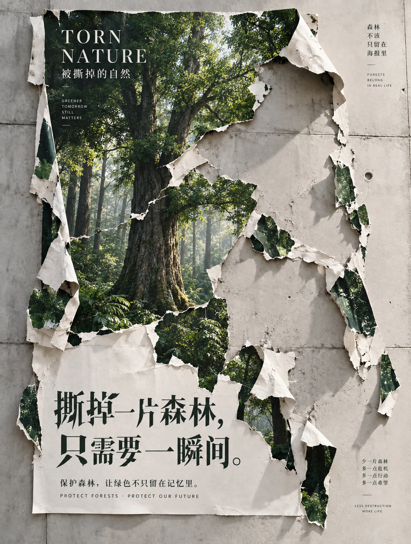
Realistic Torn Forest Poster Typography Refinement AI Image Prompt
Keep the original 3:4 composition, torn poster structure, wall position, green forest area, and all text content basically unchanged; only optimize texture and typography. Focus on optimizing the forest image in the poster: upgrade the trees, trunks, branches and leaves, and distant forest to a realistic natural photography texture, like an old-growth forest shot in a professional ecological documentary. Trunk structure should be realistic and thick, bark texture clear and natural; leaf size, density, and branch growth relationships should follow real plant patterns, avoiding AI-generated repetitive leaves, blurry clumps, or over-sharpening. The forest should have real spatial depth, with foreground trees clear and mid-to-far ground naturally entering slight atmospheric perspective. Sunlight should pass naturally through gaps in the canopy to create soft, realistic forest light; no exaggerated Tyndall effect, no dreamy fairyland feel. Comprehensively remove image noise and graininess. Wall, paper, and forest should all remain high-definition, delicate, and clean; no film grain, digital noise, matte grain, rough halftone dots, over-sharpening, or retro filters. The torn paper itself should retain real paper fibers, thickness, curled edges, and natural shadows, but the material should be delicate and clear; do not use noise to express texture. The overall result should achieve high-resolution commercial photography and high-end printed poster quality. Focus on redesigning the two lines of main copy below: '撕掉一片森林,只需要一瞬间。' Do not use the current ordinary, regular conventional Songti typography. Change it to custom Chinese font design with a contemporary art poster feel: overall a fusion of modern Songti and sharp Heiti, elongated and powerful letterforms, obvious rhythm in stroke weight, some horizontal and vertical strokes moderately extended, and carefully designed character size and letter spacing; very restrained 'tearing, missing, broken' structures can be integrated at the stroke edges of a very small number of characters, so the font itself echoes the concept of 'a forest being torn away,' but Chinese must first remain clearly legible. The two lines should form a more tension-filled asymmetrical editorial layout in size, line spacing, and starting position, like typography for an international design exhibition, art book cover, or fine public-service poster; no calligraphy, no brush lettering, no ordinary computer fonts, no flashy decorative type. 'Torn Nature / 被撕掉的自然' and the bottom auxiliary text should also have optimized letter spacing, size hierarchy, and whitespace, making the whole type system more unified, restrained, and refined. Final effect: realistic ecological photography × torn paper installation art × contemporary graphic design. The image should be quiet, breathing, and designed; the forest realistic and natural, the paper delicate, and the typography the second visual focus. No AI feel, no over-aging, no cluttered elements. It would be wonderful for the characters '撕掉一片森林' themselves to have slight missing strokes/tears—not adding effects to the letters, but actually making a few strokes look as if a small part has been torn away, so the typography relates to the theme.
Content: Structure: original-image base + realistic forest texture + paper material + typography redesign; covers composition, light, material, layout hierarchy.
Pros: Detailed constraints help avoid AI repetition and noise; typography echoes tear theme.
Cons: Many constraints may conflict; custom type is hard to render reliably.
Reference image: Clearly relies on reference image: keep original composition, wall position, and text content.
Curated from publicly available creative examples. Prompts and commentary are edited and organized by this site. Please contact us with any rights concerns. Copyright & Privacy