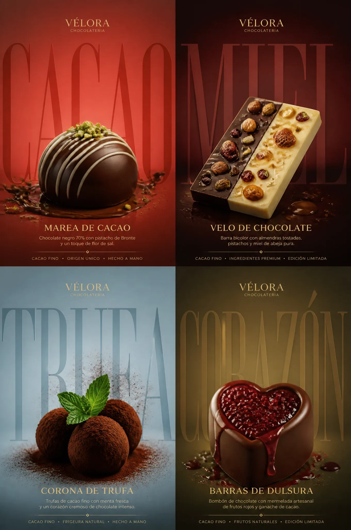
VÉLORA Luxury Chocolate Poster AI Image Prompt
Create a high-end horizontal advertising poster with four panels (2x3) for a newly created luxury artisan chocolate brand VÉLORA. The final design should look like a top-tier chocolateria ad: bold, minimalist, with the product as protagonist, collector quality, and unmistakably exclusive. Use a strict four-panel system with absolute visual unity, but each panel must feature a distinctive bonbon or chocolate bar with a stronger personality, more striking presentation, and more memorable premium ingredients. Main composition: Use a strict 2x3 grid. Each panel follows the same hierarchy: 1. A large bold background text fragment or a giant cut-out letter, 2. A protagonist artisan chocolate placed lower center, 3. An elegant Spanish chocolate title, 4. A brief supporting description below, 5. A minimal info line or footer with the brand style. All four panels must have identical rhythm and spacing, like a unified luxury campaign. Brand direction: Use my self-designed gourmet quality brand with a refined Western luxury identity, e.g., «VÉLORA CHOCOLATERIA». Use an elegant, exclusively Spanish brand with a sober, high-end logo. The brand system should convey modernity, exclusivity, purity, and impeccable design. Star bonbon selection: Create four high-end gourmet bonbons, each with a more pronounced high-chocolateria identity than typical chocolate bonbons: Panel 1: Dark chocolate bonbon with white chocolate lines Panel 2: White and black chocolate bar with nuts and honey Panel 3: Fine cocoa truffles with mint leaves Panel 4: Large heart-shaped bonbon with red berry jam Each panel should feel like a true star dish of a world-class Western chocolateria: recognizable, visually special, luxurious, not generic food photography. Color worlds: Each panel has its own refined chromatic atmosphere while maintaining campaign unity: Panel 1: coral red, ivory, saffron gold Panel 2: deep burgundy, charcoal brown, toasted bronze Panel 3: pale silver blue, citrus cream, soft grass green Panel 4: olive cream, truffle brown, dark moss, hazelnut beige Each panel must be distinctive yet synchronized within the premium VÉLORA universe. Culinary realism: Represent each dish with extreme realism and premium tactile details: blue lobster shell shine, saffron butter luster, intense wagyu marbling, foie gras caramelization, black truffle surface texture, sole meat layers, beurre blanc sauce shine, risotto creaminess, boletus texture, grated parmesan translucency, and refined reflections on plate edges. Each star dish should be jewel-like and immediately appetizing. Lighting logic for each dish: Let each dish shine like a luxury object under precise commercial lighting. Ingredient logic (Cream Halo Transit): Maintain the same four-panel structure, but reduce each panel to only 2–3 essential elements for a more iconic, less cluttered dish: Panel 1: melted cocoa with pistachio slices Panel 2: white and black cocoa drops Panel 3: bitter cocoa powder as a cloud Panel 4: passion fruit ganache as a backdrop No superfluous elements or excess garnishes; secondary ingredients should enhance the main dish, not compete. Large typography logic: Enlarge the giant background typography so each word fragment occupies nearly the whole panel and is cropped by the edges. The typography should feel monumental, graphic, and architectural. Typography-background fusion: The large letters must be deeply integrated into the background color field via tonal blending, subtle texture continuity, soft depth layers, brightness attenuation, shadow overlay, and atmospheric integration. They should appear embedded, not superimposed. Let the chocolates sit in front of the giant typography, which blends with the background. Slight vapor, sauce shine, plate reflections, or ingredient sparkles may cross in front of the letters to reinforce integration. Headline system: Each panel includes a smaller elegant headline, such as: “MAREA DE CACAO” “VELO DE CHOCOLATE” “CORONA DE TRUFA” “BARRAS DE DULSURA” These smaller headlines remain elegant and readable, while the large background text is the main graphic element. Lighting: Use high-end commercial lighting, soft and delicate. Let food surfaces shine with subtle reflections.
Content: Uses a 2x3 four-panel grid with a hierarchy per panel: large backdrop text, chocolate subject, Spanish title, description and footer; includes brand colors, ingredients, textures, lighting, and typography fusion to form a unified luxury ad formula.
Pros: Systematic structure for batch generation; detailed and instructive.
Cons: Highly prescriptive, may limit creativity; some textures are loosely related to chocolate.
Reference image: No obvious reference-image dependency
Source materials are collected from publicly accessible web pages. Contact us if a rights issue needs review. Copyright & Privacy