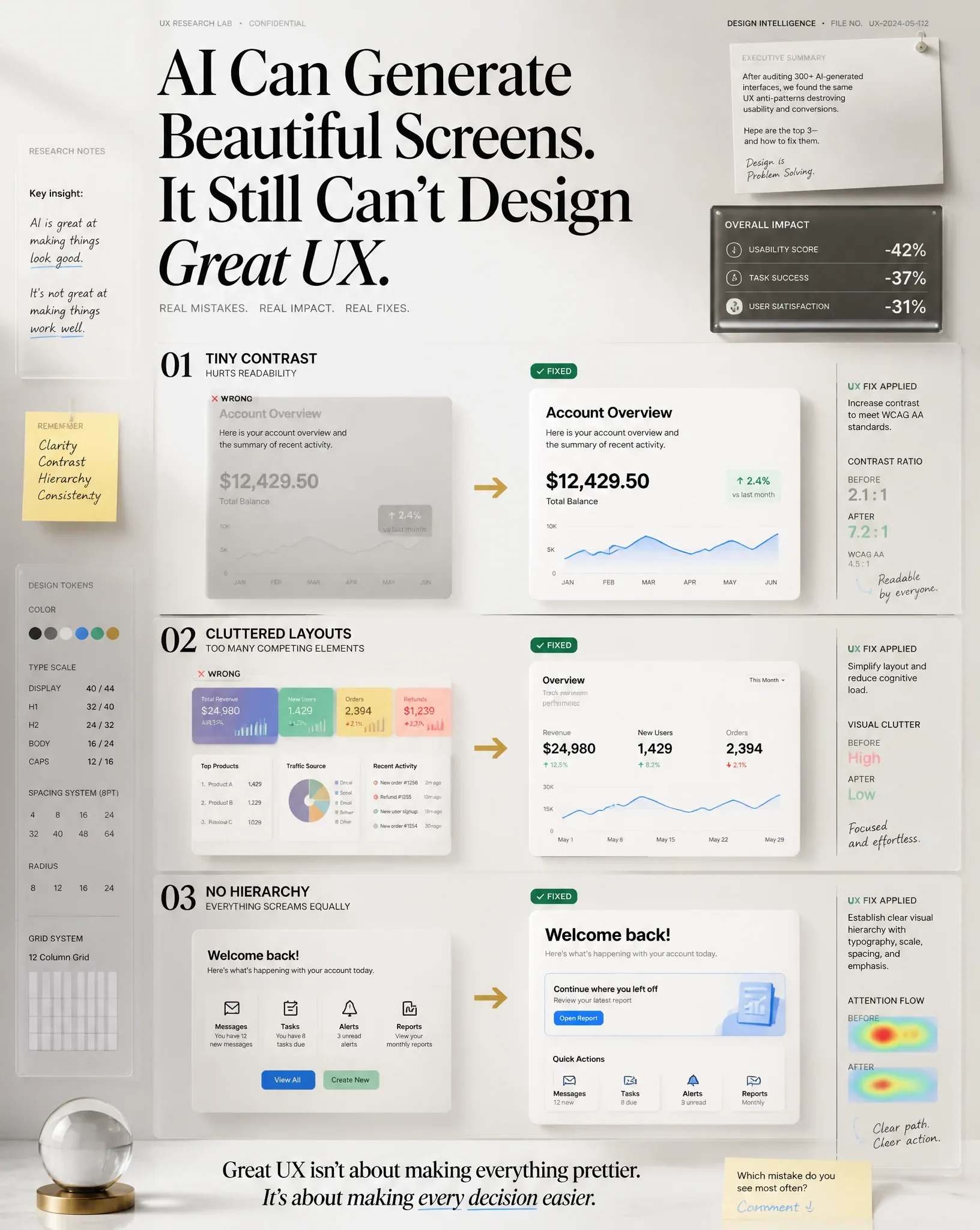
3 UX Mistakes in AI-Generated Designs AI Image Prompt
Create a premium LinkedIn educational visual (1080 × 1350 px, 4:5 vertical) designed to stop scrolling instantly. TOPIC: 3 UX Mistakes I See in AI-generated Designs CONTENT TYPE: Educational FORMAT: Text + Image DOMAIN: Micro-Learn SCRIPT: Call out the three most common AI-generated UX mistakes: 1. Tiny contrast that hurts readability. 2. Cluttered layouts with too many competing elements. 3. Zero visual hierarchy where everything screams equally. For each mistake, immediately show the improved version with one practical UX fix. OPENING HOOK (Large Editorial Typography) "AI Can Generate Beautiful Screens.It Still Can't Design Great UX." The hook must dominate the composition and immediately create curiosity. VISUAL STRUCTURE Center the design around three cinematic comparison panels. Each panel contains LEFT Wrong Version (desaturated, messy, faded) RIGHT Fixed Version (clean, premium, glowing) Panel 01: Tiny Contrast - Small gray text on gray background → transformed into accessible high contrast typography Panel 02: Clutter - Too many cards, too many colors, no spacing → transformed into minimal Apple-inspired layout Panel 03: No Hierarchy - Everything same size, buttons compete equally → transformed into perfect typography scale, spacing, emphasis and visual hierarchy Add animated directional arrows connecting Wrong → Fixed. Blend together the following premium visual concepts naturally: CINEMATIC EDITORIAL KNOWLEDGE WALL, DESIGN CONSPIRACY FILE, APPLE KEYNOTE MEETS BRUTALISM, FUTURISTIC OPERATING SYSTEM UI, DOCUMENTARY STORYTELLING, CEO DESK INTELLIGENCE BOARD, VISUAL THINKING MAP, AI STRATEGY WAR ROOM, EXECUTIVE DASHBOARD, 3D INFOGRAPHICS, 3D GLASSMORPHISM, XRAY UX METRICS, BEFORE vs AFTER TRANSFORMATION, GEN Z INTERNET DESIGNER, Luxury SaaS Editorial, Swiss Editorial Layout, Minimal Apple Design Language, Floating Research Notes, Sticky Notes, Handwritten UX annotations, Premium grids, Micro typography, Strategic arrows, High-end UI cards, Glass UI, Soft glow, Editorial labels, Research snippets, Design system tokens, Accessibility metrics, Contrast ratio visualization, Spacing measurements, Grid overlays, Typography scale indicators, Heatmaps, User eye tracking, Interaction paths, Floating UX metrics. Create an environment that feels like an elite UX consultant is presenting confidential research inside Apple's design lab. Everything feels expensive. Nothing feels like generic AI art. COLOR SYSTEM LIGHT MODE: Warm White, Soft Beige, Off White, Slate Gray, Apple Blue, Emerald, Champagne Gold accents, Dark typography, Very soft shadows, Minimal gradients DARK MODE: Matte Black, Graphite, Dark Navy, Electric Cyan, Neo Mint, Apple Blue, Emerald Glow, Purple Ambient Light, Floating volumetric lighting TYPOGRAPHY: Large luxury editorial headline, Swiss typography, Apple keynote presentation style, Massive whitespace, Perfect alignment, Premium hierarchy, Small research labels, Tiny metadata, Micro captions, Bold section dividers CINEMATIC DETAILS: Volumetric light, Depth of field, Floating particles, Glass reflections, Editorial shadows, Premium realism, Ultra sharp focus, Layered composition, Magazine cover quality, Luxury consulting presentation BOTTOM INSIGHT: "Great UX isn't about making everything prettier.It's about making every decision easier." SOCIAL CTA: Small elegant footer "Which mistake do you see most often?" "Comment ↓" Rendering Style: Hyper realistic, Editorial, Ultra premium, High-end product design, Apple event presentation, Behance featured project, Awwwards winner, Dribbble trending, Visual hierarchy masterpiece, Cinematic lighting, Ultra clean, Professional, 8K, Photorealistic, No watermark, No logo, No mockup device frame, Ready for LinkedIn.
Content: The prompt centers on a vertical LinkedIn educational visual: theme & script → hook → three before/after panels (wrong vs fixed) → blended visual concepts → dual color systems → typography & cinematic details → bottom insight & CTA → rendering style. Emphasizes composition, lighting, materials, camera, and aspect ratio.
Pros: Clear structure and explicit layering; rich details for precise generation.
Cons: Too many stacked concepts may dilute core visuals; some descriptions overlap.
Reference image: No obvious reference-image dependency
Source materials are collected from publicly accessible web pages. Contact us if a rights issue needs review. Copyright & Privacy