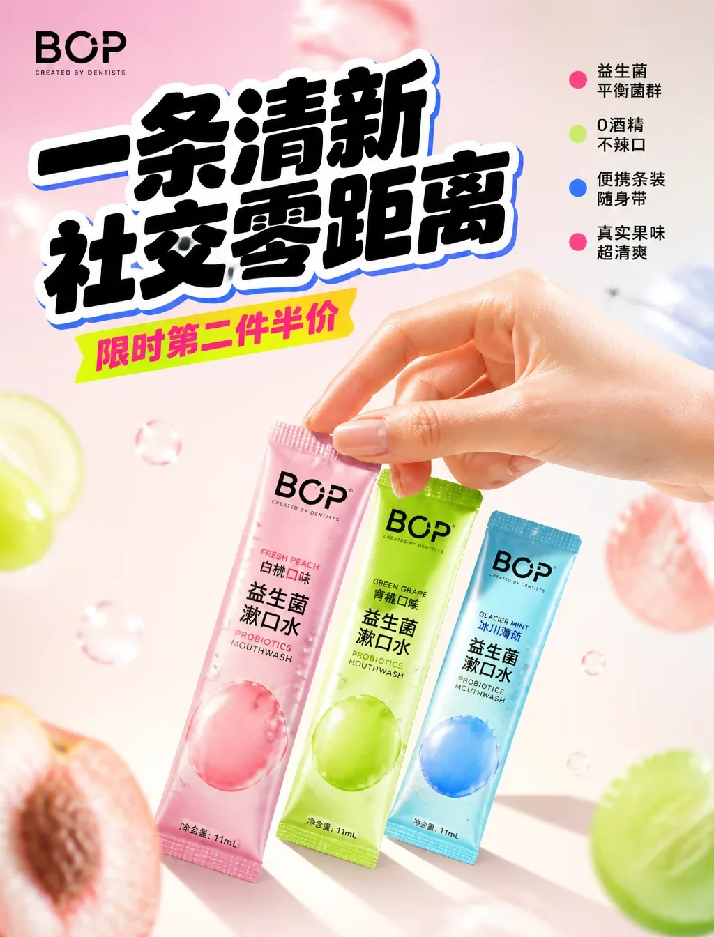
BOP One Fresh, Social Zero Distance AI Image Prompt
BOP: One Fresh, Social Zero Distance [Format] High-end FMCG social media advertising, 4:5 vertical, Instagram key visual, commercial product ad, 4A-level art direction, Behance homepage quality, 8K UHD, hyper-realistic, photography × graphic design fusion, zero cheap AI feel, zero generic product mockups, zero floating product renders. [Brand Positioning] This is not a mouthwash poster, but a BOP brand promotional campaign centered on "social satisfaction". The product must be in an active "being used" state, establishing immediate trust and scene association. The visual needs to present: the campaign quality created by BOP internal creative team in collaboration with e-commerce promotional art directors. Viewers instantly understand: portable, fruity, probiotics, limited-time satisfaction. [Visual Composition] The BOP probiotic strip mouthwash set is the absolute visual core, occupying about 45% of the frame. Three different flavors (white peach/green grape/glacier) are arranged in a fan shape on a cream-colored tabletop. A young, energetic hand enters naturally from the right side of the frame, index finger and thumb lightly pinching a white peach mouthwash strip, while the other three fingers rest naturally on the tabletop. All five fingers fully visible without crossing, each finger anatomically correct, knuckles clear, nails neatly trimmed with natural nude luster. The packaging surface has realistic fruity shine and fine water droplets. All elements are built around BOP's classic macaron color palette. [Background Design] Cream white gradient background, accented with soft-focus macaron color light streaks (pink/green/blue), foreground has soft-focus fruit slice bokeh, background has soft-focus bubble particles for depth. Commercial-grade warm light bloom, subtle fruity bokeh floating in air, premium matte reflections. Pure advertising-level fashion social studio setting. [Product Presentation] Real BOP probiotic strip mouthwash, label fully visible, packaging ultra sharp, frosted bag micro details clear, realistic fruit color reflections, condensation droplets, high-end commercial retouching. [Typography Hierarchy & Font System · Promotional Sensory Stimulation Version] Top left: BOP official logo, small and refined. Main title: Fresh One, Social Zero Distance — ultra-bold rounded inflated black style (reference e-commerce promotional "inflated font"), extremely heavy weight, slightly rounded edges, subtle 3D thickness and contrasting outline (white peach pink vs. electric blue), tight letter spacing -8%, text slightly tilted upward 3°-5° to create dynamic forward motion, occupying the absolute visual focus of the upper half. Subtitle: Limited time: second item half price — medium weight rounded sans-serif, all Chinese bold, letter spacing +5% airy arrangement, with slight fluorescent background block to create price urgency. Right side benefit points (minimal icon system): ● Probiotics balance flora ● 0 alcohol no spicy ● Portable strip for on-the-go ● Real fruity ultra refreshing. Bold rounded sans-serif, small size, left with high-saturation dot symbols, each line 4-6 characters punchy, clean and highly legible. [Graphic System] Apple-level minimalism, HEYTEA-level youthful confidence, e-commerce promotion-level visual stimulation. Strong visual hierarchy, perfect negative space, dopamine FMCG layout, mobile-first readability, all elements aligned to a professional advertising grid. [Lighting System] High-end commercial soft light, overhead large warm softbox, macaron high-saturation rim light on package edges, controlled soft highlights, extremely soft shadows, warm glow around product. [Camera Parameters] Hasselblad H6D-400C, 85mm lens, f/4, ISO 100, studio commercial photography, ultra-sharp focus, professional advertising retouching. [Colors] White peach pink, green grape green, glacier blue, fluorescent pink accents, electric blue outline, cream white base. [Emotions] Satisfaction, dopamine, limited time, shopping rush, energy, social, fruity, youthful. [Technical Constraints / Hand Correction] anatomically correct human hand, exactly 5 fingers, natural finger proportions, no extra fingers, no fused fingers, no missing fingers, no finger deformities, clean knuckle definition, visible fingernails, no substance obscuring finger joints, no liquid covering fingertips, hand and product in clear spatial relationship, photorealistic skin texture, professional advertising retouching on hands. [Final Effect] A world-class BOP promotional advertising poster, presenting a realistic global young oral care campaign quality, combining hyper-realistic product photography, realistic human-machine interaction, luxury commercial lighting, dopamine e-commerce graphic design, strong brand recognition, explosive typography hierarchy, and high-conversion social media aesthetics.
Content: Structure: format + brand positioning + composition (product 45%, hand interaction) + background + product details + typography hierarchy + graphic system + lighting/camera + color/emotion + hand-fix constraints.
Pros: Clear brand and selling points, full visual hierarchy; hand-correction details reduce AI deformity risk.
Cons: Too many elements may overwhelm generation; some terms (e.g., 'inflated font') rely on Chinese context.
Reference image: No obvious reference-image dependency
Source materials are collected from publicly accessible web pages. Contact us if a rights issue needs review. Copyright & Privacy