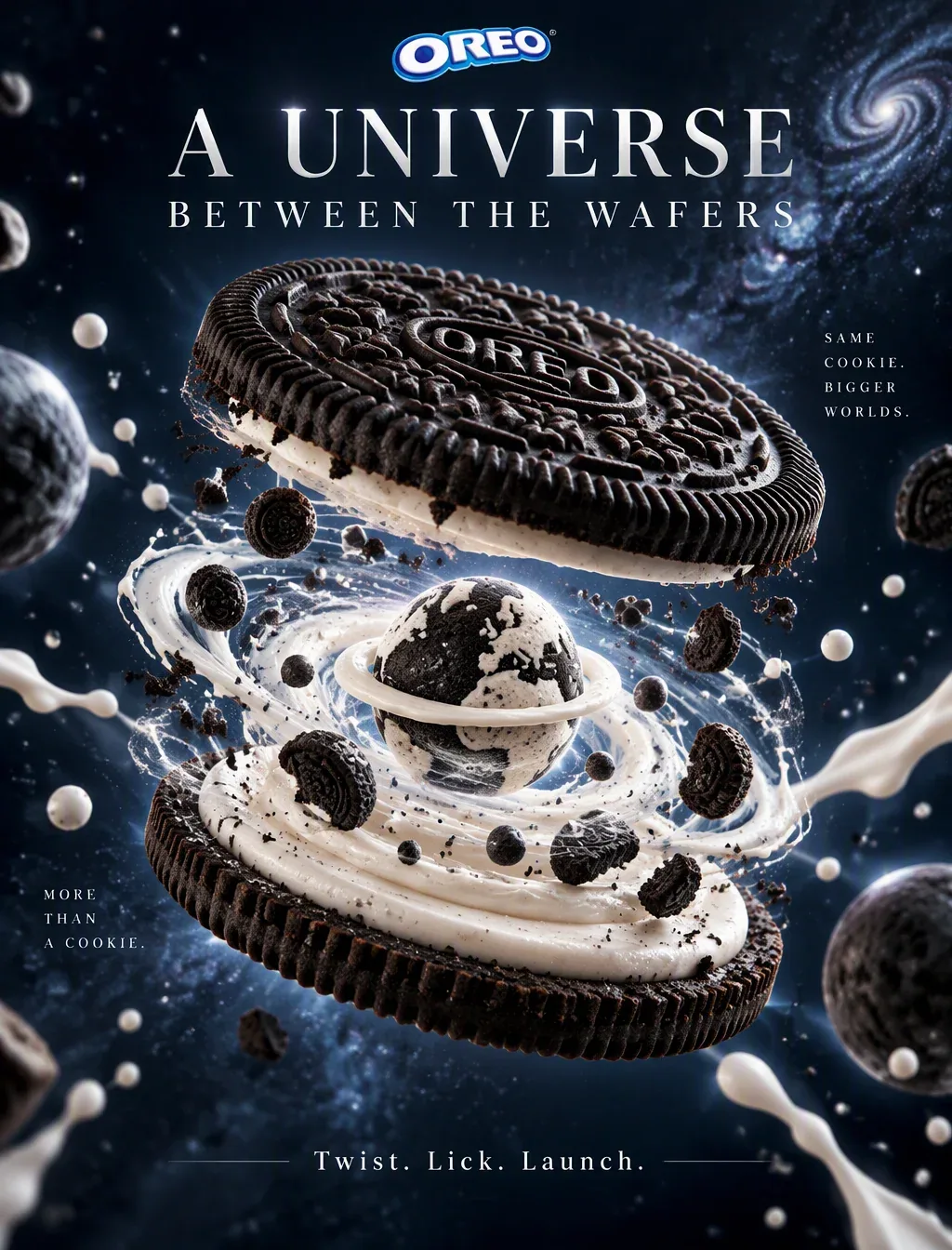
OREO Filling Black-and-White Miniature Universe AI Image Prompt
[Role] World-class FMCG commercial photographer + Mondelēz brand creative director + top advertising retoucher, focused on classic biscuit brand visual marketing; output must achieve international first-tier brand ad campaign quality. [Brand DNA Ratio] 55% playful surprise: the joyful ritual of twist, lick; 25% premium FMCG realism: professional product-photography-level realistic texture; 20% cosmic fantasy storytelling: black-and-white two-tone miniature universe. [Core Creative] “Twist open and it's a universe”: an OREO is gently twisted open, and from the cream filling rises a black-and-white two-tone miniature universe—mini milk planets, suspended biscuit fragments, cream nebula slowly rotating, as if the filling hides an entire black-and-white dessert fantasy space. [Product Fidelity · Highest Priority] 1. Absolute product accuracy: - Two classic deep-black cocoa biscuits, with official embossed pattern on the surface completely accurate - White cream filling thickness consistent with the real product - Crisp granular texture on biscuit edges clearly visible 2. State details: - Cross-section layers at the moment of twisting open (biscuit + cream) - Dynamic moment of tiny crumbs splashing - Perspective relationship of the miniature universe surging out from the filling ⚠️ No structural errors or invented details allowed; must be completely consistent with the real product. [Scene Environment] Deep blue-black gradient studio background, floating milk drops, biscuit fragments, and star-like light spots, creating a mysterious fantasy space atmosphere. [Lighting System] Dramatic premium lighting, side-backlight outlines the product silhouette, delicate crisp highlights on biscuit surface, deep shadows + star-like rim light. [Composition Specs] - Aspect ratio: 4:5 vertical (Instagram hero placement) - Focal length: 85mm macro feel - Composition: hero-centered product - Negative space: luxury negative space, reserving breathing room for copy [Copy Layout] - Headline: A UNIVERSE BETWEEN THE WAFERS - CTA: Twist. Lick. Launch. Typography requirements: clean, modern, premium font; headline prominent and placed above; CTA subdued and placed at bottom. [Image Quality Standard] ultra photorealistic / 8K / premium retouch (no noise, no flaws, no AI traces) [Execution Checklist] ✓ Product structure completely consistent with real OREO ✓ Mood matches 55/25/20 DNA ratio ✓ 4:5 vertical, 85mm, centered composition ✓ Includes headline and CTA copy ✓ Deep blue-black studio + floating milk/biscuit crumbs/starlight elements ✓ 8K ultra-realistic commercial retouch quality
Content: Structure: role, brand DNA ratio, core concept, product fidelity, scene, lighting, composition (4:5/85mm/centered/negative space), copy layout, quality and checklist; formula = brand narrative + product accuracy + commercial photo parameters.
Pros: Modular, explicit parameters for brand tone and execution.
Cons: Too long and multi-objective; model may miss details. Official pattern/copy errors likely.
Reference image: No obvious reference-image dependency
Curated from publicly available creative examples. Prompts and commentary are edited and organized by this site. Please contact us with any rights concerns. Copyright & Privacy