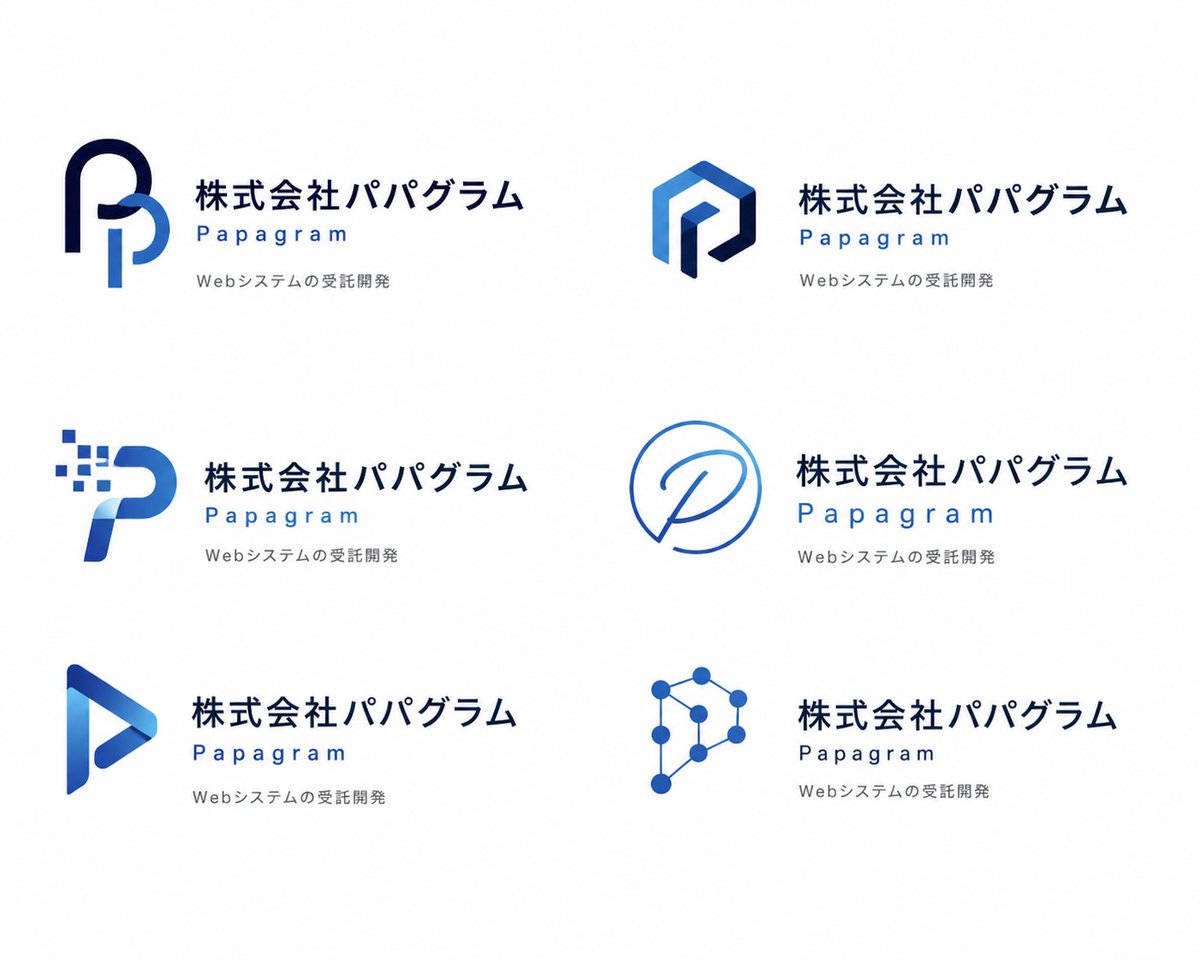
Papagram Logo Concept Board AI Image Prompt
Type: logo concept presentation board; Style: clean modern corporate branding sheet on a pure white background; Brand: company name in Japanese: 株式会社パパグラム, brand name in English: Papagram, tagline in Japanese: Webシステムの受託開発; Visual direction: mood (cool, professional, minimal, tech-oriented, polished), palette (deep navy, royal blue, light azure), typography (bold Japanese sans-serif for the company name, widely spaced geometric sans-serif for the English brand name, small light gray sans-serif tagline); Layout: grid (2 columns, 3 rows, 6 total), sections include: top-left logo (rounded monogram P made from two thick ribbon-like strokes, dark navy outer arch and lighter blue inner vertical curve), top-right logo (faceted hexagonal monogram P, angular geometric mark with gradient blue faces and dark navy inner stroke), middle-left logo (digital pixel P, curved blue letterform with a cluster of 8 small square pixels dissolving from the upper left), middle-right logo (single-line circular emblem, thin blue outline forming a speech-bubble-like circle with a handwritten P inside), bottom-left logo (triangular play-button P, glossy folded ribbon shape with blue gradient and hollow center), bottom-right logo (network-node P, constructed from 8 circular nodes connected by thin lines into a polygonal tech symbol); Text placement: for each of the 6 concepts, the icon is on the left and the text block is on the right; Spacing: wide margins, generous whitespace, evenly distributed concepts with consistent alignment; Repeated text block: 6 total, structure: large Japanese company name on one line, English brand name below in blue with wide letter spacing, small gray Japanese tagline on the third line; Rendering: finish (flat vector logo mockup), lighting (none, studio-flat graphic presentation), shadows (none), detail (crisp edges, high-resolution brand proposal sheet).
Content: Formula: brand concept board = grid layout (2 cols x 3 rows) + brand info (names, tagline) + visual direction (cool tones, professional, minimal, tech) + typography specs + 6 icon+text block combos.
Pros: Clear structure, rich details, easy to customize and extend styles.
Cons: Fixed layout lacks flexibility; complex icon designs may cause generation errors.
Reference image: No obvious reference-image dependency
Curated from publicly available creative examples. Prompts and commentary are edited and organized by this site. Please contact us with any rights concerns. Copyright & Privacy