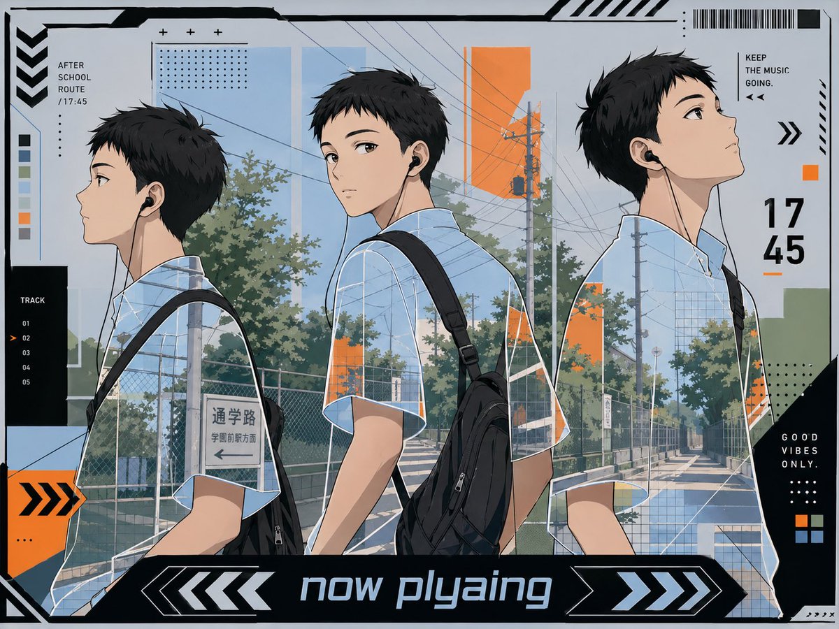
Three views music poster: school boy walking home AI Image Prompt
A stylish anime illustration designed like a futuristic music player poster, showing 3 views of the same high-school boy walking home in a quiet suburban Japanese street at late afternoon. The character is a slim handsome teenage boy with short tousled black hair, light skin, and black wired earbuds, wearing a pale blue short-sleeve check-pattern school shirt and a black backpack slung over one shoulder. Arrange him in 3 large overlapping side-profile figures across the image from left to right, each showing a slightly different walking pose and angle, with his face intentionally obscured by a soft blurred rectangular block. The background is a sunlit residential school-route road with utility poles, dense overhead power lines, chain-link fences, trees, sidewalk shadows, and a visible Japanese street sign reading 通学路 and 学園前駅方面. Use a clean cool palette of light blue, gray, black, white, and muted green, accented with bright orange geometric blocks. Frame the image as a graphic design composition with dense UI-like overlays, including a large bottom banner reading now playing, a large right-side time display reading 17 45, a top-left label reading AFTER SCHOOL ROUTE / 17:45, a left vertical track list labeled TRACK with 5 numbered entries 01, 02, 03, 04, 05 and 02 highlighted, a top-right phrase reading KEEP THE MUSIC GOING., and a bottom-right black panel reading GOOD VIBES ONLY. Add barcode-like stripes, arrows, chevrons, dotted grids, thin technical lines, cropped corner borders, and layered translucent panels for a modern posterized techno-aesthetic. Make it feel like an ikemen anime playlist cover, calm, urban, fashionable, and cinematic.
Content: Subject (3 side-profile views of high-school boy) + Background (Japanese suburban street) + Style (cyber music player poster, graphic design + UI overlays) + Composition (left-to-right overlapping) + Lighting (late afternoon sunlight) + Color (cool palette with light blue/gray/black/white/green, orange accents) + Material (technical lines, translucent panels, barcode) + Lens (no specific lens, multiple angles) + Aspect ratio (horizontal).
Pros: Rich visual hierarchy, natural fusion of illustration and UI design
Cons: Dense elements may distract from subject; face blur reduces emotional connection
Reference image: No obvious reference-image dependency
Curated from publicly available creative examples. Prompts and commentary are edited and organized by this site. Please contact us with any rights concerns. Copyright & Privacy