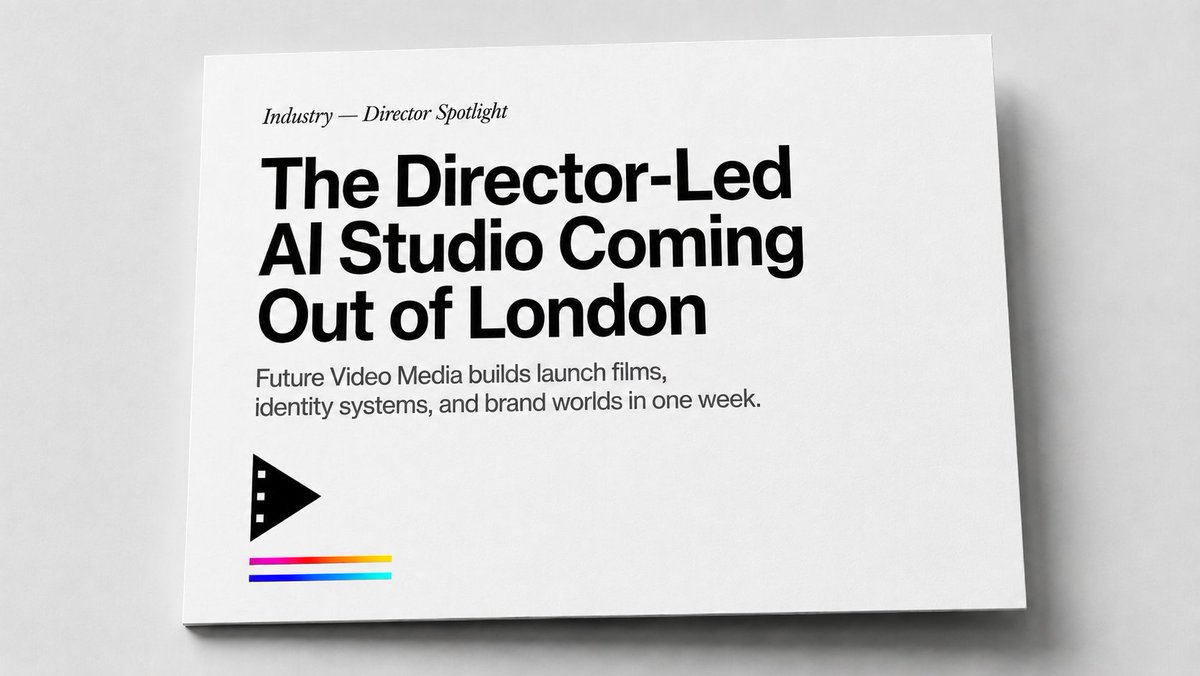
Minimalist magazine cover mockup AI Image Prompt
Create a realistic editorial print mockup photographed from above at a slight angle: a single white landscape-format card or magazine cover lying on a pale gray tabletop, with soft studio lighting, subtle paper texture, a thin shadow under the lower and right edges, and lots of clean negative space. The design is minimalist black-and-white with a small color accent. Place all typography flush left in the upper-left quadrant: a small italic serif kicker reading "Industry — Director Spotlight", then a very large bold black modern sans-serif headline on three lines reading "The Director-Led AI Studio Coming Out of London", followed by a smaller gray-black sans-serif subheading on two lines reading "Future Video Media builds launch films, identity systems, and brand worlds in one week.". In the lower-left area beneath the copy, add exactly 1 black geometric film/play icon: a right-pointing triangular play symbol with three small square film perforations along its left edge. Under the icon add exactly 3 thin horizontal color stripes, stacked with small gaps: top stripe magenta fading into red and yellow, middle stripe deep blue, bottom stripe cyan/teal. Keep the card edges crisp, the background neutral, the overall style like a premium magazine feature cover or agency one-sheet, with no extra text, no people, no watermark, and no additional logos.
Content: Subject: white landscape card/cover on pale gray table, slightly angled overhead; Scene: studio soft lighting; Style: minimalist B&W with small color accent; Composition: text upper-left, icon lower-left, ample negative space; Lighting: soft, thin shadow on lower/right edges; Color: B&W main, color stripes (magenta/red/yellow/deep blue/cyan); Material: paper texture; Lens: overhead slight angle; Aspect: landscape.
Pros: 1. Specific details (texture, shadow, icon) easy to generate; 2. Parametric text reusable.
Cons: 1. Shadow/icon placement needs precision; 2. Stripe gradient may add difficulty.
Reference image: No obvious reference-image dependency
Curated from publicly available creative examples. Prompts and commentary are edited and organized by this site. Please contact us with any rights concerns. Copyright & Privacy