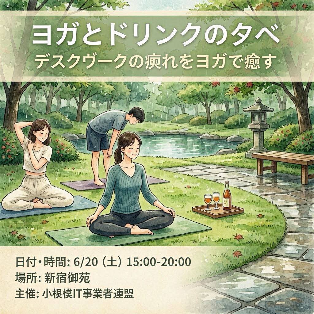
Yoga & Drinks Evening Flyer AI Image Prompt
Goal: Create a square illustrated Japanese event flyer for ヨガとドリンクの夕べ, promoting an outdoor yoga-and-drinks evening for desk workers. Canvas: 1:1 square flyer, soft watercolor illustration, calm natural palette, hand-painted texture, gentle ink outlines, inviting wellness-event atmosphere. Layout: Use three horizontal zones: a translucent pale green title banner across the top, a large central garden illustration, and a cream information panel along the bottom. Keep all typography bold, clean, white or dark charcoal, with subtle drop shadows on the headline for readability. Top text: Large Japanese headline: ヨガとドリンクの夕べ. Beneath it, smaller Japanese subtitle: デスクワークの疲れをヨガで癒す. Central illustration: A peaceful Japanese-style park beside a pond, with leafy trees, shrubs, stepping-stone path, a stone lantern on the right, a simple wooden bench, rocks, grass, and a few scattered red leaves. Show exactly 3 yoga participants on mats: 1 seated woman in the foreground wearing a teal ribbed long-sleeve top and dark pants, sitting cross-legged with relaxed hands on knees; 1 woman on the left wearing a white sleeveless top and loose white pants, seated cross-legged and stretching one arm behind her head; 1 man in the rear wearing a light gray T-shirt and navy shorts, barefoot on a mat, bending forward with hands near knees. Add exactly 1 wooden drink tray on the grass to the right of the foreground mat, containing exactly 3 drink items: 2 stemmed glasses filled with amber/orange drinks and 1 tall bottle with a warm-colored label. Bottom information panel: Cream rectangle with three bold Japanese lines, aligned left: 日付・時間: 6/20(土)15:00-20:00, 場所: 新宿御苑, and 主催: 小規模IT事業者連盟. Constraints: Preserve the Japanese text exactly as written in the parameter defaults, make the flyer look like a finished event poster rather than a photo, avoid logos or watermarks, keep the faces simple and unobtrusive, and do not add extra people, extra drinks, or extra text.
Content: Structure: goal (square illustrated flyer) + canvas (1:1, watercolor, calm palette) + layout (three horizontal zones: top banner, central illustration, bottom info panel) + detailed central scene (park, 3 yoga participants, drink tray) + parameterized text.
Pros: 1. Clear structure, precise details, easy to reproduce. 2. Parameterized text allows easy customization of event info.
Cons: 1. Overly detailed, limiting creative freedom. 2. Strict constraints on element count and placement.
Reference image: No obvious reference-image dependency
Curated from publicly available creative examples. Prompts and commentary are edited and organized by this site. Please contact us with any rights concerns. Copyright & Privacy