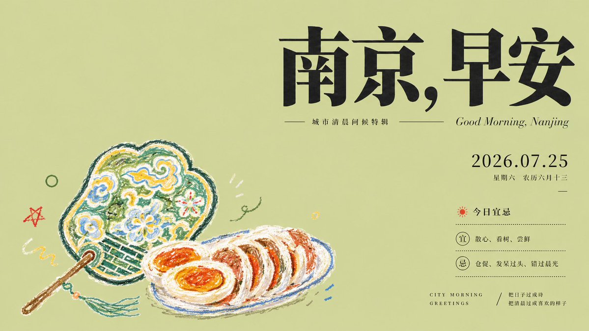
Nanjing, Good Morning: City Morning Greetings AI Image Prompt
Create a literary magazine cover style poster about Nanjing, good morning. Use a wide horizontal 16:9 canvas with a muted pale olive-green background and lots of quiet negative space. Place the main typographic weight in the upper-right: huge black Chinese calligraphic serif characters reading “南京,早安”, thick, elegant, slightly oppressive like inked magazine masthead typography. Directly beneath the headline, add a thin horizontal rule on both sides of a small Chinese subtitle reading “城市清晨问候特辑”, and to the right add italic English text “Good Morning, Nanjing”. On the right-middle, set the date 2026.07.25 in refined black serif numerals, with smaller Chinese text below: “星期六 农历六月十三”, then a tiny centered dash. Below that, create a compact almanac-style information block with a small red sun icon and the label “今日宜忌”, dotted divider lines, and exactly 2 circular badges: one labeled “宜” followed by “散心、看树、尝鲜”, and one labeled “忌” followed by “仓促、发呆过头、错过晨光”. At the bottom-right, add spaced small caps English “CITY MORNING GREETINGS”, a diagonal slash, and a small Chinese quote: “把日子过成诗 / 把清晨过成喜欢的样子”. In the lower-left, depict the theme object as naive crayon drawing rather than realism: exactly 2 illustrated food objects, a decorative handheld fan and a plate of sliced salted duck with orange egg-like centers. The fan should be ornate, rounded, outlined in dark green, filled with childlike swirls, flowers, cloud motifs, yellow, blue, white, and green crayon scribbles, with a brown handle and teal tassel. The plate should be a simple blue-outlined oval containing several thick slices of duck rendered with rough white, brown, orange, and red crayon strokes. Add small playful doodles around them: one red star, one green circle, one yellow squiggle, one tiny green vine flourish, three short white accent strokes, and a few small blue dash marks near the plate. Overall style: calm editorial cover, literary magazine layout, refined black typography contrasted with innocent wax-crayon illustration, minimal color palette, soft paper texture, no photorealism, no extra objects, no watermark.
Content: Structure: subject+scene+style+composition+light+color+material+camera+ratio. Formula: 16:9 wide canvas with whitespace, upper-right headline, mid-right date, lower-right text, lower-left crayon art, overall editorial cover style.
Pros: Rich details, clear layout; strong style contrast, distinct visual hierarchy.
Cons: Many elements may increase generation difficulty; overly specific descriptions may limit creativity.
Reference image: No obvious reference-image dependency
Source materials are collected from publicly accessible web pages. Contact us if a rights issue needs review. Copyright & Privacy