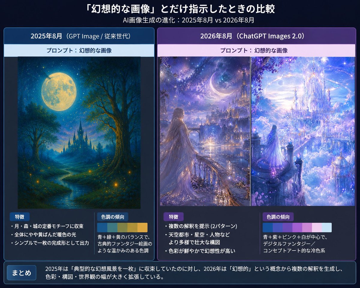
AI Image Generation: Prompt 'Fantasy-like Image' 2025 vs 2026 AI Image Prompt
Create a Japanese comparison infographic slide about how AI image generation changes when given only the prompt {argument name="prompt phrase" default="幻想的な画像"}, comparing August 2025 and August 2026 outputs. Canvas: 4:3 horizontal presentation slide, dark navy gradient background, polished tech-report style. Use crisp white Japanese typography, glowing borders, and subtle blue/purple highlights. Overall mood should feel like a serious visual analysis of fantasy AI art evolution. Header: At the top center, large bold Japanese title: 「『幻想的な画像』とだけ指示したときの比較」. Directly underneath, smaller subtitle: 「AI画像生成の進化:2025年8月 vs 2026年8月」. Layout: Use exactly 2 large rounded comparison panels side by side. - Left panel: blue theme, labeled 「2025年8月(GPT Image / 従来世代)」. - Right panel: purple theme, labeled 「2026年8月(ChatGPT Images 2.0)」. Each panel has a pale prompt strip near the top reading 「プロンプト:幻想的な画像」. Left panel content: Show exactly 1 fantasy artwork: a traditional painterly fantasy landscape with a huge full moon, deep blue night sky, forest silhouettes, a winding glowing river, small firefly-like lights, and a distant dark castle with spires. It should look like a complete single illustration, warm and nostalgic, with a restrained composition. Below the artwork, create exactly 2 analysis boxes: 1. Box title 「特徴」 with exactly 3 bullet points: 「月・森・城の定番モチーフに収束」, 「全体にやや黄ばんだ暖色の光」, 「シンプルで一枚の完成形として出力」. 2. Box title 「色調の傾向」 with a small horizontal color palette of exactly 4 swatches: deep blue, teal green, warm yellow, golden ocher. Add explanatory text: 「青+緑+黄のバランスで、古典的ファンタジー絵画のような温かみのある色調」. Right panel content: Show exactly 2 fantasy artworks side by side inside the panel, separated by a thin vertical divider. 1. Left artwork: a luminous fantasy city at night with a crescent moon, starry sky, distant towers, glowing waterfront, and a long-haired woman in a flowing dress standing on a balcony or bridge, looking toward the city. 2. Right artwork: an opulent celestial castle floating above clouds, white and lavender architecture, sparkling sky, crystalline towers, pink-purple blossoms, and a small robed figure looking into the glowing city. The right panel art should feel more complex, cinematic, saturated, and concept-art-like than the left panel. Below the artworks, create exactly 2 analysis boxes: 1. Box title 「特徴」 with exactly 3 bullet points: 「複数の解釈を提示(2パターン)」, 「天空都市・星空・人物などより多様で壮大な構図」, 「色彩が鮮やかで幻想性が高い」. 2. Box title 「色調の傾向」 with a small horizontal color palette of exactly 5 swatches: cyan blue, violet, pale pink, white, light sky blue. Add explanatory text: 「青+紫+ピンク+白が中心で、デジタルファンタジー/コンセプトアート的な冷色系」. Bottom summary bar: Across the full width at the bottom, add a rounded dark blue box. On the left, a small label button reading 「まとめ」. To the right, summary text: 「2025年は『典型的な幻想風景を一枚』に収束していたのに対し、2026年は『幻想的』という概念から複数の解釈を生成し、色彩・構図・世界観の幅が大きく拡張している。」 Visual style: Clean Japanese infographic, presentation slide, thin neon blue/purple borders, subtle drop shadows, high readability, balanced margins, precise alignment. Use fantasy images that look like embedded generated examples rather than photographs. Constraints: Include exactly 3 fantasy artworks total, exactly 2 main comparison panels, exactly 4 analysis boxes, and exactly 2 color palettes. Keep all Japanese text legible and do not add extra labels, logos, watermarks, or irrelevant decorations.
Content: Comparison infographic: 4:3 canvas, navy gradient, dual panels with artworks and analysis boxes, bottom summary. Specifies style, layout, lighting, color, material, and count constraints.
Pros: Clear structure with explicit constraints for accurate generation.
Cons: Dense information may cause detail omission.
Reference image: No obvious reference-image dependency
Source materials are collected from publicly accessible web pages. Contact us if a rights issue needs review. Copyright & Privacy