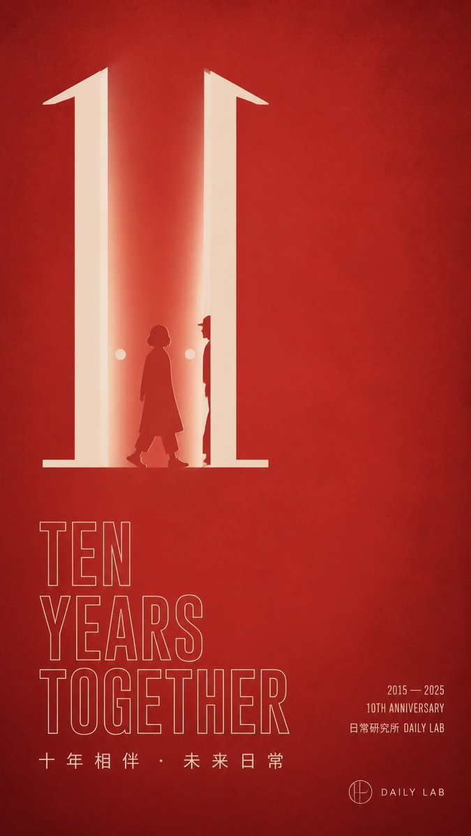
DAILY LAB 10th Anniversary Red Poster AI Image Prompt
Goal: Create a minimalist vertical red anniversary poster for {argument name="brand name" default="DAILY LAB"}, with an elegant corporate/public-institution aesthetic and strong negative space. Canvas: Tall vertical poster, 9:16 aspect ratio. Deep textured crimson-red background with subtle paper grain, soft vignetting, and faint tonal variations. Layout: Place the main visual in the upper-left half: a giant luminous cream-white number "10" built like two tall architectural pillars or doorway shapes, with warm glow spilling inward. Keep the right half mostly empty red space. In the lower-left quadrant, stack a large thin-outline English headline. In the lower-right quadrant, add small anniversary details and a simple logo lockup. Main visual details: The number "10" should be enormous, cream-white, and softly illuminated. The "1" and the right vertical stroke create a doorway-like corridor with bright inner light. Inside the doorway, include exactly 2 dark red human silhouettes: 1 shorter person walking left-to-right wearing a long coat, and 1 taller narrow figure standing near the right pillar, partly hidden in profile. Add exactly 2 small glowing circular lights, one on each side of the walking figure. The figures should be silhouettes only, no facial details. Text content: Use exactly 4 main text groups. Group 1, lower left: large outlined uppercase sans-serif words stacked on three lines: "TEN" / "YEARS" / "TOGETHER". Group 2, below the headline: spaced Chinese text "十 年 相 伴 · 未 来 日 常". Group 3, lower right: small condensed text on three lines: "2015 — 2025" / "10TH ANNIVERSARY" / "日常研究所 DAILY LAB". Group 4, bottom right: a small circular monogram icon followed by "DAILY LAB". Make all typography cream-white, with the headline as thin outline lettering and the small text as solid lettering. Visual style: Minimalist modern poster design, Chinese contemporary brand aesthetic, warm red-and-cream palette, precise alignment, clean grid, soft cinematic glow, understated premium feel, no photographic realism except subtle paper texture. Constraints: Use only red, cream, and dark red tones. Keep the composition uncluttered with large empty space. Do not add extra text, extra people, decorations, borders, or watermarks. Ensure the anniversary theme is immediately readable and the giant "10" dominates the poster.
Content: Subject: glowing cream-white '10' as architectural doorway with silhouettes and light dots; scene: deep red textured background with negative space; style: minimalist modern corporate; composition: left-upper focal, right empty; lighting: soft cinematic glow; color: red and cream; material: paper grain; lens/ratio: vertical 9:16 poster.
Pros: Clear structure and explicit constraints (counts, text groups, palette) make it easy to execute.
Cons: Many elements may weaken minimalism; precise placement of figures and lights is highly specified.
Reference image: No obvious reference-image dependency
Source materials are collected from publicly accessible web pages. Contact us if a rights issue needs review. Copyright & Privacy