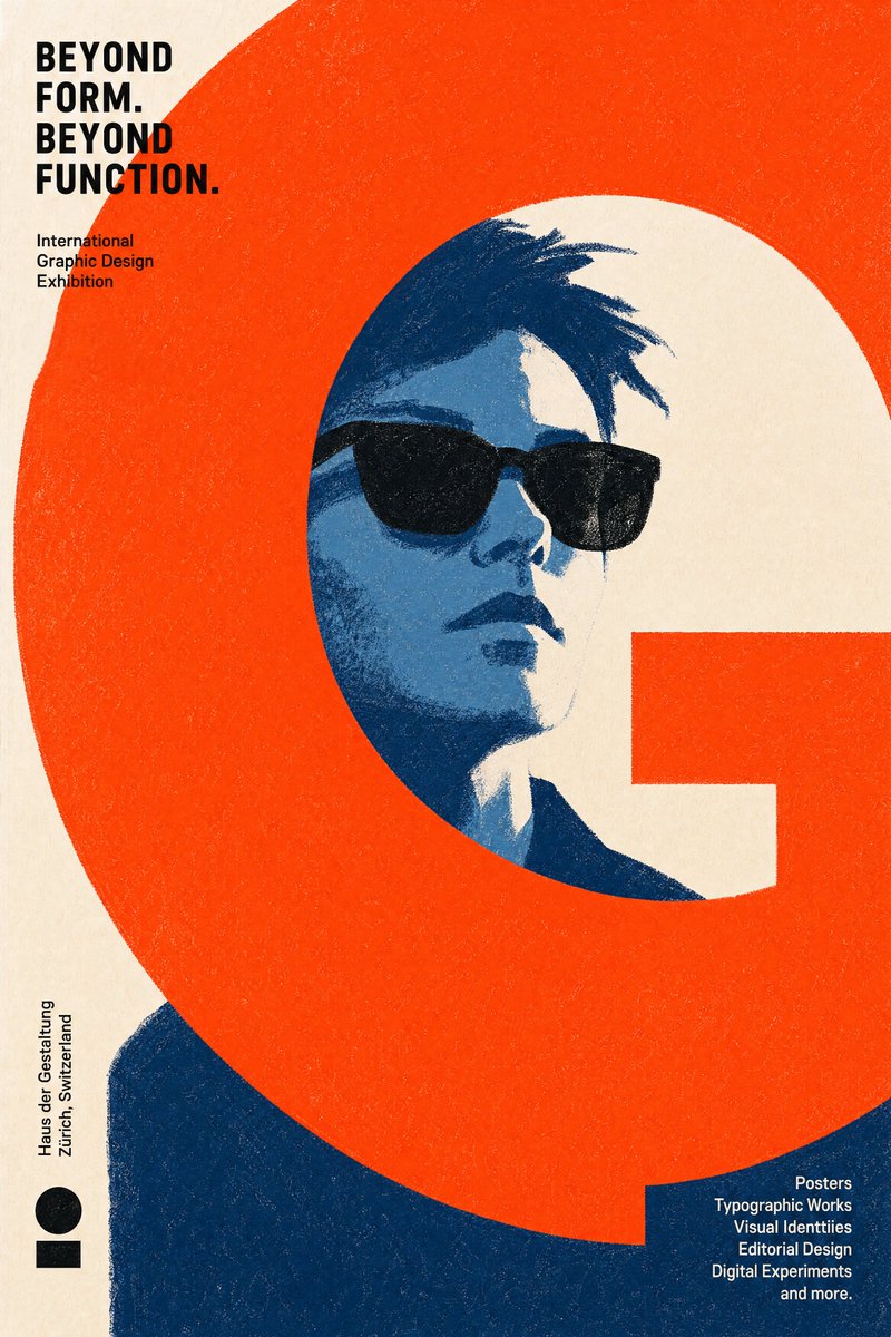
Contemporary Graphic Design Exhibition Poster AI Image Prompt
Create an original contemporary graphic design exhibition poster suitable for an international contemporary graphic design exhibition. Think like a graphic designer, not a portrait painter—the graphic design is the artwork; the illustration exists to support it. Required elements: a recognizable character wearing sunglasses, and one dominant {argument name="graphic design element" default="graphic design element"}. If a reference image is provided, preserve the person's recognizable identity; otherwise, use the same character established throughout the conversation. These are the only mandatory visual elements; everything else should be freely reinvented. The dominant graphic element may be geometric, typographic, architectural, abstract, organic, or entirely original, consisting of a single bold shape, oversized typography, bands, frames, grids, blocks, lines, curves, cut-outs, negative space, or any other graphic device. Choose the single visual element that creates the strongest overall composition. Visual style: no lineart; construct the image entirely from {argument name="art style" default="flat graphic color shapes"}. Large simplified shapes, minimal details, visible dry crayon texture, limited {argument name="color palette" default="color palette"}, bold negative space, minimalist editorial poster. Embrace bold simplification, reduce details whenever possible, communicate through shape before texture, design with confidence not accuracy. Composition determined entirely by the art director: the portrait may be cropped, offset, scaled, partially hidden, or extend beyond the frame. The dominant graphic element may intersect, crop, frame, hide, divide, surround, interrupt, or visually balance the portrait. Treat typography, negative space, geometric balance, and composition as equally important as the portrait. Avoid centered composition, symmetrical balance, and conventional portrait layouts. Prioritize bold graphic design over realistic illustration. Color: use bold, unexpected combinations inspired by professional color references, not natural colors; avoid realistic color choices; each poster can explore a completely different palette. Creative freedom: the illustration style, composition, color palette, graphic language, shape design, texture, typography, and visual storytelling should be freely interpreted. Never repeat the same visual solution twice, do not establish a recurring signature motif; each poster should invent its own visual language from scratch, as if created by a different world-class graphic designer while still belonging to the same exhibition.
Content: Structure: exhibition poster; required elements (sunglasses-wearing character + dominant graphic element); style (lineart-free, flat color shapes, dry crayon texture); color (bold non-natural); composition (asymmetric, avoid centered); creation (unique visual language each).
Pros: Prioritizes graphic composition over realistic illustration; grants high art-direction freedom, suitable for series.
Cons: Many constraints may unbalance generation; recognizability requirement limits creativity.
Reference image: Reference image only for identity preservation, not required.
Source materials are collected from publicly accessible web pages. Contact us if a rights issue needs review. Copyright & Privacy