Handcrafted Paper-Art Toronto Islands Ferry Poster AI Image Prompt
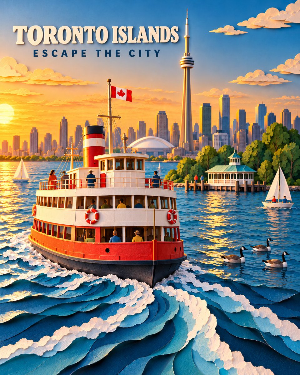
A premium handcrafted paper-art travel poster featuring a classic red-and-white Toronto Islands ferry cruising across Lake Ontario at golden hour. Show the ferry prominently from a slightly elevated three-quarter angle, carrying a small number of naturally positioned passengers. Its dramatic curling white paper wake leads the viewer’s eye from the foreground toward the boat. In the background, show Toronto’s recognizable skyline with the CN Tower as the dominant landmark. Include warm sunset light glowing from the left, the island ferry dock and pavilion surrounded by lush green trees, two small sailboats, several Canada geese floating naturally on the water, and an accurate Canadian flag flying from the ferry. Create the entire scene as an intricate dimensional paper sculpture using layered cut cardstock, curled paper waves, deckled edges, folded-paper architecture, subtle handcrafted imperfections, and realistic shadows between the layers. Use rich lake blues, crisp white, warm red, leafy green, and luminous golden-orange light. Sophisticated editorial travel-poster quality, cinematic depth, clean composition, highly detailed and visually striking. Add the exact title “TORONTO ISLANDS” in bold, raised cream-white paper lettering near the upper-left area. Below it, add the exact tagline “ESCAPE THE CITY” in smaller, widely spaced dark-navy uppercase letters. Keep both lines clearly readable, safely inside the margins, and away from the CN Tower. Vertical 4:5 composition. No crowds, malformed people, duplicated birds, excessive clutter, flat vector styling, plastic appearance, borders, logos, signatures, watermarks, or additional text.
Content: Structure: red-and-white ferry, Toronto lakefront and skyline; dimensional paper-sculpture style with layered cardstock, curled waves, handmade flaws; golden-hour light, blue-white-red-green-gold palette; vertical 4:5, upper-left title/tagline, negative constraints.
Pros: Complete structure with clear subject, setting, style, lighting, typography, and ratio; specific placement and negative constraints.
Cons: Many elements may feel cluttered; paper details, landmark accuracy, and exact text may be hard to balance.
Reference image: No obvious reference-image dependency
Curated from publicly available creative examples. Prompts and commentary are edited and organized by this site. Please contact us with any rights concerns. Copyright & Privacy