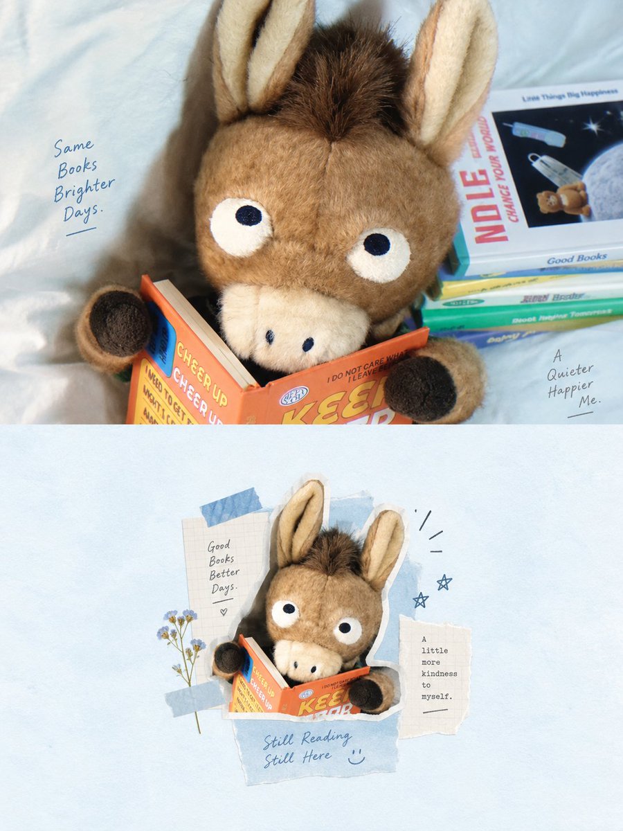
Vertical 3:4 Top-Bottom 1:1 Collage Poster AI Image Prompt
Please turn each photo I upload into an independent, high-end design poster. Do not merge multiple photos; output each separately. Use a vertical 3:4 composition with the top and bottom halves strictly at a 1:1 height ratio, each occupying 50% of the screen. The top half retains the original photo, preserving the subject's identity, structure, posture, realistic texture, natural light, and original color atmosphere, with only slight premium color grading to give it the quality of art magazines, independent publications, or exhibition images. To adapt to the frame, the environment background can be naturally extended, but the subject must not be stretched, distorted, or changed. The bottom half first understands the core theme, relationship, structural trend, emotional atmosphere, and visual memory points of the original photo, and then reconstructs it as a whitespace digital mixed-media collage insert. Do not copy the photo item by item or fill the screen. Instead, remove irrelevant details and only keep the structures, trends, and visual clues that best represent the original. Re-summarize through photo fragments, fine black line art, handwritten notes, paper elements, and a few collage shapes so that the correspondence with the photo above can be recognized at a glance. The composition uses small-format centering + large amounts of surrounding whitespace. The true visual subject is controlled within a small area in the center of the lower half, placed in a clean and wide background like a magazine insert or collage card. The subject does not need to be fully expanded; it can be moderately cropped, compressed, or combined, with only a very small amount of auxiliary line art, paper scraps, arrows, symbols, or small text notes around it, forming a relaxed and restrained editorial relationship with the subject. Whitespace is not an empty background but an important part of creating a sense of breath, space, and rhythm with the subject. The visual language uses digital mixed-media collage: combining a few photo fragments, simple black line graffiti, handwritten notes, paper collage marks, slight tape or sticky note elements. The overall style must be restrained, light, and quiet, without heavy layering or complex decoration. The subject remains clear, and auxiliary elements only serve to emphasize the theme, supplement memory, and optimize the layout without forming a new visual center. The color palette is based on a light, airy color system of low-saturation light blue and white, with fine-tuning based on the photo above. Use light blue, fog blue, pastel blue, white, or off-white as a large area background, supplemented by black lines for structure, a small amount of deep blue for rhythm, and allowing a hint of light yellow, pale gold, or very few warm colors as highlights. The colors are calm, light, healing, and clean, avoiding high saturation, cluttered colors, or excessive vintage darkness. Text intervention is minimal. Words, short phrases, or notes can be extracted based on the subject, location, or emotion, using fine, restrained, and relaxed handwritten or editorial styles distributed naturally around the subject or at the edges of the whitespace. The overall presentation is a small-format subject with large-area artistic whitespace, a light blue and white main tone, a combination of photos and line art, paper-feel collage, and a light and relaxed editorial insert feel, referencing minimal mixed-media collage / whitespace scrapbook layout / centered editorial collage / airy zine-inspired layout. Avoid full-page collages, complex backgrounds, decorative piling, or commercial template feels.
Content: Subject: uploaded photos made into paired vertical posters, top 50% kept original, bottom 50% collage reconstruction. Composition: 3:4, 1:1 halves, small centered subject with wide whitespace. Style: minimal mixed-media collage, airy zine, magazine insert. Materials: photo fragments, black line art, handwriting, paper, tape. Palette: low-saturation light blue and white with subtle warm accents. Light: natural light preserved, only light grading.
Pros: Clear structural, ratio, and color constraints; strong whitespace rhythm and top-bottom correspondence.
Cons: Long and abstract, outcome depends on model understanding; prone to decorative clutter or garbled text.
Reference image: Clearly depends on uploaded photos: it requires processing each uploaded photo and uses the original photo as the basis for both halves.
Source materials are collected from publicly accessible web pages. Contact us if a rights issue needs review. Copyright & Privacy