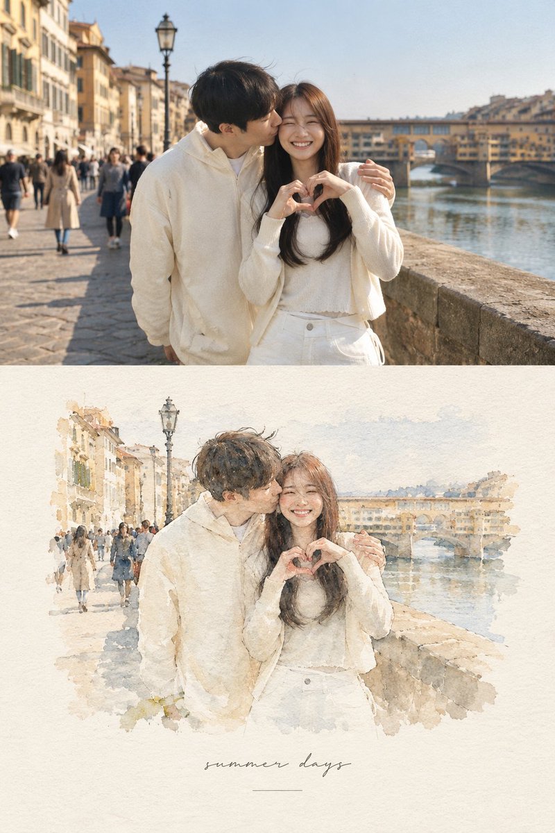
European Travel Photo-to-Watercolor Editorial Composition AI Image Prompt
Create a refined editorial {argument name="location atmosphere" default="European"} travel-art composition based on a reference photograph. The image is divided vertically into two parts: the upper section is a realistic cinematic travel photograph, while the lower section transforms the exact same scene into a delicate {argument name="watercolor style" default="hand-painted watercolor illustration"}. Upper section: authentic candid travel photography, natural daylight, soft shadows, subtle film grain, realistic textures, documentary-style composition, people naturally walking through the scene, beautiful architectural details, slightly muted elegant colors, high-end travel magazine photography. Lower section: a minimalist handmade watercolor painting of the exact same scene, preserving the recognizable composition, architecture, people, poses, perspective and major visual elements from the photograph. Loose translucent watercolor washes, delicate ink details, visible paper texture, soft edges, imperfect brushwork, subtle pigment bleeding, airy negative space, understated pastel tones, artistic but realistic. Leave generous warm ivory/off-white textured paper space surrounding the watercolor illustration. Add a small elegant {argument name="caption" default="handwritten caption"} near the bottom, such as “summer days” or “a quiet afternoon”, with a thin minimalist horizontal line underneath. Overall aesthetic: luxury travel journal, fine-art watercolor postcard, contemporary editorial design, nostalgic European summer, understated elegance, tactile handmade paper, sophisticated and serene. Portrait orientation, clean composition, premium art direction, no clutter, no borders, natural proportions, highly detailed photograph transitioning into an airy watercolor illustration.
Content: Portrait editorial split composition: top realistic travel photo, bottom same scene as handmade watercolor; includes natural light, film grain, pastel tones, paper texture, handwritten caption and thin line.
Pros: Clear structure and strong photo-to-watercolor contrast; cohesive journal/postcard style.
Cons: Depends on reference image; exact same scene/person reuse is difficult.
Reference image: Clearly depends on a reference photograph and exact same scene.
Source materials are collected from publicly accessible web pages. Contact us if a rights issue needs review. Copyright & Privacy