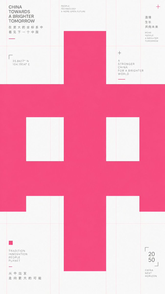
Futuristic Oversized Bold Typography Layout AI Image Prompt
Take any futuristic theme providing core concepts, short phrases, and minor auxiliary notes, and translate the theme into an extremely enlarged text or symbol subject: The first impression must be heavy, bold sans-serif glyphs filling almost the entire frame, pressed horizontally into the layout, with the character body occupying the center like structural beams, partially cropped or overflowing, making reading first become a strong form event before reading subtitles at its edges. Keep the background largely empty with cool white space, overlaid with extremely thin, light warm-colored composition lines, baselines, and vertical column lines; these lines should look like unhidden skeletons of a design draft rather than decoration. Use only high-saturation orange-red as the primary color to carry all visual weight, gray for small explanatory text, avoiding multi-colors and gradients. Information modules are sparsely placed at grid intersections and edges: small icons composed of simple geometric angles, dots, and short dashes; titles are short and bold; body text is in narrow columns and light gray. The overall presentation should have a precise, restrained, experimental typographic educational feel. Glyph construction requires low contrast, thick strokes, large open counters, flat terminals, tight tracking; punctuation and auxiliary symbols also follow the grid rhythm. If switching to other writing systems, maintain equivalent block volume, inner/outer spatial relationships, cropping pressure, and horizontal reading momentum. Prohibit illustrative backgrounds, shadows, paper textures, centered cards, rounded cuteness, commercial poster lighting effects, and over-packed information. Theme: Joy Aspect Ratio: 9:16 Note: Appropriate Mid-Autumn elements Font Color: Gucci Ancora Red
Content: Futuristic typographic poster: enlarged text/symbol as subject, heavy sans-serif filling frame, horizontal press, cool white empty background with thin grid lines, high-saturation orange-red primary, gray auxiliary text, sparse info at grid intersections. Glyphs: low contrast, thick strokes, open counters, flat terminals, tight tracking. Params: theme, 9:16, Mid-Autumn elements, font color. Includes prohibitions.
Pros: Comprehensive structure with specific font, color, grid, and prohibition instructions.
Cons: Dense terminology may cause generation deviations; many prohibitions may limit creativity.
Reference image: No obvious reference-image dependency
Curated from publicly available creative examples. Prompts and commentary are edited and organized by this site. Please contact us with any rights concerns. Copyright & Privacy