Realistic Desk Photo vs Kawaii Illustration of Same Items AI Image Prompt
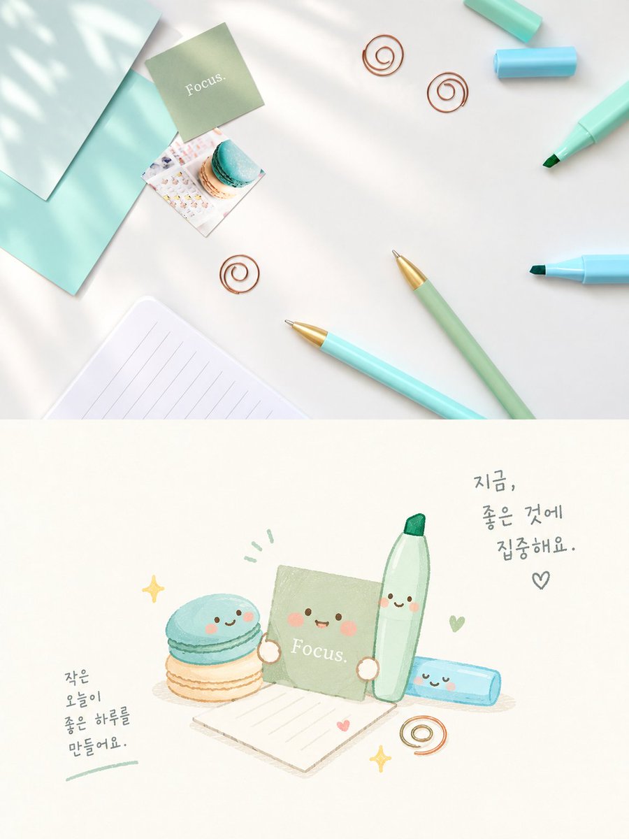
Goal: Create a vertical two-panel image contrasting a realistic top-down desk photo with a cute kawaii illustration of the same items. Canvas: Vertical 4:5 aspect ratio, split horizontally into two equal sections. Top Section (Realistic Photo): A high-angle flat-lay photograph on a clean white surface. Soft dappled sunlight shadows fall across the scene from the left. Items include: a mint green sticky note square labeled "Focus." in white serif text; a small square photo of a blue and beige macaron; three copper wire spiral paper clips scattered around; a light blue marker pen with cap off; a sage green mechanical pencil with gold tip; a light blue ballpoint pen with gold tip; a light blue highlighter; a teal envelope or folder edge on the left; and a lined notepad corner at the bottom left. Bottom Section (Kawaii Illustration): A hand-drawn watercolor-style illustration on a cream background featuring anthropomorphic versions of the items above. The characters have simple happy faces (two black dot eyes, pink blush circles, smiling mouths). Elements include: a stack of two macarons (blue top, beige bottom) with a face; a sage green sticky note character labeled "Focus." holding a tiny heart; a tall green marker character standing upright; a lying down blue highlighter character; a lined paper sheet; a copper spiral clip; and yellow sparkle stars. Handwritten Korean text appears in two places: upper right says "지금, 좋은 것에 집중해요." (Now, focus on good things.) with a heart symbol; lower left says "작은 오늘이 좋은 하루를 만들어요." (Small todays make a good day.) underlined in green. Visual Style: The top is crisp, bright, and airy photography. The bottom is soft, pastel-colored, whimsical watercolor art with thin outlines.
Content: Vertical 4:5 two-panel: top realistic flat-lay, bottom kawaii watercolor anthropomorphic items; same stationery/macaron subjects, Korean text; composition, lighting, color, material, style contrast.
Pros: Clear top/bottom contrast; rich item, text, and color details.
Cons: High density may miss items; exact layout and Korean text often fail.
Reference image: No obvious reference-image dependency
Curated from publicly available creative examples. Prompts and commentary are edited and organized by this site. Please contact us with any rights concerns. Copyright & Privacy